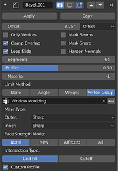
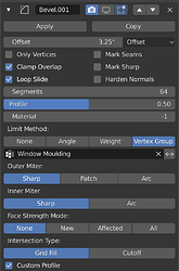
HooglyBoogly said:
" I’ll explain the logic of how I organized the bevel UI, because I’m not convinced by all the changes you’re suggesting.
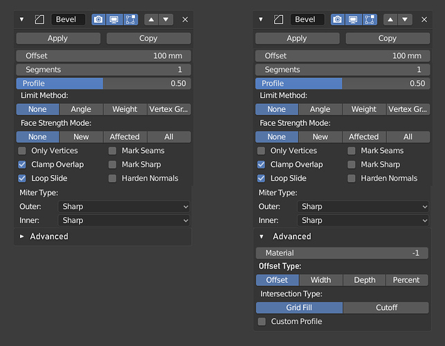
First, Offset Type is right below Offset Value (which is at the top of course) because that way it doesn’t need a title. It also makes sense to put the control for what a value means right next to the value itself.
Second, all of the check-boxes appear below that for a couple reasons.
- A few important settings are there: Only Vertices , Harden Normals , Clamp Overlap . These are some of the options I see people using the most.
- To break up the big block of gray that we get if we put all of the slider / number properties at the top. This is just a visual thing but I think it’s important.
- All the check-boxes are together because I don’t think there are enough of them to justify moving them to two different sections. When you’re looking for “some check-box,” it’s useful to know they are all in the same place.
Third comes the other most commonly used options, except for maybe Limit Method , which comes later because it’s an expanded enum which needs a title.
Last are all of the other options, which aren’t used as much, and the order is a little arbitrary. I would venture to say Face Strength Mode is the least used option, so that could probably come at the bottom, but I put Custom Profile at the bottom because it expands the panel, and that’s weird if it happens in the middle.
In the future, with constant radius bevel, the Custom Profile check-box will turn into a Profile Type enum. When that happens Face Strength Mode should probably move to the bottom.
Limit Method could probably be moved above Miter Type , because it’s used quite a lot."
My original Proposal is here Right-Click Select — Blender Community
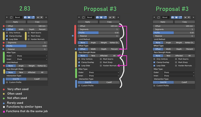
- You split the most commonly used settings into two parts. This Offset Value, Segments and Profile.
This is obvious to those who often use this modifier.This is the most inconvenient place in this modifier.
Profile is not a commonly used feature, but it makes sense to keep them all together. - Harder Normals and Face Strenght Mode also splited, but must be together because they work together.
By the way Harder Normals requires activation “Auto Smooth” checkbox in Object Data Properties.
It might be nice to duplicate the Auto Smooth settings in this modifier when clicked Harder Normals? And make it possible to hide or show these settings?
The same goes for other modifier who need Auto Smoothing activation. What do you think? - The interface should provide quick access to frequently used functions, be convenient and understandable. But this one looks divided and not organized. I use this modifier every day and it is inconvenient.
I tried to analyze what steps would need to be done with the standard way of creating a bevel.
- First:
Offset value
Segments
Profile
these three points are the embodiment of the bevel, they must be the very first and be together. - Second. Where bevel should be? On all geometry, on corners, on weight, on vertex groups?
- Third, how it should work? Everything else here.
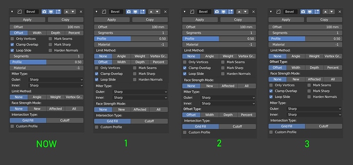
I suggested several options for the interface, I personally really like #3.
Here I was guided by 3 principles:
- Lift all frequently used functions up and combine
- Combine functions by similar types
- Combine functions that do the same job.
But this is based only on my personal experience.
I will try to summarize
- Bevel Size
- Segments
- Profile
- Limit Method
All this takes 90 percent of the interaction with this modifier, in most cases (imho).
They should not be separated and scattered across the interface.


 Have a nice weekend everyone.