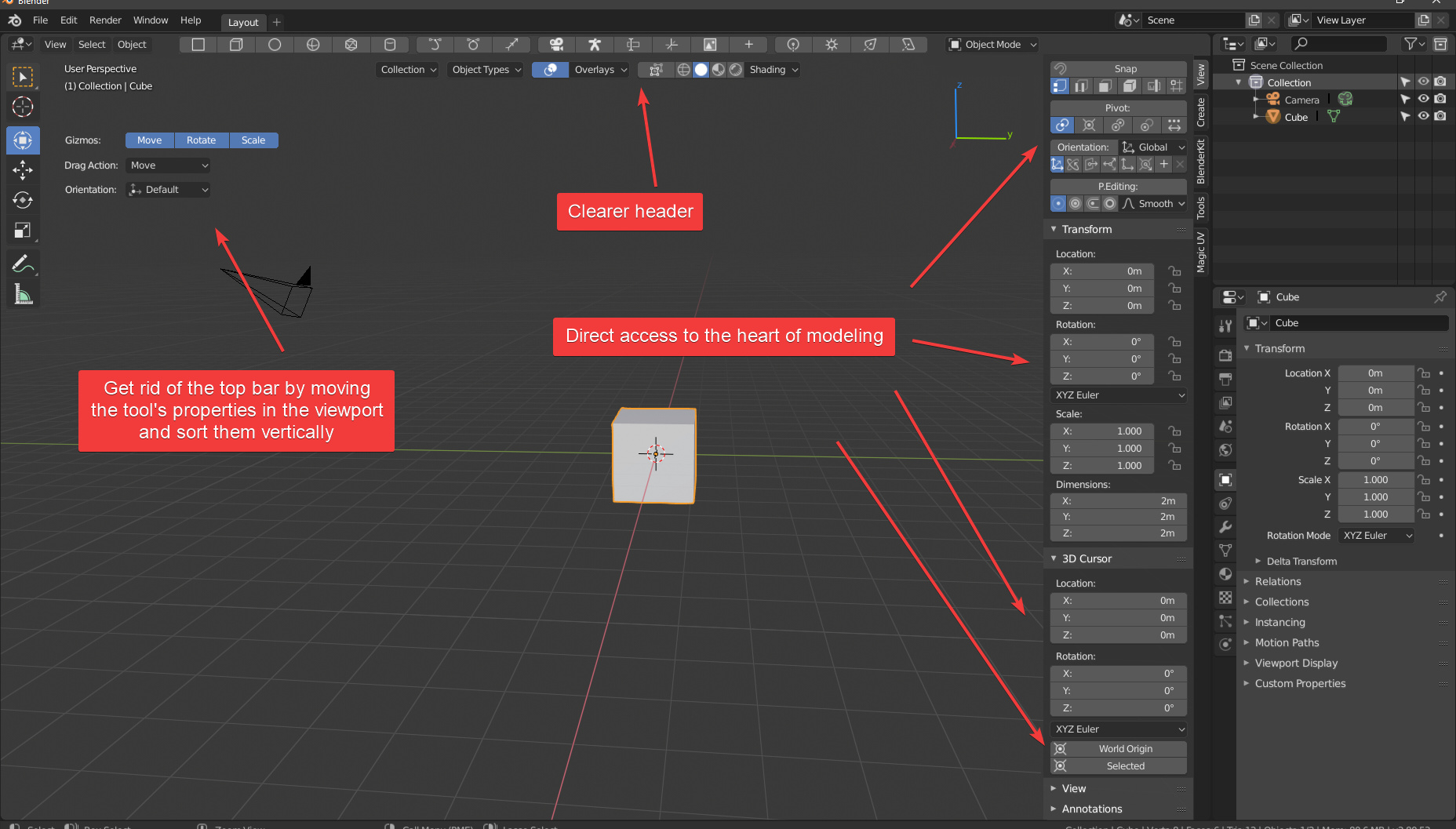
Since there is an active debate aound the ui these days, I sketched this to show an other point of view for the viewport reorganization. The idea is to have a better readability of the viewport while improving the worflow speed.
The active tool’s properties are moved to the viewport and sorted vertically
I reorganize the header by separating things related the viewport and things related to modeling
I reduced the number of dropdown menus to have direct access to the heart of modeling
I introduced an “add object” toolbar at the top (optionally)
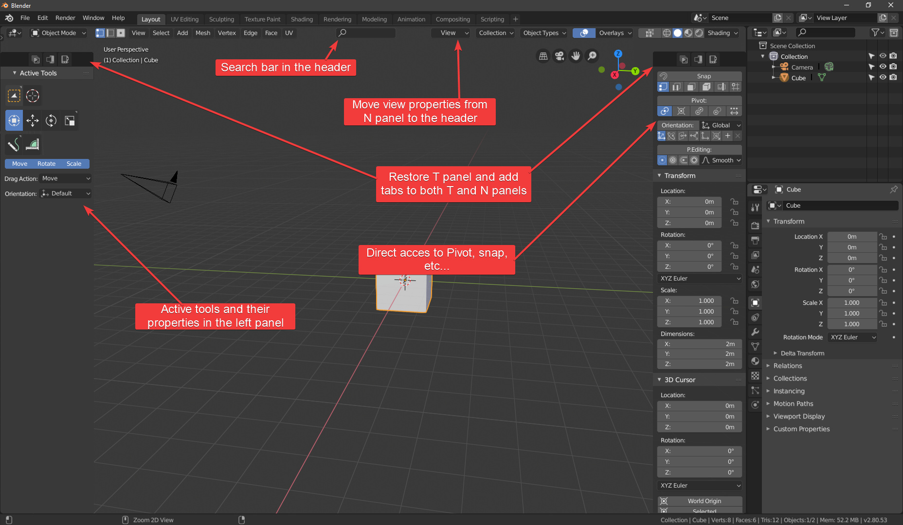
agree it was a bit poor (or maybe too much) sorry
This is now my upgraded point of view. After reading almost all discussions about the ui subject, I tried to take the good from each one:
You’re overcomplicating the problem. Everything is more or less fine. The main problem is the top bar and what to do with it. It was in different places already and never felt comfortable to use. This bar is just useless in my opinion, in object and edit modes the top bar is basically empty space with a few settings. But in painting/sculping mods you would probably ended up using this panel anyway, so the top bar is kind of useless for everything.
Your proposal has pretty much overcrowded the area around the viewport with panels filled with busy sets of buttons of an erratic layout. Current state of Blender’s 2.8 UI is great in a sense that it draws focus to the actual content the user is creating, instead of the UI elements. Your proposal takes a step back in this regard.