I am against noob modes. Dealing with a feature makes a novice user angry and therefore causes the user to investigate or complain in a forum. So other users will teach him all the possibilities and best options available. With a noob mode, the user may not have the concern of looking for better options or other possibilities of working with Blender.
Anyway, in 2.8+ we have Active Tools. Many might consider Active Tools the “noob mode”.
I agree with better tooltips and “did you know …?” assistant.
When they press R, just one time, rotation is made according to pivot of transformation in plane corresponding to their viewpoint.
That is not erratic. That is predictable.
That is the same as when using white circle of rotate gizmo.
And in 2.8, there is a Rotate active tool with gizmo showing axes of rotation as colored circles.
The fact that by default axe of rotation is perpendicular to view plane is absolutely not an advanced feature.
So, if you are talking about the fact that when you press a second time on R, you are switching to Trackball mode.
It is true that shortcuts in Status bar are not reflecting that.
Message is exactly the same for all transform operators although that does not correspond to reality for Rotation.
So, I agree. That should be fixed.
That has nothing to do with the operator doing complicated things.
I don’t know if trackballs became rare things.
But I don’t think it is complicated to explain the logic behind that rotation modes in tutorials for beginners.
That is not a pro feature. That is just a rotation mode free of axis/plane constraints.
Well, there is always the possibility of being annoyed by an unknown bug.
I think that is just safer to avoid unpleasant experiences of crashes and bugs due to unused features.
That was just an example of people who will probably don’t need to generate images and tweak them in compositor.
Experienced users will use an addon like node wrangler.
That is more versatile to add stuff only on desired selection and not everywhere.
Material library addon is not just about material examples but also functional templates named about usecases.
I think that is a more valuable approach because than changing defaults.
Because defaults of Noob UI can only correspond to one set-up.
But here, the addon is sharing lots of different usecases.
An addon can be enabled/disabled.
If you think of addons as bricks of your Noob UI, combining them differently allows you to produce multiple Noob UI.
You can enable/disable them per workspace.
And you can produce application templates without being a core developer.
Basically, you just have to set a start-up file in a folder and share it as is. https://docs.blender.org/manual/en/dev/advanced/app_templates.html
OK. I did not get what you were saying.
That looks like a bug to me. That does not happen, here.
Color Space is the one expected according to its format.
When I open .png, .jpg, color space of node is set to sRGB. But when I open an .exr, it is set to Linear.
And if I change it to Non-Color, it does not go back to sRGB after a simple connection.
Freestyle was the name of an external project of render engine like Cycles or EEVEE who started outside of Blender. http://freestyle.sourceforge.net/
Keeping the name was the way to credit original project.
When it was integrated Blender Internal render engine already had a post processing feature called Edges.
Freestyle was evoking the fact that line would be stylized.
Integration of Freestyle into Blender Internal took 8 years. During that period, all threads on forum where you could find help was using the word Freestyle.
It was in the name of blog about its development who was the main source of documentation.
You could think that after several years, that would be possible to rename Freestyle. But a new and faster engine for non photorealistic rendering producing Grease Pencil lines will come up, soon.
And its name will be Line Art.
Cycles is just the name of a render engine. Render Engine are so numerous, that most recent ones try to have cool names to distinct themselves to the mass of other render engine. (Appleseed, Mitsuba, Aqsis, Pixie, Fstorm, Octane, Corona, Redshift, Nox, Indigo, Sunflow, Kerkythea…)
If you find “ray” or “render” in their name, there is a chance that the renderer is more than 15 years old.
(PovRay, Yafaray, V-ray, Renderman)
The name, here, is just the basics of how to create a brand.
EEVEE is the anagram of Extra Easy Virtual Environment Engine.
They just tried to give a cool codename to their project from a pokemon.
Clearly, if you only type Blender in a google search, the answers will not be related to 3D.
I think that what, maybe, could be implemented is something like a non-linear increment of accuracy for transforms (translate, rotate, and scale). For example: if I’m very, very close to the object’s center (or even on top of it) the accuracy to the cursor’s position could be “dampened” in favor of a pleasant experience in order to not become erratic and unpredictable, like you say.
Me too, but I think for different reasons. I think any UI should be simple by default (or as simple as it can be when you have sooo many features like Blender has), and powerful when needed. That doesn’t mean that every advanced feature should be hidden, but that they should be grouped and hierarchised in a way that doesn’t bother new users, but also allows easy (or say, relatively easy) access to advanced users.
You can’t simplify much the panels of an airplane but you can make the more used buttons and levers bigger and attention-grabbing, and the less used and less urgent buttons and gauges be smaller.
I guess that’s one of the issues @chippwalters was kind of trying to address, no? That maybe there is missing a clearer way to find the beginner-used stuff first, and to make a “path” to find the advanced stuff on our own.
That and also to differentiate between things that actually need to be addressed because they are a repeating annoyance or restriction and other things that just need to be learned because it is just the behaviour of software.
I’d say that problems that repeat over and over again and keep you from working fast and fluent even after years with the software certainly need to be addressed. These are workflow issues like when Blender was not able to work on several submeshes at once to create a shared UV map (that was a great addition!). The recent changes to the outliner. Things that are still missing like only being able to assign modifiers one by one. Per object … these kinds of things.
On the other hand G, S and R for Grab, Scale and Rotate behaviour are predictable after using them for some time. At some point they don’t slow you down any more like they do in the beginning. They can still be improved because they make it difficult to switch between the tools without looking at the keyboard but it’s by far not as time consuming as adding or editing values on separate objects when there should be a multi-object editing (sorry - I’ll stop mentioning this, ,now ;).
All of these things are general UI and UX decissions that are relevant to all users, though. Then there is a third part, aforementioned userbase knowledge:
How many people from the games industry are using Blender, how many architects, how many movie animators, VFX and Motion Graphics, Special Effects …
For example there are now talks with people from animation studios giving input to Blender’s animation pipeline. That is great because it gives insight into production worklows from outside Blender’s own productions (which are great in themselves because it means that the tools are railored towards actual productions … looking at you, Unity). As a game modelerr/artist I’d love to see more love in the UV Editor, export presets and the retopo-mode. Things that are apparently on lower priority for movie animation. That’s why userbase is another factor in the UI / UX roadmap. These can also prioritize and influence decissions on how to tailor workflows to certain groups of people. Or maybe at least help giving priority to the long backlog of UI designs.
Buuuuut - at this point I’d like to hear more from @chippwalters, actually. I am only rambing here but I do not have any practical experience on a scale like Blender’s. Since he pretty much started the idea of this thread, I’d like to hear more about how such a customer journey could theoretically play out or what steps should be taken. And what how we could actually gather, structure and improve on the UX basis.
While I too have opinions of which interface elements work and don’t work, this discussion is not targeted at such.
I am not talking about the details or specifics of what currently needs to be fixed in the interface.
It’s a fact that in evaluating user experience, legacy subject matter experts, like those here who have been using Blender since before 2.8, have a difficult time comprehending what new users want or need. That is the purpose for research into those areas.
Furthermore, it would be good to consult with accomplished UX experts on methodologies to help understand the process.
Imagine for a second the value in having all the best Blender VFX artists contributing edits to the core Blender C code without having some way to manage it all. And of course, in Blender there are systems and methodologies in place to make sure only the best ideas and best code is accepted.
This does not discount everyone’s input into the process, only that there needs to be a managed process for understanding and improving on the User Experience.
It’s important to understand the difference between user experience and user interface. Here’s a good primer:
What I’m interested in is UX firstly-- and whether or not Blender Leadership is willing to commit to making the Blender User Experience a core Blender value-- with the requisite priorities and resources.
FWIW, Blender’s recent request was for a UI designer, and one of the stated job requirements was:
Preferably: someone with (basic) C and (decent) Python skills.
First time in all my years I’ve seen that as a request for a UI designer. Tells me management doesn’t understand what is needed and is going in the wrong direction.
I find it hard to catch the ironic comments in English that is not my natural language, but I think there is some of that here
Do not remove the context of what was being discussed with the other user, perhaps I should have been more specific. We were discussing transforms behavior. So I was referring to unique Blender behaviors that are clearly advantageous and users of other software complain and get angry simply because those features don’t work the way they do in the software they are used to using. There Blender is not the fault, the fault is every user who comes from another application and wants Blender to work exactly as its exclusive other program does.
In those cases, I agree with better Tooltips and virtual assistant that make it easier to understand how Blender works.
By the way, apparently in the information panel at the bottom, it does not show “Shift” key behavior information for finer control during transform (not related to the thread but to what was being discussed about transforms) @pablovazquez
FWIW, I would not even think to have this discussion a couple years ago when Blender was considered by most to be an “also-ran.”
Since, with the wonderful additions by the hard working team, to Blender’s technology, like EEVEE, along with smart UI decisions (left-click and cursor drag select to name but a few), Blender is now considered mainstream by even professionals.
So then, how to keep up? You can bet the competition: Autodesk, C4D and others, are spending lots of time thinking and testing User Experience and associated issues and remedies.
Blender only stands to relinquish current high standings if they stay fixed to old methodologies and naive user experience notions.
There is plenty wrong. Band-aid fixes, while helpful, do not address core issues, like the on ramping of new users. The customer journey exercise is a first step in understanding this process:
I know for a fact that at least Maxon does Tests on every new Feature with People who have never used it and just watching how they use the program and where the areas are where people have no idea how to progress.
It’s also why I love that Pablo Dobarro asked peope to actually post videos on how they use sculpting to see why they request certain features.
By definition, when something is new, nobody has ever used it.
If you look at artists who were part of Grease Pencil team and made Hero Open Movie project, they were a combination of experienced Blender artists who could guide artists coming from elsewhere.
That is not correct to say that their methodology is wrong.
That they don’t know about the customer journey or customer experience.
Before starting 2.8 refactor, they did a winter camp with an UI team of experience Blender users who had the role to think about it.
Then, they did a codequest based on that.
I don’t disagree on the fact that customer journey was neglected at start of 2.8 process.
IMO that is due to the scale of the refactor. Too many things were scheduled to change too fast.
But from my point of view, that is also because of massive arrival of new users hyped by project refactor.
I am not saying that they don’t come up with good ideas.
But suddenly, are participating to discussion mostly people who don’t know the software really well, don’t know development schedule.
So, community becomes people talking out-of-scope of discussion, most of time, during a long period.
Developers have to calm them down, communicate and promise to work on things that they did not intend to do, at first place.
IMO, not respecting their priorities is what is conducting development to divert from planned customer journey.
But that is also how their original idea is enriched a lot by community contributions.
That is the specification of an Opensource project like Blender. Looking at what are doing proprietary software that has a closed development and a lot more of money at disposal will not help.
They probably need more artists doing what @JulienKaspar did with his recent threads on UX/UI, here, but not after problems came-up, but during the whole period of refactor for refactors of smaller scale.
Basically, what the Grease Pencil team did.
I am not saying that Blender is perfect right, now and that everything went well.
A huge scale refactor produced huge gaps in UX of some workflows.
But I think that they have learn their lesson, now.
If they continue to have same financial support, and choose to work on UX, workspace by workspace ; they should end-up with a basis strong enough to support community suggestions gushing in all directions.
Unfortunately, that will take several years.
To me, we have to wait 2.93 to be in measure to pertinently question their methodology.
It is at that moment, that known gaps in regards of original proposal will be filled.
To me, that is totally logical that users are experiencing problems with features that are in an in-between status.
That is probably why they are searching for someone who could understand why a developer may encounter difficulties that could postponed expected improvements.
Oh - I love that they are developing the tools alongside an actual production. It even seems that the tools that are developed that way turn out to be the best. It’s something Unity suffers from until this day, I think. Unlike Unreal they don’t produce their own games. Godot has the advantage that the main developers have been developing games with Godot and is very close to community input all the time. It’s also still a tad smaller than Blender
The question is rather how to actually structure this process now and how to actually give it direction so that the input from many users will be directed in the right way.
Designing in a vacuum leads to less than ideal results.
There’s also a certain amount of iterative analysis involved in UX design. UX designers will create wireframe rendering of their interface interactions and get user feedback. They’ll integrate this into their designs. It’s important for UX designers to have a holistic understanding of how users prefer to interact with their applications.
Structuring the UX principles the right way would probably also help the core team.
Then again I also have no real overview over their design process. There are the blog posts already posted. And I am sure they already have their own agenda. It would be cool to hear from them, though.
Is this something where input is even desired?
Do we discuss about something that is already being planned in a similar or completely different way?
How can the community help more?
'cause personally I’d love to help with UX if I can but I don’t know how other than posting in a few threads and hoping that it’s something that goes in the right direction or hasn’t been considered yet…
It seems to me that all this falls into the fallacy that an improvement in UX always needs a big change in development.
Blender 2.8 did very little to improve the user experience, beyond the movies that everyone wants to invent all the success of 2.8 is summarized in adding the active tools and changing the left click. Making UX available to new users is a matter of very few changes and improvements in blender.
Blender is currently one of the most used software, its paradigm is being imposed, it is taught in public schools in my country… Our first impression of its learning curve is not different from maya, modo, houdini, Zbrush or max. Nobody can use it without looking at some tutorial, some explanation of its structure or how it works.
If someone says they’ve learned to use a 3D suite without looking at a single aid, they’re lying.
What? The overhaul of the UI, EEVEE and several improvements in Sculpting improved the user experience a lot. And many more things. But maybe I don’t understand what you mean. I am kinda lost in this thread.
EEVEE and general sculpting have nothing to do here, is not a UI part.
What UI overhaul? Change the theme to a dark version? hide to add an object in a viewport menu? put the editor properties tabs in vertical? Move the addons from left to the right? Nothing of that have a real improvement in UX and the learning curve. Only the active tools and basically the left click was a real change for new users.
The refactoring of the entire menu system has IMO been an immense help for new users, as has drag to select. For the first time, Blender starts to embrace standard UI concepts, like toolbars (you mention) default states, enhanced gizmos and of course left-click. These somewhat “simple” changes have a massive affect on new user experience.
More Blender users should know that hovering your pointer over a UI element and pressing F1 takes you directly to the relevant Blender online manual section. Maybe an interactive Help mode should be made available to activate for novice users.
This is exactly the type of thing I was alluding to with my earlier post. This isn’t even hinted at anywhere in the UI. It’s a hidden feature that can’t be discovered naturally by exploring the program.
Also the operator that calls this function (wm.doc_view_manual_ui_context) does not exist in the Industry Compatible key map at all so it doesn’t even function. And in the Blender 27X key map it’s mapped to Alt+F1 so this feature is not consistent across Blender user experiences. That’s bad. This could be fixed if the tool tip had an extra line at the bottom (and if the operator was given an entry in the Industry Compatible key map) that encouraged exploring the online manual. That small change could make a huge difference in accessibility for a new user.
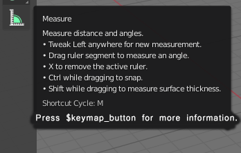
For example here’s a mock up of the Measure tool’s tool tip with this enhancement.