I don’t know … I think it would be a good idea if the Blender Core Team provides the outlines on how to maintain a good and cohesive user experience as well as how to design for Blender’s user interface. Most users don’t have any idea where the grand scheme of design is heading. It’s much easier to provide ideas when there is a theoretical foundation to talk about. Even spitballing ideas needs direction.
Of course the community can, should and will provide ideas, afterwards. That’s how open source works. There has to be a central hub that is managed by someone, though. Otherwise you’ll get RightClickSelect which has good ideas but goes into so many different directions regarding design paradigms that a mixture of all the top ideas could become counter productive again. The Blender developers also have the best overview about how the core software is built and where it’s currently going.
That’s probably also part of what Ton meant when he said that the documentation and onboarding for new developers needs to be improved. IIRC that’s where most of the Epic MegaGrants are going over the 3 years timespan.
Ok, I get it. You want to debate point by point – which I am not interested in. I have read your posts, and while I don’t agree with much of what you say, I understand it is your point of view.
I think you have taken your careful time and thoroughly explained yourself. I would actually like to hear from others on this topic as well. If you want to continue on this conversation, I encourage you to start your own thread with the topic of your choice.
Hi,
UX is a very difficul topic in software applications and it is ussually a weak point in OSS.
But, If we see the evolution of Blender in the last 5 years, we can see that the usability improvements, have been huge, from general usage to visual improvements, like left / right mouse button, drag’n’drop, visual operators, …
All in all, usefulness of updated official documentation are still problematic, and adding new functionality perhaps has bigger priority over its usability, but that’s often in OSS.
I prefer to think that it is been improved, and has a lot of work to do.
I don’t understand this answer, since you don’t agree with my opinion you don’t want me to participate in this debate anymore?
I really don’t understand what you want here, just people that plainly agrees with your point of view?
If you don’t want to debate your proposal point by point how do you want us to analyze it?
You could have written a letter directly to B.I. regarding this, but if you’ve done an open letter I assume it’s to generate a debate around it, not just the debate you want with the ideas you like and that’s it.
And I agree with that, that’s why I mentioned the idea of revive the Blender 101 as a community effort project having the Chipp idea in mind but with guidance from Ton/Dalai, it’s not doing it ignoring the core team, it’s just not spending the core dev team time on this.
I wanted to contribute here, but the ‘I know better than you’ tone of replies from the OP to posts that aren’t in full agreement puts me off from really engaging. Did you actually want a discussion? Given the OP’s suggestion of ‘off-the-cuff’ and ‘not fully formed thoughts’, there’s also too much goal post moving going on. Perhaps a few concrete examples of solutions to existing problems would allow this ‘open letter’ to be more productive.
I think the idea here was more to set up a basis on which ideas actually can be made concrete.
Know who your audience is and what they want. Godot does this each year with an anonymous survey to give directions where to put the emphasis of the next features. So for example if Blender just made a survey to have the users give an aproximation of what it is they are using Blender for. What the experience level is. What fields they use Blender in, what pieces of Blender they see as the most lacking or the most urgent, what they think are Blenders best features and traits, do you know about the best ways to actually request features or look up if a feature has already been requested, do you know about this or that feature of the documentation …
Of course none of these things is really binding. If there will be only 186 survey results it doesn’t say much … But it doesn’t hurt at all to just at least give it a try.
Then when there’s hopefully a direction of what users actually do with Blender for one thing:
the core team could potentially better decided where to put their own emphasis but also
maybe structure tasks for the community to take from this. Sort of making the process more accessible and structured for new developers. Giving guidelines where attention is needed the most.
Maybe there could also be a Wiki for UI / UX paradigms so that every developer, be it for helping with crucial Blender features or be it an add on developer, is on the same page of how to provide a consistent experience for the user as good as possible.
Maybe even a checklist (where do I put the icons, where should I put input fields, what shortcuts are strictly reserved, what menus are ok to use, how should an active state behave … that kind of stuff - I don’t know what else. I’m not a programmer )
Structure and a clearer basis on what to discuss. Blender has become a huge construct. Not just the program - the whole ecosystem. I think the structure behind all that large ecosystem is something that isn’t being discussed as often as actual features. It could provide a better basis on what to discuss, though.
At least that is the thing how I understood the original post.
It was not meant as a way to say “dumb blender down” or “put rookies in the driver seat”.
The way I understand it the TL;DR was: “Let’s see who is using Blender, actually. Let’s also see if these people maybe could provide hints on how to better focus feature ideas in the first place. If we understand the user better we can discuss concrete how to give these users the best experience for the Blender we have. Would this be of interest? How can we achieve a structure that actually makes clear where UI and UX need improvement in the first place?”
Do you have some specific examples of that? I am also a big supporter of the “Less is more” direction, but I can’t point at many places in Blender that have changed for the worse since 2.7 days. Sure, many of them did not really change for the better, which does indeed concern me a bit, but I am also not seeing anything going significantly worse.
The N panel example you mentioned - in vanilla Blender, out of the box, the panel comes with just two tabs: Tool and View. Both of them are equally as simple as in 2.7 days except the (admittedly dumb) decision to put per-Workspace panel in the Tool tab, as that thing could not be further from the definition of what a “tool” is in a context of Blender.
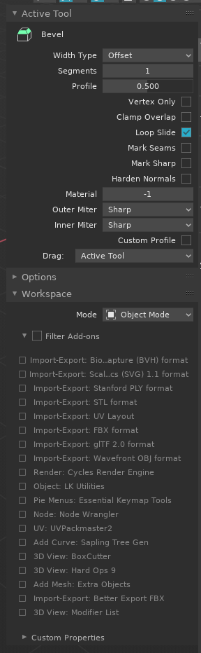
“Oh yeah… umm… lemme tweak the profile value of my bevel a little bit, crank up the segments, add a little bit of Import-Export: STL format and sprinkle some of that Node: Node Wrangler on top and it’s going to look perfect!” … said no one ever…
But this little rant aside, in general, 2.8 doesn’t seem significantly more cluttered than 2.7. I do agree that Blender Foundation should be a bit more vicious when deprecating and removing old features made obsolete by new, superior ones. A little example of that would be to finally remove ability to flip headers to the bottom. This is one of these things that has just became annoyance when opening older scenes.
Lastly, I am still 99% sure that the reason people keep complaining Blender is so hard to learn is the brutally bad input mapping (default keymap). It’s been beyond horrible in 2.7, it’s still horrible in 2.8, and Industry Standard one has been a complete waste of opportunity.
BUT, aside these few things, I consider everything else going in a positive direction.
My mistake. I only wanted to provide some brainstorming material, not anything near final solutions. It’s typically part of an early design discussions to ideate when talking about how to address potential problems.
In summary what I really want to posit is the possibility of Blender Leadership embracing User Experience as a “core value” for Blender– just as Apple and now Google and other companies do for their software.
If that is possible, and we can agree there are ways the Blender User Experience (NOT the User Interface-- that comes later) can be improved, then next steps are research, not my stupid off-the-cuff proposals. So my apologies for even mentioning them as they have surely taken this topic off track.
This is not a “papercut” type of discussion where I’m pointing out what may be broke in the UI, but rather a strategic discussion to discuss if and how user experience design can possibly help Blender.
To that end this post by @SpookyDoom is right on target.
A first step in designing the user experience around your product is understanding who you customer is and their pain points.
This could be a pretty good idea, and based on the amount of downloads Blender experiences, if the survey is well presented to the user and it does not bother the user, it could be a very good information source.
Regarding that, I’m not sure it would be so useful for that, but could be very useful to have a birds-eye view of the situation and help the management to define a medium-long term plan, like Animation 2020 for example, it was clear that it was something absolutely needed for current users, but also to get newer users from the animation field, now the details are a different thing that could be heard, but never decided by the users in general, we as users tend to be biased towards our own momentary needs, so it’s a good information source, but never the deciding source IMHO.
This is also a good idea, like a style guide, I think the UI team may have something along these lines as an inside document, not because they want to hide it, but because it may be some informal documentation or something like that, but a style guide for programmers, both core and addon programmers, could be a good idea, at least to set some basic design guides.
With that said, I have to say that anyways the python api does not leave too much to the imagination regarding UI, it’s very tight and defined, you cannot even create a tree view like the outliner unless you create one manually with OpenGL, so while I like the idea, the truth is that there is not much room for variation in this field as of right now, some of the problematic things were mentioned by Rawalanche for example.
It’s not how I understood it, but it’s a good alternative view of it.
I’m curious, how would you categorise the different users?
I ask this because I don’t see a single type of user, in Sketchup or Fusion360 the type of user is pretty monolithic, they have more or less the same target and share the same concerns generally speaking.
But for Blender that’s not the case, the user base is pretty large and the type of tasks being done in Blender are very different from one to another, so to be able to do such investigation one of the first things to do would be to try to do a first categorisation of the user base.
Now with all that said, I wonder if the UI team has done a big part of this already, since they work on this and they probably have their own studies and design documents, so could be great to hear from them here.
Also the Blender 101 initiative may have some of this work already done, since it was more or less in line with what I understood in the original letter.
That would be one of the purposes in canvasing the user base-- to find out what kind of people use Blender.
I know a lot about SketchUp-- as I’ve used it to to create some very large scale projects over the years. And, you are 100% correct, the topology is beyond terrible.
When SketchUp was first introduced by @Last many years ago-- it was targeted directly at architects. After Google acquired SketchUp, there is a strong argument it became the most widely used 3D application in the world, boasting over 30 million activations in 2012.
SketchUp also became the defacto 3D application taught in schools because 1) it was free and; 2) it was easy to learn (but not easy to master).
Now that Trimble owns it, they want to re-target architects only and their userbase has dropped IMO significantly. I now believe Blender to have the largest installed userbase in the world for 3D.
I do not favor the SketchUp direction, but I will say it has several on-boarding experiences which help it-- and when initially developed it used superior user experience as a key differentiator.
All that is to say while SketchUp was initially targeted at architects, it has now become a generalized 3D modeling application for those who don’t need professional levels of functionality. It’s also true that some truly amazing models have been created with it, not to mention SketchUp’s 3D documentation capabilities go far beyond anything Blender can do.
So, I don’t know what the typical Blender user is anymore than I know what the typical SketchUp user is.
Hi, all! I just arrived to this thread and I feel like I’m kind of agreeing with… everyone?
I think the UX could and should be improved in order for people with literally zero experience could pick it up and create some simple models, with simple materials, and simple animations and rendering that without reading a manual. The UI/UX should be self-explanatory (whether is through tooltips, hierarchy methods -size, grouping, shading, etc-, highlights, etc.) and easily discoverably.
But dumbed down never. And different packaged versions of Blender? Also never.
And, like someone said in the thread: yes, the BF should give a clear direction and a big push for this to happen, but also the community should make tangible suggestions with mockups and big plans on how to improve the UX and why.
I agree with OP so far. I’m new to Blender, I spent some time with 2.79 for a bit before going 2.8. But I have tried using Blender way longer before that and never get hooked. “It’s hard to use” was kind of the problem. I keep on learning Blender right now solely because I’m extremely curious of the software’s features. And let me say this: anything we just started to learn will always be hard. Blender is hard, but the difficulty doesn’t come from the same source. Simply put: it’s with the un-intuitiveness of the software. For example, I had to Google how to close a segmented window, with result that I must put my cursor slightly in the corner and drag over the other window, gotta say that’s ridiculous - for both of it. That’s not the only one. There are many things that I Googled and ended up shaking my head upon discovery of the solutions.
I’m sorry for anyone having pride in ‘Blender is Hard’ idea, but when it comes to the software’s 3D tools and features itself, I find Blender has some areas simplified for the ease of use compared to how other softwares may handle it, which is great! I’m GRATEFUL and AMAZED! (I bet you’re also proud now, right?).
Being unintuitively hard tool doesn’t make it ‘not children’s toy’. It just makes it, well, illogical or unintuitive to use. Stoves are digitized now, safer to use, simplified things on your fingertips. Does that make digital stove a children’s toy? Nope. On the other hand, if a hammer has a folded hammerhead that you need to vertically shake mildly and lightly tap on hard surface for it to unfold, does it make it not children’s toy? Nope. It’s just unintuitive to use.
Being illogically complicated, impractical, non-intuitive isn’t the same as technically deep.
We as users should give our feedback and suggestions regarding to this matter. Not to make it into another software, but to make it less unnecessarily complicated to use. I’ve done my part regarding Blender’s options and functionality of referencing another file, which is still too much click for limited result compared even to 10-years-back Maya’s. The thread’s sunk somewhere though. Oh well.
I’m a new Blender user. I started around 2.78 or 2.79. This is what made it hard for me to learn Blender.
Navigation
Factory settings:
autodepth & zoom to mouse position are off. Spacious scenes were painful to
navigate. I’m ashamed to admit it took about 6 months to find those settings.
Hardware
Many people don’t have:
Numpad keyboard (I still don’t have one)
can’t use certain shortcuts. (Home key, numpad . key, etc.)
emulated numpad isn’t intuitive
3-button mouse (I had to buy one)
Emulated MMB is slower to use because of the extra buttons.
Lots of features
Despite the near -impossibility of learning every single button in Blender, I think the extremely high number of features is Blender’s greatest strength because it sets such a high ceiling for what you can accomplish. I strongly believe there is a way to fit all of the features into a compact, easy-to-access, & organized space.
Advanced vocabulary
People without college level education in various fields might have trouble understanding vocabulary like:
Delta Transform
Quarternion
Nabla
Stereoscopy
Impulse clamping
Anisotropic
Obscure vocabulary
Sometimes tools are given their own unique names that don’t really explain their function. For example:
Freestyle
Christensen-Burley
Random walk
GGX
Eevee
Each time someone has to look up a word, it takes valuable time. In many cases, commonly used words could replace rarely used words.
Hello Guys, let me start a bit metaphorical before moving on to the technical aspects:
I love Blender, like all of you, but that’s the point! Loving means to forgive, to grow side by side and to accept imperfections. But we are talking about users that are going to flirt with Blender, not about those already happily married
Now, to the hard facts:
I voluntarily teach Blender to industrial design students at our university and i have to admit that some of them have had some trouble with minor quirks in the UI that lead to major frustration.
(Please note that we are mainly using the animation, texturing and rendering systems and apart from shadow catchers, we hardly do any modeling inside Blender!)
So, maybe there could be some “NOOB MODE” which is ON by default and can be disabled on the splash screen at the first load of Blender (just like the right-click-select option), when you are an experienced user. And of course, it could also be fully customized in the Preferences later, with lots of nerdy checkboxes
From my experience with new Blender users, I would strongly suggest to change the following behavior in the “NOOB MODE”:
3D View: Transform (S, G, R, E…) precision should not depend on the distance from mouse cursor to active object, as most people hover with the mouse over the object and then fire a command, which leads to inaccurate transform behavior.
3D View: Autodepth and zoom to mouse position should be ON by default. (as mentioned above)
3D View: lock camera to view is such a crucial feature. It deserves an own UI toggle button. Don’t hide this in the side menu!
Compositor: The checkbox “use nodes” should be ON by default. (duh!)
Compositor: The Viewer Node should be connected (with backdrop enabled) by default
Shader Editor: The checkbox “use nodes” should be ON by default.
Shader Editor: The default shader could come with properly connected PBR inputs (generic textures? not sure about this)
Shader Editor: Texture Nodes should automatically be set to non-color data when connected to a non-color data input!
(to be continued…)
Unfortunately, i have absolutely no scripting experience, so i can’t do this myself. But i would be happy to collaborate and develop such a NOOB MODE!
I admit that this is somewhat frustrating when you are learning Blender, but then when you learn it, the behavior of it is useful. Also maybe it’s not so obvious, but people should learn “Shift” key behavior during transform.
I admit that [transform precision depending on distance] is somewhat frustrating when you are learning Blender, but then when you learn it, the behavior of it is useful. Also maybe it’s not so obvious, but people should learn “Shift” key behavior during transform.
Yes, it is of course useful. However, a noob mode would provide a minimum of quirks in the early hours of learning. Maybe there could be a hint to the “pro functionality” in the bottom of the window (in the info bar, where all secondary functions are listed when you use a command).
Or maybe a little suzanne head shows you some “did you know…?” hints, every hundred times you press S. Hahaha! Maybe not…
There are some old unresolved issues yet where [“use nodes”: on by default] can make fail the GUI
I am actively following Blender Development since blender 2.43.
I already saw how long and painful 2.5x UI refactor development was because of lack of maintainers.
I am talking from experience. That literally takes years to end-up with a design that satisfies community.
There were discussions about UI during years before 2.80 release.
Some of those discussions were closed, some are continuing and some are just suspended.
Developers produced lots and lots of design documents, opening hundreds of UI tasks pages on d.b.o.
You can have a quick access to them through UI module workboard. https://developer.blender.org/project/board/12/
I am just asking you to respect work that have been done by community, until now.
What @billrey proposed is not entirely there.
From my point of view, that is not pertinent to emit an overall critic on something that is not completed.
That does not make sense to ask to simplify an advanced version of software that still has some basis at WIP state.
Are you realizing that you are asking Blender Foundation to improve Google Search ?
There is an help menu in Blender window, that is guiding you to manual. If you type Window in that search, first suggestion is chapter about Areas describing that.
If you use right click menu on any element of UI, you have a direct link to manual.
Manual can probably be improved. @Blendify who is maintaining would probably like some help.
But I don’t really see how software could guide you better through things that are particularities of Blender.
Blender has a community that is a lot larger than Godot’s one.
There are millions of downloads per year.
So, unless you collect hundreds of thousands of replies to your survey, result will not be representative and if you have, they don’t have people to read and triage that amount of replies.
They are collecting feedback from here, from chat, mailing lists, blog articles commentaries, blender communities forums and Blender Conference.
And at the end, result is not so awful.
Blender development is open. There is no barrier between developers and users.
Users are already directly talking to them.
But that’s pure physics. The more users, there are. The more, time of one-to-one communication of developers is split between them.
They are encountering difficulties to do so.
That’s why they are offering jobs in that area.
Defaults are always a touchy topic.
The result is a combination of different factors.
History of software, preferences of developers trying to debug software, preferences of Blender Animation Studio artists, preferences of communities members.
When you have different ways to rotate and zoom, there is not an obvious way to give priority to intuitiveness over efficiency.
You can prefer to keep your mouse on a corner of 3D view to clearly see what you are rotating around and to be able to instantly zoom on it with keeping center of view as focus without moving mouse.
That is an historical choice that comes from a time when no laptop was able to be used for 3D.
And keymap was also designed for a qwerty keyboard, at that time.
2.8 keymap had to be a mix between what experienced users were using in 2.7 and a new keymap.
Otherwise, without absolutely no documentation, experienced users would have been as lost as new users in 2.8 and nobody could have teach blender to new comers.
But in 2.8, that should not be difficult for a new user to surpass that.
There is an obvious Navigation gizmo and a Pie-menu dedicated to that.
That is what is behind the idea of new workspaces tabs.
Allowing users to use more active tools in editors and use less properties dedicated to a specific task.
Problem we are facing, now is : all expected gizmos have not been realized, yet.
Most of addons writers are not really trying to build a whole workspace but just UI for a small tool.
That is the basics of learning to use the vocabulary proper to the field you are discovering.
You would not ask to people involved in mechanics to replace the words they are using to describe the pieces of a car. You would not be annoyed to see them using Names of inventors of motors or creators of a trademark of cars.
You quoted mathematical terms, optics terms, algorithms names and render engine names.
A 3 dimensional space is a mathematical concept. That is normal to use 3D mathematical terms related to that.
3D rendering is a computer generated approximation of laws of optics. That is normal to retrieve terms related to optics.
The same way that you are not forced to understand how to build a car to be a passenger of a car of a certain trademark : you don’t need to have the degree of the guy who wrote the algorithm to use his method for rendering.
Maybe such advice should be added to manual.
But replacing words unemployed in everyday life by vague terms that could be polysemic, is not really more helpful.
In none of your example, I see an easy replacement that would instantly communicate the meaning of what it is.
That is why when mouse pointer is hovering such word, you should see a tooltip describing its purpose.
You can enter value of a transform in redo panel.
You just have to provide a startup.blend file with redo panel opened by default instead of a closed one.
That only makes sense if your intention is to use compositor.
What’s the point for people learning basics of modeling to do 3D printing ?
And one of the point in favor of EEVEE is to do almost everything in 3D space.
Development of viewport compositor is supposed to start in few months. https://developer.blender.org/tag/eevee_viewport/
Default render engines are EEVEE and Cycles, now. Both are using nodes.
It is already the case.
Same as for compositor.
What is the point if your intention is to create a transparent material or a clay material ?
And Material Library addon (bundled with official release) is providing examples and templates of materials.
What is simpler for a newbie to re-use texture employed for diffuse color for other non-color settings or to deal with as many textures as settings, he wants to try ?
Oh yes - sure. Godot was more of an example that it’s a good thing to try and gather this kind of information, in some way. It has to be somehow managable as well, though.
I am not clever enough to say how exaclty this information should be gathered in Blender’s case. We’d need someone with experience in large scale surveys and evaluation.
A surve like this needs to be carfeully designed so that the results are acutally meaningful and don’t need to be gathered over and over again.
I’d love to direct my money specifically to most open designs in this area, if possible.
In that regard I really like what Ubuntu is doing with giving the users the ability do spcify where they want money they donate to be used.
But what works for one company doesn’t necessarily work for another.
I was complaining about having to Google up for something as basic as closing a window as well as some other things and how the solutions to those problems were unimpressive due to how complicated or weird they are, which is related to unintuitive-UI matter that I was bringing up in my last post.
Not sure how you perceived that as wanting BF to improve Google Search, but ok, whatever. I’ve said it and clarified it.
Thanks for that! I will look into that as soon as i have the time.
From what I understood, nobody wants to criticise Blender in general, but only improve the accessibility for new users. My suggestion is to develop a “simple mode”, which is purely optional, on by default and fully customizable in the preferences.
Replacing the word “Freestyle” with the standard phrase “Cartoon Style” or “Render Outlines” would be a good start.
I’m not sure you got me right here: When my students try rotate a cube, they select the cube (thank god its left click now) and of course, they still have the mouse on the object. They press R and the rotation is erratic and unpredictable. This leads to frustration. It’s a useful feature for pros, but it should be turned off by default.
Great news! Thanks for pointing this out!
Why? Would it leech too much performance when Backdrop is on by default?
Even if I use the compositor only in every second project, I’d be glad to not have to set it up from scratch everytime.
I’m sorry - I don’t get that…
Oh, I see. My bad.
Yes, I see your point here. But a “noob mode” is not about activating an addon that I maybe haven’t heard of and then scrubbing through complex node setups. I want to download a zip file with a PBR texture pack and hook it up.
As it is now, new users dig repeatedly through youtube tutorials about how to properly connect a normal map to a displacement node with non-color data and whatnot - then they wonder why the result is not what they expect (which is a very common feeling in Blender, i think we all agree here.)
Even experienced users have to do these steps over and over again. I just wondered if it might be better to have it the other way round and -for example- delete the default bump if you don’t need it. But i might be wrong here.
I’m afraid I don’t understand your question. Everytime I load a different metallic/bump/roughness image, the color space of the image texture nodesnaps back to sRGB, regardless of where it is connected! So i have to double check all image texture nodes just when i want, lets say, a different wood texture.
 )
)