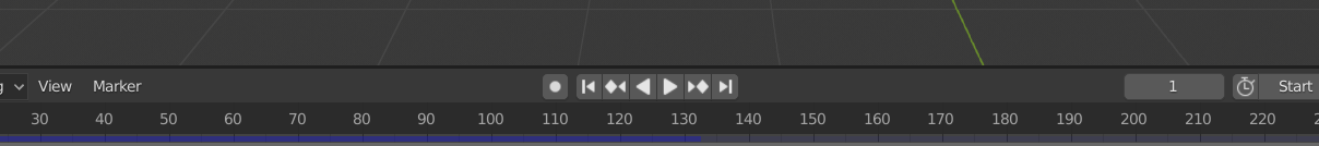
Why are the control buttons so crammed when there is ample empty space? I often misclick other buttons. Why not add an option to adjust the spacing? The space is wasted anyway.
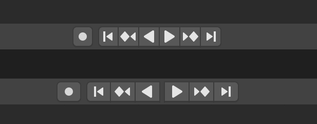
Take this capture you made and bring it into any image program you are familiar with. Then drag around the control buttons into some arrangement that you think is ideal. Then paste it back into this thread.
We all know how it looks now. What I want to know is how you think it could look better.
2 Likes
That’s not the issue imo. The problem is that this precious space is highly under-utilized, there are several other animation controls that should be there. Pity.
Isn’t it just a separate issue though? Your desire to utilize the space better and add more controls won’t help with their mis-clicking those little buttons. With @illbeback I am mostly wondering if they are wanting bigger or just wider, perhaps gaps, or groupings, etc. Is it just a single button always misclicked or all of them? Nice to get a fresh perspective on things.
Which ones specifically,exactly where, and in which order, etc? I know it can seem like wasted breath sometimes but it really is worth it to flesh these things out.
That would need some experiments, and people’s tastes may be different, so instead of a fixed gap, width, etc, it would probably better if those are adjustable in the Preferences.
In my opinion, I would not want the buttons to get taller because vertical space is so precious on today’s wide monitors, but I would probably like them to be a little bit wider, since there is ample space. And I would probably put some gap between each two buttons, not just between the Auto Keying and Jump to End Point.
The buttons I often misclick is the back play button when I tried to click the play button, and the back Jump to Keyframe button when I wanted to click Jump to End Pint. They look similar, and they are too adjacent without gaps, so they are confusing. I don’t know about others, but I don’t need those back play or back Jump to Keyframe buttons. I tried to find a way to hide them but I could not.
Nah… just pretend you are the only one who gets to choose. About the only thing I would say is that for improving the accuracy of hitting them with your mouse making them wider is more effective than adding gaps. But gaps are nice to make logical breaks or making them easier to read quickly.
The following is my attempt, making them all a bit wider and with a gap between directions. Above is how it looks now, below is proposed. Just save the file, make your own ideal changes and paste back.
1 Like
My thoughts on this would probably be against blender’s UI team rules of hiding everything, and I’m all about efficiency, intuitiveness and good visual clue, which is the opposite. ![]()
Prolly not worth the effort.
Always worth the effort. Especially with Timeline right now being a bit “half-baked” since 2.80.