In the 2.4 days I had a pretty rad custom theme where each panel was a different color. With 2.8 having a big focus on user interface, I thought it would be fun to re-imagine this concept. Along the way I’ve been bumping in to a bunch of interface elements that don’t have assignable colors, panels that don’t have assignable colors, colors that can be assigned but aren’t actually used, and so on and so on. Turns out this will actually be a great way to test. So… here’s a thread where I kind of stumble my way through making this theme, and fixing blender’s theming along the way. 
Here’s the Outliner with a bunch of different states. For this panel I wanted to evoke the classic yellow notepad.
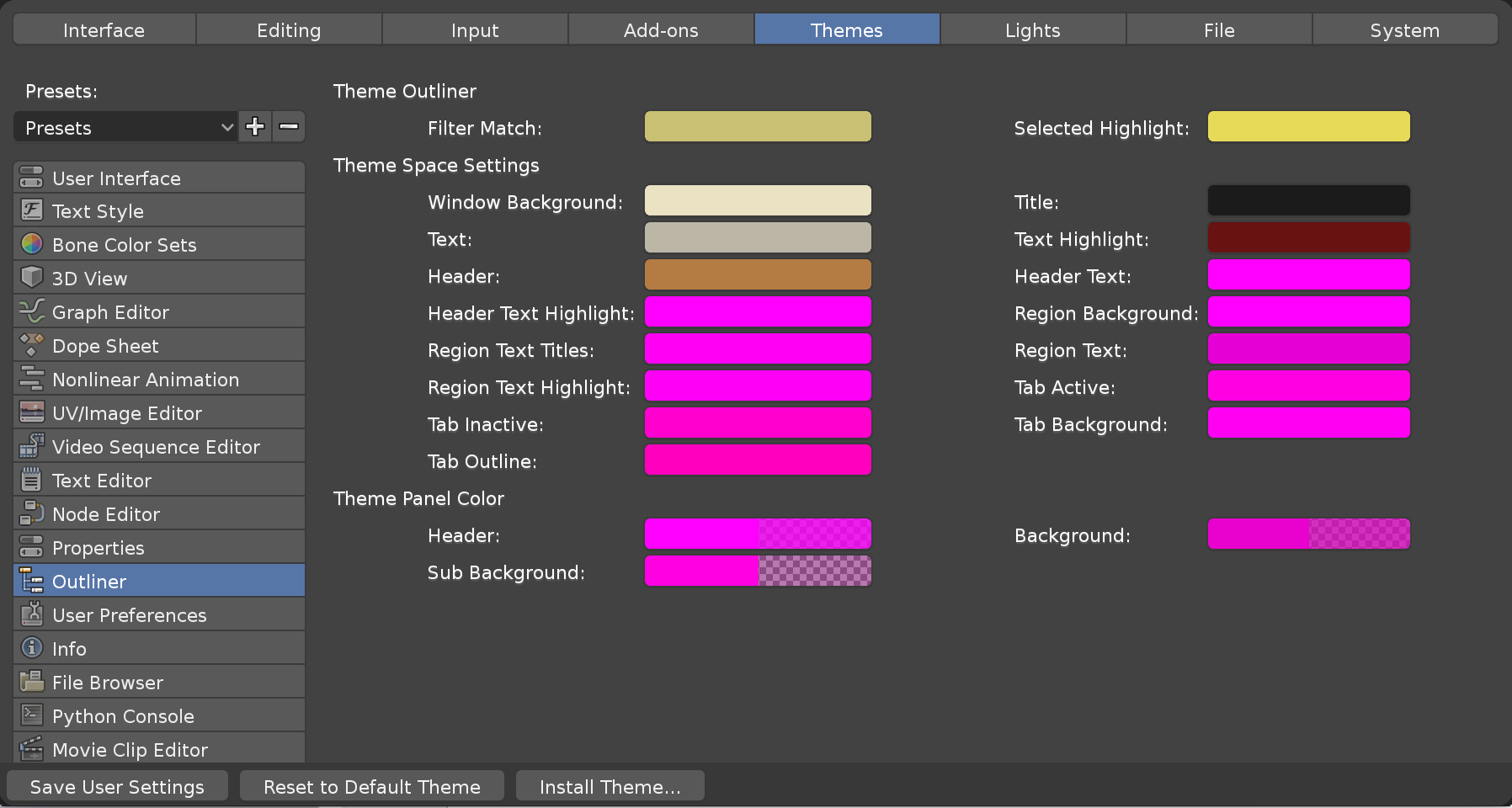
I noticed along the way that Outliner’s theming could do a better to use the proper terms. Here’s my take.
 Filter Match Pointless since filtering hides anything that doesn’t match the filter.
 Selected Highlight works as expected
 Active Highlight would be useful since active item may have different text color
- Window Background works as expected
- Title Unused
- Text works as expected
 Text Highlight should be split into two colors, Text Active and Text Selected
- Header works as expected
- Header Text unused
- Header Text Highlight unused
- Region Background unused
- Region Text Titles unused
- Region Text unused
- Region Text Highlight unused
- Tab Active unused
- Tab Inactive unused
- Tab Background unused
- Tab Outline unused
- Header unused
- Background unused
- Sub Background unused