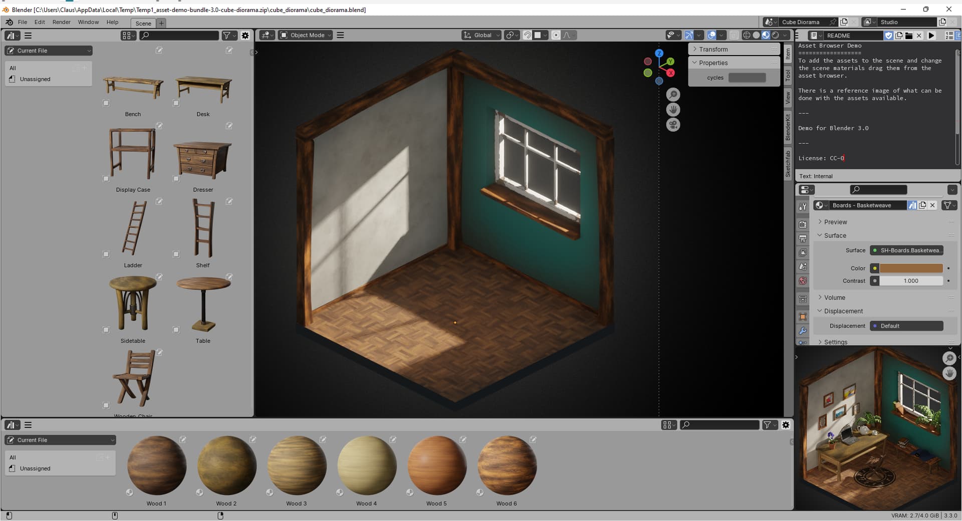
Past months I’ve had the joy of working with @kame404’s Piano White theme.
The current Blender Light theme looks more like an “Improved Contrast” theme in comparison. I believe with some minor adjustments to pass the usability contrast test (Web Accessibility Color Contrast Checker - Meet WCAG Conformance), Piano White should be the default Blender Light theme.

Note: I am using the Inter font with anti-aliasing and full hinting, and changed text style sizes slightly to improve legibility so my interface might look different than yours.