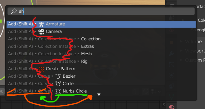
Since function names (white text) are primary results you’re looking for, they should be first shown and aligned to the left edge of search popup for a neat vertical aligning. Menus and hotkeys should be placed after it, on right - they’re just a secondary info. I’d also argue for option to hide pathing through menus, I don’t feel it’s useful for anyone using search and hotkeys. Maybe new users would see it helpful, but I’d definitely suggest at least adding an option to toggle it to reduce info and visual clutter in searcher.
Basically I’d prefer that red line representing reading flow in below screenshot to be straight vertical line (with icons not affecting vertical lining up, so some fixed left margin could be added for icons alone).
Can I add a vote for this. I use operator search as my main method of navigating blender’s operators and using the operator search is now much harder with the newly added cruft on the left that shows what menu something is in. At least move the cruft to the right so the useful information is on the same level or give us the option to switch this stuff off. Alternatively have this information available as a tooltip. I realise you want to make stuff easier to navigate via mouse for beginners, but please don’t break other forms of navigation in the process.
Bumping. Could we get at least explanation behind design decision? @pablovazquez? I really can’t think of reason why secondary/tertiary info (hotkey + menu pathing) would be aligned to the left, pushing away most crucial search results into irregular horizontally listing on right. Please. Using searcher is my hand extension in blender and it bothers me I have to look through lines of text every time to find relevant white-highlighted result I need. Sometimes I look at menu pathing/hotkey to memorize, but that’s like <10% of occurrence.
I look at hotkeys a little more frequent than 10% but in that case would’t it still be okay if the columns were ordered this way?
[Comand] - [Hotkey] - [Path]
(edit) just realized that in 2.91 the hotkeys are on the right, anyways. I think that’s okay.
Flipping command and path should be enough, shouldn’t it?
I think this would be the best design, if we mix the proposals of tonpix and leul_xyn to make it blender style
Search Box Icon + Search Text
Icon of Function + White text that we look for + (How to Access it/Path) + [Hotkey]
(Special Icon or
GenericMenuIcon)
So this way the search magnifier icon will be aligned with the icon of function and also the search text will be aligned with the function that we look for , then in paranthesis ‘‘the path/way to access the function’’ and in the square brackets we will see the hotkeys). As for the icon, it will be specific icon or if it doesnt have icon due to being in menu, there should be a ‘‘menu’’ icon which implies that its a menu option. As for the colors. The Icon, Function/Command Name and Hotkey will be white, while the Path will be grey
Or we can just add icon column on the left side alighned with search magnifier icon on the Leul_XYN’s design (its really cool) and make the texts little smaller and use it. I really liked it