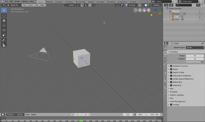
2.8 Outlined/Coloured Icon Adaptation

@Jendrzych fixed a lot, and did a lot of work to bring us a new icon set for 2.8. However myself and many others believe the design goals behind them, namely their being mono-colour, are flawed and detract from the user experience in a desire to simplify things, and make the icons easier to create.

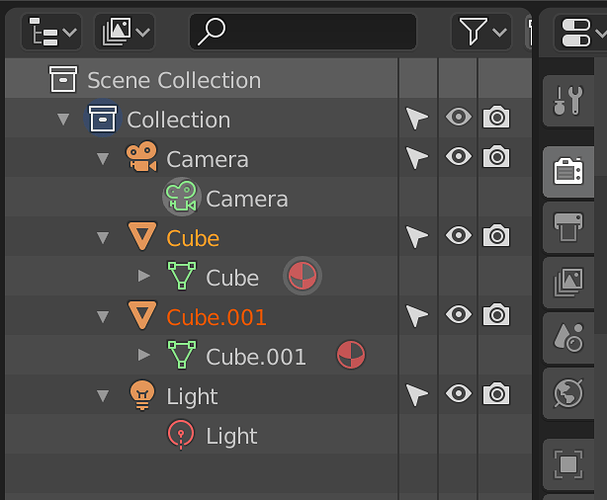
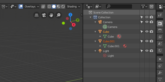
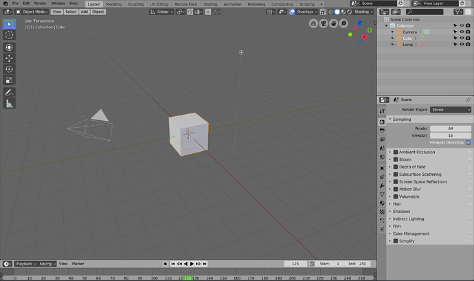
In an effort to give us an alternative to the mono-coloured icons Jendrzych made for 2.8, I’ve been adapting his icons to include a splash of colour, and an outline or shadow, posting on the blenderartists forum before now. However, The icon set is now fully complete and up-to-date, so I am bringing it here.

I’ve now done a 16px sheet, if it turns out using the extra space for the outline is not an issue.

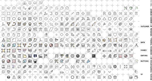
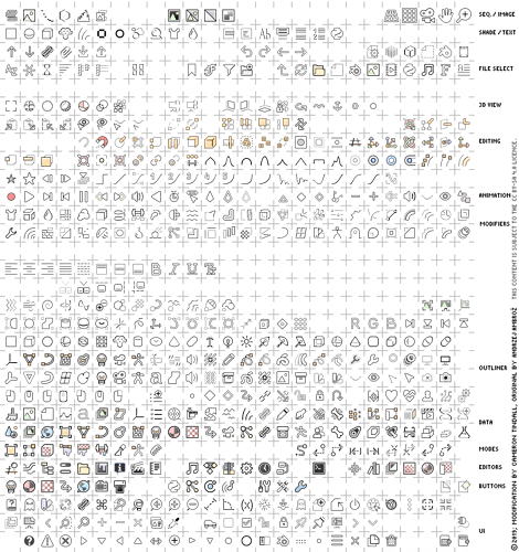
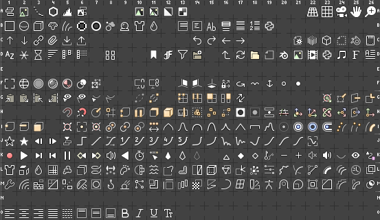
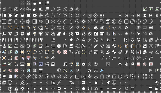
Here’s an overview of the 14px sheet.
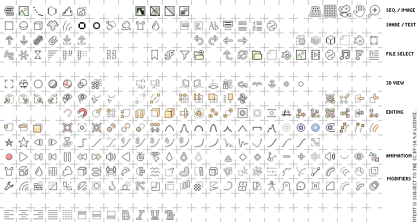
bitmap-0-0
bitmap-0-1

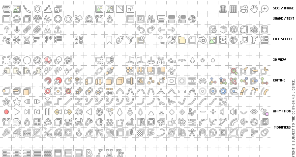
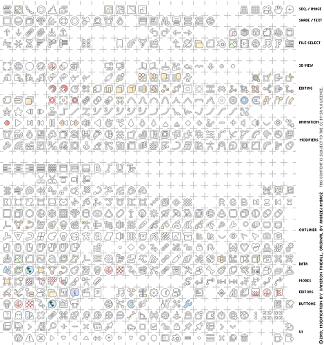
And the 16px sheet.
bitmap16-0-0
bitmap16-0-1

14x14px Sheet Files & SVG

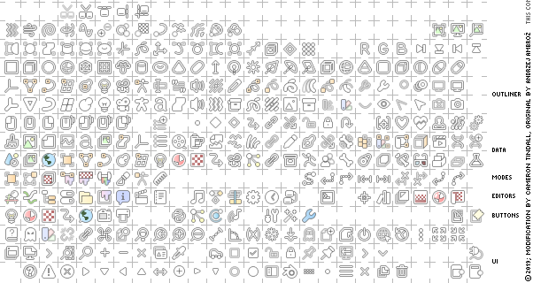
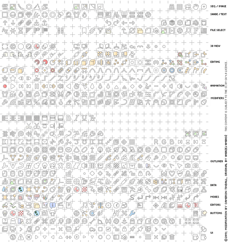
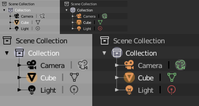
Varying background preview
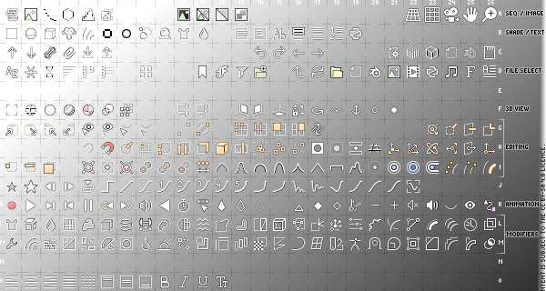
bitmapBG-0-0
bitmapBG-0-1

PNGs (Click, open in new tab, or download for 100% zoom)
1x


2x

SVG
Chrome doesn’t display the SVG entirely correctly (not sure about other browsers), it seems it doesn’t like clipping masks so the outlines appear thicker than they should for some icons.

The PNG can be used to preview the icons in that case, or open the SVG in inkscape.

(Open in new tab, or download for 100% zoom)
blender_icons

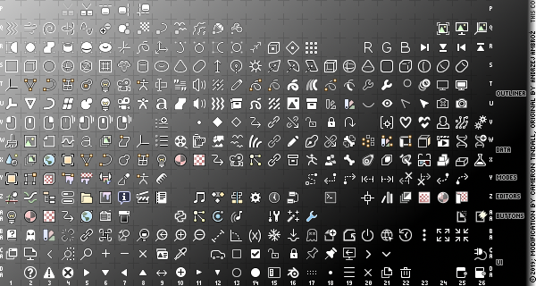
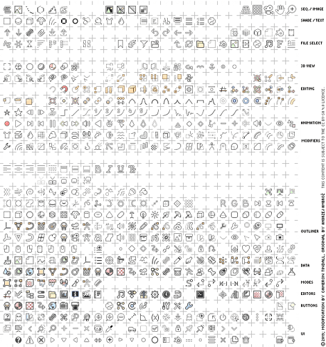
And several previews (a few icons like orientations and cursor have updated since this preview, open in a new tab to get 100% zoom):

16x16px Sheet Files & SVG

PNG
1x


2x

SVG (This one’s too big to attach directly)
https://www.dropbox.com/s/p37q1shvqc84go4/blender_icons_16px.svg

Previews


prvicons

Since jendrzych sorted out the original sheet’s license, this sheet falls under Creative Commons CC BY-SA 4.0, as a modification

These are the design guidelines I am using:

  • Icons get a black outline, if the interior is bright, or a light outline if the interior is dark. Sometimes both (a ‘shadow’ can be substituted if the shape/size can’t support an outline). This means all icons will work with any theme regardless of colour. It also slightly shrinks the icons, which overall adds more negative space between icon lists, but can make maintaining shape slightly difficult.
  • In order to keep new icons relatively easy to create, these icons should match the look and style of icons that are purely white with a black outline.
  • Colour should be added to aid in understanding icons, and distinguishing neighbouring icons. As such, not every icon needs colour.
  • Colour-coding (that is, picking colours in an effort to organise and categorise related icons together) is secondary, as most places it adds little that the shape or context does not already handle. This also prevents us getting bogged down trying to over-categorise everything.
  • Colours should be bright and not overly saturated, appearing more like a tinted white, this aids in matching coloured icons and non-coloured ones into a cohesive set. It also should keep icons reasonably theme-able.

Lastly, @brecht, you said once that you’d be happy to have a coloured icon set available. Now there is one. I can only hope this gets seriously considered, and discussed by the developers.![bitmap16px-0-
14 Likes

There are also the icons from https://github.com/Bforartists/Bforartists/blob/master/release/datafiles/ (no idea how many rearrangements will be needed to match original locations, but “the pixels” are there). That is the one I know publicly, maybe others unknown but also avaliable, or people that keep a personal version and just recompile.

Should we discuss technicalities here or somewhere else? Not fun to code something and later get a “not right”, “not enough”, “X is already working on it”, etc. The current situation involves these sheets (which can start as SVG, or at pixmap step) and the “polygonal” icons (add option to replace? by same format or also via pixmaps?), and also if the pixmap system should be ready for/already include even bigger versions (48? 64?).

As 2.80 is still away from release, maybe time to rearrange the sheets too, both in row and column layout sense, and size as current 32 pixels version use 10 pixel spacers which could be 8 or 4 (to waste less with higher versions and try to keep around power of 2). Also good moment try to colaborate with others like BFA and avoid duplicities, before things diverge even more.

1 Like

I think I’ve said I’d be fine accepting a patch that adds support for loading custom icons? That has not be submitted yet as far as I know though. Blender bundling colored icons would be fine with me personally if there is someone who maintains them and they are high quality enough.

However these icons and the bforartists ones I feel are not up to the standard of the old or new icon set that @Jendrzych made, so including them by default in this form seems not so likely to me. Though I’m not a designer, to me it seems that:

  • Colors are not nearly saturated enough to be distinguishable, it all looks rather muddy to me.
  • Some icons have far too much detail to fit in 16x16. Pixel alignment in generally seems to not be taken account carefully, which makes the icons look blurry.
  • Outline thickness is inconsistent.
1 Like

The colours, as indicated by the design guidelines, are meant to be just enough. If the call is there, I can saturate them more, but this will have the side effect of hampering the ability for the theme to change the colour of the icons if it needs to.

The icon set balances the style and look that people who like the new icon set want, with the need for colour and outlines, it’s not a full-blown 3d shaded colour set. There’s a balance of elements going on, which resulted in using muted colours rather than ones with large saturation.

These icons have the same amount of detail as @jendrzych’s icons, they’re literally based off of them. I spent careful attention going over every icon by hand, rather than applying any kind of simple filter or outliner, to make sure that the icons were as recognisable as possible under as many background shades as possible. I did pay special care to pixel alignment, very few of the icons if any are blurry to any significant degree. Also the icons are 14x14, not 16x16.

What’s more, the set also manages to, on a dark background, look almost identical to the original icon set, in shape, sharpness, and in most cases size (some icons had to be shrunk, slightly).

I should also point out the forum isn’t displaying the previews for the icon sheets in 100% size, incase that’s why things look blurry.

As far as outlines, make sure you’re not looking at the SVG in a browser.

-Edit- I updated the original post so the PNG, which doesn’t have issues displaying in a browser, is forefront.

Other than the browser issue, there is a mild inconsistency in outline sizes, but those primarily fall on the icons that need more definition anyway, if it’s really an issue I can go over those icons - but it feels like a nitpick over something that to be honest fits the primary icons (those being the ones in the properties editor tabs, and the editor menu.
In every icon I made sure to balance the black and white segments outline and opacity so that white showed up well on black, and black showed up well on white.

On the maintenance front, I’d be happy to maintain these icons as long as I can, but the contingency is there, the same reason why Jendrzych made the move to mono-colour icons, is integrated into the design reasons behind this set:

In other words, relatively simple white icons will fit into the icon set just fine, the only extra work over the mono set is adding a small outline or shadow.

2 Likes

Yes you discussed it on BA with BTolputt.

If I understand this discussion correctly, BTolputt wrote that he would look into coding a patch - when (if ?) he had the time.
Do you have any idea on how far BTolputt are in the process of coding this ? (Or is it a question, which is better to leave to BTolputt to answer).

I’m not certain yet, but pretty sure that when we display this type of icon we could use a shader that supports desaturation, as we do with the new vector geom icons after we rasterize them.

In that case these icons could be made much bolder. Then users could select their desired saturation on a slider, just like opacity, in the theme preferences.

I like they are looking familiar)

There were talk about outlining in FreeCAD topick
https://forum.freecadweb.org/viewtopic.php?f=34&t=34687&start=50#p298796

FreeCAD uses outlined icons because Linux users have issues with QT - some of them have dark interface with light menus, so they made that to have single solution for any possible cases.
Black outline should be outweighted with high saturated colors, otherwise it is not working.
All this measures are bad for design, but it works for such extremal conditions.

Blender have separate UI, so it doesnot have such problem, so am not entirely sure.
Can you attach twice bigger png please?

I’m not sure entirely what you mean by outweighing the outlines, but I suspect that’s more to do with designing full shaded/coloured pictogram icons, which these aren’t. The outline, on lighter backgrounds, forms the shape, which is what a large majority of the icons use for differentiation. The icons that do have colour have to blend in with the set to feel cohesive, and the colours aren’t meant to pop out so much as be subconscious signposts. I’m blending the modern design with usability here, have you read the design guidelines?

I’m not sure what you want a larger PNG for, as the native resolution is the most important one for making things legible. (You have to click, open this in a new tab, or save it)

@brecht I fixed the first post, and figured out why the forum was scaling the preview of the sheet, so it should appear at 100%, and without the browser-SVG-artifacts that cause large outlines from clipping groups aswell.
bitmap-0-0
bitmap-0-1

And on a varying background
bitmapBG-0-0
bitmapBG-0-1

4 Likes

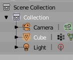
I don’t think it’s an issue with the scaling. Looking at this part of your screenshots for example:

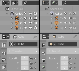
icon_inconsistency

The light outline has a different thickness than camera and mesh icons. The collection icons have a white/black outline that makes them look shaded, while the object icons are flat with a black outline.

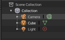
The orange camera icon lost its clear shape, especially the base, and the green one is just broken. Compare to the current ones:

default_icons

Adding good outlines to the existing set is hard, it’s effectively adding extra detail that you’d ideally take into account already at the start of the design.

1 Like

Well, you certainly picked the single hardest icon in the entire set, I’d have to say. Not even the flat one for the camera manages to fit into 14x14 px.

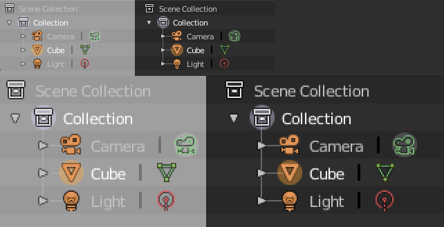
But let’s have a look with some less fuzzy scaling, and the updated preview (The camera icon was among those changed). And let’s compare light background with light background.
image
image

I don’t think it’s as bad as you make out.
Looks like I need to tweak the outline on the mesh mostly, it’s a bit too light. But it’s quite subtle. And I could still possibly try and find a better way to do the hollow camera icon. But as I said, that’s one of, if not the, hardest icon in the set to get right.

If you want to look at some of the other hardest icons, the white portion of the python symbol (AA10), the monkey head (S7/B4), the blender icon (specifically C25), the particle instance modifier icon (L18)

As for the collection icon, I don’t see it, maybe because of the blur, but it seems clearly a white line drawing with a black outline, and given many icons in the set follow that design, even if you were to think it shaded at first, you would see it as a line drawing as you work with other icons. This difference in style is merely an extrapolation from the original icons, that being a combination of solid block icons and line drawings, that is all.

I know how hard it is to do, I’ve been doing it for 4+ months, and right now, I have to say, it feels like for someone who was open to the idea it feels like you’re being very dismissive over some minor issues that if pointed to I will work out. I could have caressed the icon set for another three months but if it was going to be possible it had to be here and complete before 2.8 leaves beta, so it was better to post it, even though some tweaks are still called for.

I have supplied an icon set, that hits on a select combination of design principles as to appeal to as wide an audience as possible, increasing usability and visibility at the same time, whilst providing a high level of quality, a willingness to move forward and fix and tweak any issues and continue working on it moving forward. And I’m getting almost complete dismissal over a few minor issues.

2 Likes

Of course one idea is to add the outlines programatically around the current icons, but I didn’t find much interest in that…

3 Likes

You abandoned that revision, so I didn’t have a look at it yet and I haven’t had time to focus on icons myself. But I think it’s a promising way to make the existing icon set work well especially in light themes where colors are problematic without the outline.

There is the issue of the extra space the outlines take up, it looks great in high DPI screenshots but for regular DPI it will be more cramped I guess. There are probably solutions to that.

1 Like

I’m just giving my honest opinion on this. Looking at the screenshots, with the dark theme the outlines are mostly making the shapes less clear (maybe an acceptable trade-off for better light themes) and the colors don’t have enough contrast to make them easier to spot. On the light theme the outlines help but the colors don’t pop out enough, the icons just don’t look very distinctive to me. The white text on light gray background is barely readable as well which maybe makes it looks worse overall than it may be for just the icons.

It may well be possible to improve them without huge changes, or maybe the other UI designers disagree with me and think this is mostly fine. But I don’t want to give the false impression that I personally would accept this with fixes to some specific icons, I think there’s a bigger design issue.

Yes, never sure what to do with patches that aren’t specific fixes or features, not WIP, but more illustrations of a technique. I marked a recent one with “For Discussion” so maybe that is something to use going forward.

Actually I first ensured there was adequate space around all the icons, no matter the scale factor or line width, long ago. Here is another sample taken at 1X, so you can see how it works on smaller icons.

IconOutlines3

2 Likes

The white text is because at some point, the icon colour was tied to the text colour, so everything turns black if the text is black. This is the only theme change, programming-wise, that would need to be sorted.

As for the other points, I don’t know what to say at this point. They’re all factors I had already come across, considered, worked around, and optimised as much as is possible in the space available - And frankly, I think I’ve come away with an exceptionally good result given the number of design parameters, and benefits thereof. Any icons that lose clarity in shape is honestly minimal, running these icons on 2.8 and on the dark theme the difference is barely even noticeable, not to mention a good portion of the icons weren’t actually shrunk or even had anything coloured over the original white icon - they were always kept intact where possible. And the colours are enough if you consider they’re not meant to pop out and scream at the user so much as be mostly-subconscious signposts, guiding the way. I’ve received positive feedback on the saturation choice, from people who sit in either camp (those wanting coloured icons, and those who like the mono icons).

Regardless, the reason I posted here was to get the discussion happening between you and the other UI designers. The only other one I run into is @billrey, and he’s made it clear that he just flat out doesn’t like the idea of outlines. So my recourse is to ask you to introduce this topic of conversation to the UI team.

I would point out the reason why this works with minimal editing, is because it does effectively make all the icons 16x16. The ui technically has space for it, but it’ll affect negative space on light themes.
I’d also point out that the icons for 2.79, from what I can tell, generally averaged 15px, including outline, with some teetering over a little higher, others lower.

2 Likes

If you have to stay within the limited space it is challenging. But we could go a bit larger as @Harleya proposes. As a test, this is the icon PNG modified in GIMP. The icons are blended over a black Gaussian blurred copy of the icons to create an outline:


It’s not perfect and the icons are somewhat cramped, but it preserves the shape better. These outlines could be optional for dark themes and any glyph-like icons that follow the text color. Color could possibly be added to the icon SVG without shape changes.

1 Like

It is tight, basically just one spare pixel around and no more when at 1x scale. Less than that is better, as in a one-pixel outline that is less than full opacity.

I redid that patch in case you want to play with it. Does outline and creates a “disabled” version as well.

https://developer.blender.org/D4670

1 Like

I don’t think you understand how many points I’ve hit with this sheet. And I’m really tired of the dismissive argument that shape isn’t preserved, when that’s absolutely not the case:

image
image
Please tell me which of these icons have such terrible shape preservation.

You’re fixated on the fact that some of the icons are slightly smaller, over-emphasising the difference it makes, and you picked the hardest icon to get right as your example.

The sheet I’ve made hits all of these points:

  • Introduces colour
  • Isn’t distracting
  • Is well received by people who like flat icons, and people who want colour
  • Uses an easy-to-reproduce style
  • Requires as little code changes as possible to implement (new icon loading code, extra icon rendering code etc)
  • Doesn’t require two or multiple icon sheets, layers etc
  • Doesn’t encroach on negative space
  • Maintains shape, shrinking icons only where necessary, and even then, keeps crisp, clear, lines with few exceptions.
  • Has outlines/shadows interfere with the default dark theme as little as possible
  • Doesn’t require hundreds of colour settings, for each individual icon
  • Has someone supporting it
  • Works on many backgrounds without modification or settings changes

I’ve seen a lot of good proposals pass by in the BArtists thread on Jendrzych’s icon set, but every one of them had issues with simply requiring too much work to implement, typically being unrealistically long term idyllic and elaborate implementations.

I set out to make something that runs on the system we have, that works now, or as close as possible. And I’m sorry @Harleya, but that patch doesn’t actually do the job, it only creates an outside outline at best, because from what I can tell it just scales the icon up by 2px. It also doesn’t solve the issue of having hundreds of colour settings in order to introduce colour - nor does just adding a shadow to the entire sheet, And that has it’s own problems anyway that lead to the idea that it would be optional. Again, more settings, and you’d either need two icon sheets and the code to load them - or alternatively the code to gaussian blur and layer the icons.

Unless you’re willing to have all the icons be 16x16 with outlines on both themes (some icons actually still need to be shrunk in that case, such as the camera), there’s a bunch of programming work to implement these ideas.

I don’t know what you did in your mockup @Brecht, the camera icon didn’t get clipped. You also have to be careful with blanket-ly applying filters like this, because lines that aren’t straight get darkened by the outline - in the sheet I had to set some of the white lines to 1.2 or 1.3 thickness to overcome it. Also be careful about adding a black layer underneath a partially transparent line - these lines are everywhere.

Here is an actual comparison, with all the icons having the same opacity, values etc. And can we keep things to 1x (I had to do my own mockup because scaling down yours would make it blurry, and you have theme settings there that would affect the impression).
image
image
Again, in a fair comparison, slightly smaller, no less clear, and the colours pop just enough.

Every time this or anything like it has been discussed, the response has been that the old icon sheet was old, and you had to use what you had, suggestions for fixes that might require some work were given no credence because you couldn’t work for a possible future implementation, you had to use what you had.

But now when I’m introducing this icon sheet, have put the work in, and provided something that works now, all of a sudden we’re looking at possible implementations, ones that require code or filters, things we don’t have. What changed?

1 Like

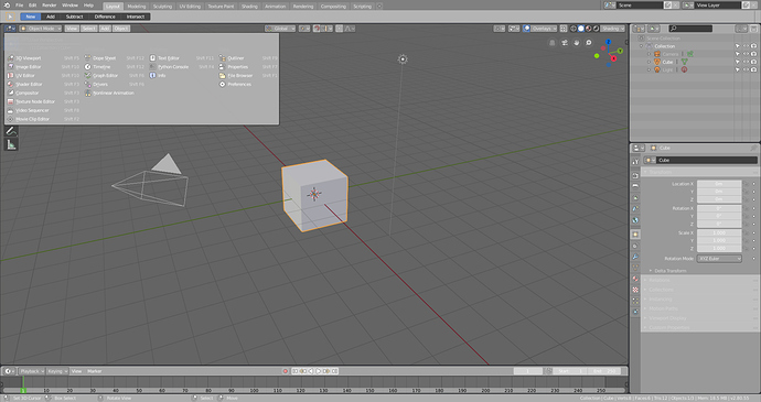
It’s of course a subjective thing to some extent, but I really see the majority of icons as having a less clear shape than before. I can’t go over every individual icon, but some more examples from the editors menu:

  • 3D Viewport: grid not clearly recognizable, looks like broken up pieces.
  • Image Editor: paint splash not clearly distinguishable from the rest, colors much too close.
  • UV Editor: grid not clearly visible due to lack of contrast, folded over piece of paper not clearly distinguishable because of that.
  • Shader Editor: contents of sphere has not clearly distinguishable pattern, just looks like a muddy mix of things at first sight.
  • Compositing: mostly looks fine, but have to squint a bit more due to smaller icon in dark theme because outline shrinks it by 1 pixel.
  • Texture Editor: grid pattern not clearly visible, colors too close.
  • Video Sequencer: diagonal lines of clapboard stick out which makes it not look quite like a clapboard.

Just as a whole I don’t think they’re good enough to be the default Blender icons, I’m sorry.

It feels to me like you’re looking for faults in order to justify not considering it.
If you look for faults in something, you will always find what you’re looking for, in increasing triviality.

The issues you point out, every time, vary between completely subjective, minor, utterly trivial, or “it shrunk”. And most if not all of them I would pick up in a final polish pass. No reason not to begin any discussions.

You said the other UI designers might disagree, is it going to be discussed?