X-Ray selection experiments build

There already are suggestions in this thread. There’s even a working patch that reduces all this nonsense to a single checkbox.

What’s even worse idea than having lots of options is having lots of options toggleable by one more option, because it takes that ugly dump of unnecessary options and even adds one more.

I am getting increasingly fed up with this “there’s nothing wrong with ideas” mentality. There are some ideas that can really kill an effort, such as these giant button control panels. I’d really love for some people in this thread gather their sanity, and create their own “Adding more buttons to blender” thread, instead constantly trying to ruin this one by poisoning the idea of a single toggle by patches with dozens of them.

Every feature of this custom build is opt-in. Want default blender for some specific feature in this build? Don’t change anything.

Wan’t kio’s build? Don’t change anything. The one exception to this, that I can think of anyway, is that you aren’t forced into invisible facedots when select through is enabled and you go into x-ray shading. Want to get feature that back? Make a python macro to keep xray facedots visible when select through is off, and invisible when they are on. Not a big deal.

Want it to be simple? You can make most of these features more simple, and they usually are at their most simple by default. This definitely applies to the “selection filter” stuff. You can also set these things one time, then not mess with it. You won’t have to think about it ever again. I don’t care for the name “selection filter”, but it is what it is until something better comes along. And that is the main point here.

You also have the ability to make things more specific to your way of doing things. But you are not forced to, and the defaults are the same as either real blender or kio’s build.

@ManuelGrad & @Hadriscus I know it looks ridiculous, but this is what it is for 3.2. Some perspective on what it is we are dealing with that may alleviate the initial reaction. This doesn’t mean it won’t change.

Faced with 3 options regarding the selection filter options. I had initially thought it was 4 options, but I forgot wtf #4 was by the time I wrote out the 2nd one :upside_down_face:

  1. Make decisions for you like real blender, with no recourse other than waiting for the dev team to change something for you and hoping it is what you want. For example: got x-ray shading on? You will select by facedot, and like it. Selecting edges? You will use “enclose” or “adaptive” selection, and like it. Want it to do something else? Go pound sand, kick rocks, and ask for somebody on the team to care enough to fix every last detail of it to your liking.

  2. Remove “Enclosed” selection of faces and “Touch” selection of edges. This would simplifiy everything to the point that only 1 checkbox is needed. X-Ray facedots. The problem with this is enclosed faces is useful, I’m not getting rid of it just because.

  3. Leave it like it was until this build. A couple checkboxes for face, and one for edge. The checkboxes for face are the issue. To get “enclose” face, you have to turn off “x-ray facedots” if you are in x-ray shading with visibile facedots. This can get confusing, so now it is spelled out for you. Not as clean or pretty, but idgaf. I will always go for the potiential for less questions and more functionality/flexibility over “it just works.” It just works usually means tricking it into doing what you want.

Always open to something new.

@LudvikKoutny
Nobody is killing anything, and nobody cares how fed up you are. You are free to do whatever you want. Use whatever patch, make your own, or change a few lines of sombody elses. Enough drama and accusations from you at every opportunity, about the same things that have been explained to you, over and over.

One more time explaining. I am giving you more options, most of them are not being considered for official blender. I never planned on submitting anything, but was asked several times, so I did. It may lead somewhere, or not. It is fun for me to do, and may help somebody a little bit. None of these things are that important, or deal breakers, but I like them to varying degrees. At the same time, I would not want to rely on someone else to fix things for me, especially when it is relatively easy. If I can do this, so can anybody else. Give it a shot, you will find the time was worth spending. Especially for select through, kio did all the hard work.

3 Likes

You should be proud of all the work you’ve accomplished here!

Is there any technical reason for Near Face not having a Center option? It seems a bit inconsistent for X-Ray Face and Select Through Face to both allow it but Near Face only having 2 out of 3 ‘types’ to choose from (only Touch or Enclosed).

-edit- I’m also a bit confused about the Circle modes. In X-Ray and in Select Through you can change it to Center or Touch but in ‘default’ selection it’s always Touch? That also seems inconsistent; if you can do Center in two modes (X-Ray, Select Through) then my expectation would be to be able to choose Center in the third mode (default or Near Face or whatever you’d like to call it) as well.

1 Like

Are these stored in preferences ? I wonder if that’s not source of problems for pipeline (sharing of blend files in the same department) if these are defined in the scene. They should be user-level preferences, not tool settings, right ?

This is something I don’t know about but if it’s a thing where sharing files between this build and normal blender is a problem I will fix. Tell me more about this or link me somewhere.

Thanks. Blender does not do face center selection outside of x-ray. I have looked at adding center face to near select a few times but haven’t been able to figure this out. Nobody else seems interested in it until now, and I was wanting it for consistency and the possibility of its usefulness.

Same thing for circle select. Blender doesn’t have anything for enclosing edges or faces with it. I imagine it could be added but haven’t looked into it. So the combination of those two things means that circle select only has 1 option in 1 context, but this context of x-ray/select through has some more flexibility if needed.

By default, blender will do face center select in x-ray. By default, kio’s select through build will do “touch” for everything. Now you have the choice of changing this, and also keeping the two things separated from each other if needed. Meaning if you want to select through by area, and also need to go into x-ray (with select through off) and want circle to select by facedot, you won’t have to do anything besides turn off select through. You wouldn’t need to go into the mesh filter options and click different stuff.

Beyond this, you also have the ability to make things very simple and decided for you. Turn off select through filter, and it will just use x-ray face and edge filter. Turn off circle filter (either one or both of them), and it will just use x-ray filter, or the select through filter if select through is on and the select through filter is enabled.

I suppose if these are stored within tool settings, then any user not using these options opening the file of another user who does use them may experience unfamiliar interaction. I think these should live in preferences instead (if they don’t already).

User preference would definitely seem to be the better place to store the data for this setting. For example, imagine the chaos if Right Select or Left Select keymap was stored in the file scene data block instead of the user preferences and you shared a file with someone using the opposite. Another example would be the mouse zoom inversion. These selection ‘styles’, although affecting the settings of a tool, are really more akin to the user’s keymap preferences because they deal with fundamental interaction and not something more aesthetic like viewport configuration.

That’s kinda dumb, but will have to be dealt with. So if I share a blender file with somebody, it comes with my toolsettings? It would change anything that was different from theirs? You’d think that could at least be turned off.

Thanks for the build. I made a quick test.
A couple of issues I would like to mention:

  • Select Through Filter influence Solid mode. (Is it supposed to?)
    Disabled Select Through Filter checkbox assumes Center option of a Select Through Faces section is on, it would be better be Touch option, since Center selection in Solid mode is quite limited by its nature, and face centers display is also switched off by default.

  • Enclose term is not the right one in case of Edges - this term means that only edges that are fully enclosed by selecting frame are selected, which is not true. Adaptive term probably fits better for current behaviour of this option.

How do you think?

Just make your own thread. This thread was always just about separating xray from limiting selection to visible faces. It was never about adding 20 buttons to Blender. Why can’t you just make your own place where you post your own patches and discuss them. Whenever someone new joins the forum to come to this thread, instead of supporting the idea, they will get confused by screenshots of crazy panels with dozens of buttons.

Just make your own thread. Make your own thread.

3 Likes

You started a thread, you don’t own it. Remember how you cried enough times that you got it locked? Relax.

@1D_Inc
I’m fine changing it to adaptive, or even adding a 3rd option for edge. Where it would be adaptive by default, with enclose and touch. Basically it would add an enclosed edge only, instead of enclosed favored with touch as a fallback, if that is something people might want.

Not sure what you mean about the Select through filter, sorry. Select through, as a feature, is essentially just doing an x-ray “style” of selection where it will include not just the near faces, but all of the ones behind it. The only difference is it won’t turn x-ray on in a visual sense, it will stay like solid shading. The reason it has it’s own filter is because you usually just want to do a “touch” or area selection with it as opposed to face center or “adaptive” edge.

I just did a quick test of two things. 1st was just saving a file from the debugbuild directly from visualstudio, with all default settings. And then another file with everything I could think of being different, even the other stuff like the cursor or header highlights. Don’t see any non-default behaviour when opening this file in the official 3.2 release.

Either way I’ll go through this later and take everything out of toolsettings just to be sure. But unless somebody finds it acting weird in this particular way with sharing blend files, I’ll wait until 3.3 or whatever else to do it.

I did notice a problem while making the weirder blend file, where hiding the x-ray button also hides the auto x-ray button, so I’ll have to see why that’s happening.

Doesn’t it depend on the default file settings? And whether or not you have enabled the Load UI?

There’s a selection menu in your build atm (not sure if it’s in vanilla too):

I would also think this should be a preference setting.

1 Like

No, I guess this is expected since 3.2 doesn’t have these options that you added, so there’s no way that would confuse it. But if this goes into master, then Blender will load the settings along with the scene, making it a potential issue. Unless I’m missing something ? always possible

1 Like

If any of it ever makes it to master, it wouldn’t be in the custom build any more because it wouldn’t be necessary. If some version of any feature made it to master, and was “insufficient” enough to consider keeping it in the custom build, I would just modify it (in the typical opt-in fashion) so that everything plays nice with each other.

Knowing about this does make it easier though, I’d rather leave things as-is unless it has a problem.

I think one problem here is that this build tries to cater to all people dissatisfied with blender’s current select-through options. But not all people are dissatisfied for the same reasons!

I agree that this panel of buttons looks way too baroque. Designing a good UI means making choices for the user so (s)he doesn’t have to bother with them. Which is I think the main reason no options for select through have been added to blender master yet. Being too strict in this design philosophy can hurt as well, though.

I think it would be useful to try to find 1 toggle that most people on this thread can agree makes thing better (even if not perfect). And keep the rest of the settings out of the UI, but accessible via python so an add-on can add the UI for people that really want it.

Finding that 1 toggle is probably very hard though … :smiley:

And I have to add: lcas congratulated on your tenacity! Complaining is easy, actually trying to do something about it is better.

3 Likes

It was already proposed - a switch between 3dsmax (classic ST) and Blender Default approaches.
It was also an initial goal of a KIO’s patch.

It was also proposed to provide the backend API functionality for the ability to construct any frontend UI via python.

But I like that we think the same way.

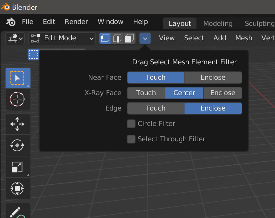
This is what blender does, without telling you. I’ll change the edge “enclose” to “adaptive” for clarity.

With faces, you have to box/lasso/circle in both solid and xray shading to figure things out. Because despite being able to turn on facedots in solid, it will not use them. And despite solid shading working with face area selection, x-ray will not allow this. Neither solid or xray has any indication of this, or a way to change it. You could infer from facedot visibility being forced on you in xray that you need to select by them, but it is not consistent with solid shading’s ability to turn on facedots and forcing face area selection.

With edges, circle only has 1 way and that is by touch. If you touch an edge with the circle it will be selected. With box and lasso you have to drag over one or more edges, but not fully enclose any of them, to realize it will do different things. None of this is ever explained, at least not that I’ve seen, and now it is laid out for you.

Beyond that, you now have the ability to further customize this behaviour to your liking. If you do not want to do that, you never have to open this popover. If you never want to see the popover itself, I could make another checkbox to make it disappear from your header.

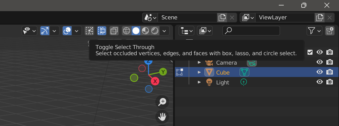
This is what select through does. It’s been a while since I used maya, which is probably the same as max, so let me know.

If you want to switch between the two things, you click the button, or assign it to a shortcut however you want.

@1D_Inc

I will try to explain the issue without making it even more confusing.
In short, there is no way to

make ST mode always use area selection in both Xray and Solid modes, according to classic ST behaviour
and make noST mode use facedots selection in Xray, and area selection in Solid, according to Blender defaults behaviour

This has never been the way these select through builds are. Both of these things were always available. I think you are just unfamiliar with how this works. Click button, switch between the two. You could do this before this latest build that lays it all out for you. You just had to read the tooltip for “xray facedot” checkbox if you happened to be fullfilling the requirements for confusion (in x-ray shading, x-ray facedots visible, both “xray facedots” and “enclosed face” on). That would result in the potential for intending to select by enclosed face, but you are getting facedot selection in x-ray. That’s because I gave x-ray facedots priority over enclosed faces. Why? To preserve default behaviour. I actually like it being laid out though, and now that they are all enums instead of bools, there is nothing unclear or unspoken.

@Baardaap
Yeah it would be nice, but is it really that bad? Everything can be hidden away, even the selection filter popup once I finish 3.21 update. Nothing has to be changed unless you want something other than default blender, or default select through, to happen.

Nothing in this build is something I expect to get a second thought from devs for addition to blender. These are all things that they could add if they wanted them, they do not need anybody to point it out to them. That is what I’ve tried to say a handful of times about select through. It would take an afternoon, or 15 minutes, depending how bad something could mess up other stuff. They do not want these things, it is good enough as is. But since I can do this, I am. Why keep it to myself? I get plenty back anyways from feedback, making it a little different, adding a couple things here and there.

1 Like

I just thought of something, I’ll throw all this mesh filter stuff into the keymap. No more popover that doesn’t attach itself to the vert/edge/face selector thing no matter what I do. It would be the same thing with minimal script editing, just have to split box and lasso from each other and tell the keymaps for box/lasso/circle to expose these enums. I think that will be a little more pallateable until something more consolidated is figured out.

Also if you want to see the extra cost of selection by face area vs facedots:
Go into xray of a higher poly mesh
Set filter for xray face to center
Enable the select through filter
Set filter for select through face to touch
Either disable both of the circle filters, or set them appropriately like they are above
Use circle select with and without select through, if the mesh is high poly enough, you’ll see the lag difference between the two. Face area will be slower of course, but it isn’t too bad on my system anyways. This lines up pretty close with the speed tests I did a while ago, where it was <.025 seconds on a high poly cube.

I am under the impression that it is really difficult to get to a consensus, we’ve been trying for years now. So each and every time someone suggests that we should reach an agreement and have Select Through be a single button toggle, it also comes across as rather dismissive IMO. Usually, it’s people complaining who haven’t participated in the entire discussion who don’t seem to be understanding the complexity of this all and why there are different opinions across the board. I understand this and was guilty of it when I joined, but please then also keep contributing to this thread, instead of throwing a boulder in front of the driving car…

Also, Lcas build is more than just Select Through, it’s a selection method revamp. Theoretically, you may get, let’s say 60% functionality with a single button. And that’ll still leave people wanting more. Moving things to an addon sounds nice, but then the addon should be one that’s bundled with Blender by default. And it needs to be maintained, otherwise, the functionality is made for naught. And do people really think that addonifying such a core functionality makes it easier on the user? I think that’s a terrible design philosophy that is hurting Blender all over the place as much as it also contributes…

It sounds nice in theory, but it seems to be advocated by those who don’t want the additional functionality and who prefer a clean UI. Something that is already catered for by hiding options. But then people complain that the options are too much, but they are hidden! And they said they won’t use them (for the non-Xray features)! So then, why should this very vocal group ‘dictate’ the build if they Lcas tried to address their concerns as best he could?

And why is there so little constructive feedback on how to actually improve stuff? Removing buttons is a chant, it does not tell any of us how, nor what functionality is or is not desired. If you want these features then help discuss them in detail please.

1 Like