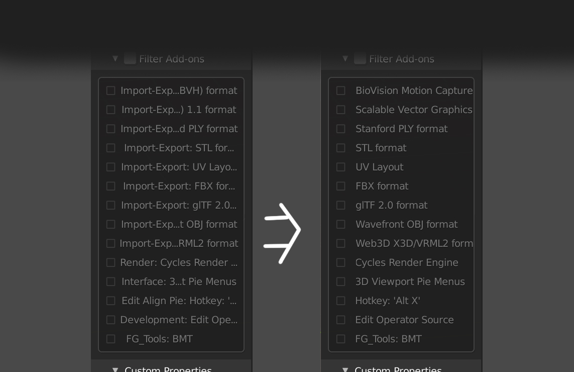
While changing panel size addon names dancing and jiggling left - right like on party.
It looks not OK even more when other panel items can stay straight while scaling panel.
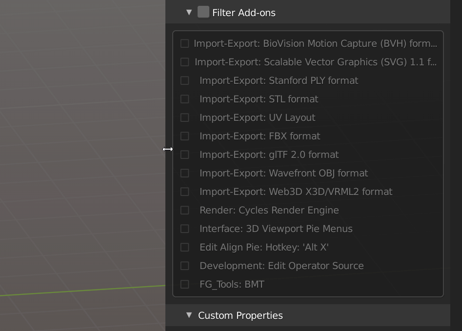
Another issue is this name end parts eating name start parts in long names. It not help with name readability in any way, with some panels sizes it make addon names pretty unreadable.

I think it could work like in outliner - just cut out part that not fit inside panel.
Or even remove this addon category prefix if full name not fitting inside panel. What the point to show that much addon category text when addon name it self is mostly hidden and unreadable?