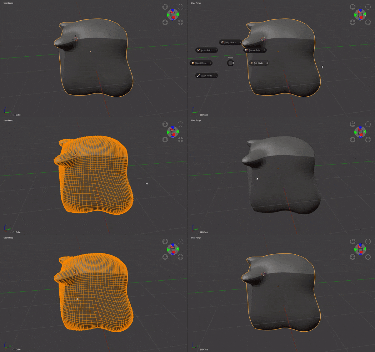
It got better than number keys, But I wouldn’t belive that this was because of feedback, it was just too obvious.

It doesn’t have to be better because they are changes that seem positive to you or others.
For example, the structure of the new interface seems to me to be clearly inferior. The interface of blender2.79 is very well balanced, the interface of blender2.8 is very unbalanced, all the weight goes to the right, the left is practically unused, the basic options are away from the mouse and you have to be constantly moving your eyes.
That balancing issue can easily be solved by changing editor’s places but what annoys me are the workspace tabs, from my point of view they only take up space.
It has nothing to do with the editor’s position. Before all the utilities were on the left, and their settings. Now they are on the left, right, up, down, in the property area.
I think you’re judging the final product by the work in progress version. If you listen to the Blender Developers Livestream you’ll learn that both hiding objects and local view “/” are both planned, but not implemented yet.
I hope you’re right.
they are going to implement Application templates which lets you change blender completely, the UI uses python i think so it’s easy to make 2.7x one just like the guy who did Blender Pro but i don’t know if it’s a top priority for the devs right now, someone else could easily make it.