For a while Blender has been shipping a multi-resolution fullcolor icon I designed based on the Tango style guidelines[1] (with the lookup broken as the high resolution variant is overriden by the scalable with a nominal 48x48px size).
Because the world has since moved on and we, the GNOME designers, wanted to have a more accessible guidelines for app developers, we’ve updated the app icon guidelines [2] for the new generation. Some background on the reasoning here – [3] [4]
I’d love to hear if there would be interest in updating the application icon to coincide with the 2.8 release?
Going with the logo itself doesn’t sound like a bad idea, however right now there’s a multitude of styles and shapes depending on what size you’re looking at.
I’d propose to only ship a scalable “size”, which based on the hicolor spec is of nominal size of 128x128px.
In addition I would suggest to install a symbolic variant that is useful for accessible themes, such as high contrast.
Should you choose to go with the plain logo, I’d advise not to bake the dropshadow in, as those are going to be rendered on top of the icons based on the context. Should you go with the above design, here’s a WIP patch with all the assets and .desktop file updated, but the build system will need to cope with the file changes (didn’t manage to work that out):
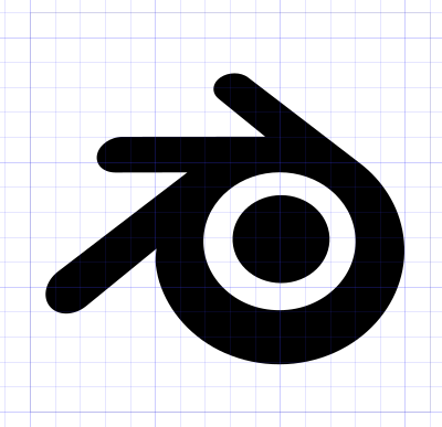
This is really more for @fsiddi, but I can see the logo shape has been altered from Blender’s official logo. The ‘arms’ are much shorter here. I’m guessing that is not going to be acceptable.
As for the highlights, I’m not so updated on the guidelines for Linux, but my impression was that each distro has different visual cues, which is why we went with a neutral, flat logo, rather than something that attempts to integrate with a specific Linux distro or version.
The shading was removed on the Mac icon too, in favour of a flat, plain design, similar to other graphics apps, and also in keeping with the design of icons inside Blender 2.8.