Topbar Menu Experiment

I haven’t made any mockups for a while so I thought I’d scratch that itch by mocking up a fairly radical idea for the Topbar menus. I have a more normal and conservative proposal here, but I felt like going a little wilder today.

The idea is that we replace our current six menus (blender logo menu plus text dropdowns) with the following eight. In most of these sets there are direct shortcuts that can let you operate the most-used functions without opening a menu at all. So you can directly click on the “File” icon to open a file, “save” icon to save, undo, redo, render, etc without having to open a menu:

When you do need to do more than those 10 common actions, you can click on a downward arrow to get a menu. For each of the following I have tried to keep them as organized as possible while minimizing submenus so that access is as quick as possible.

10 Likes

I doesn’t look bad to be honest. Tho I think the round-rectangles around the icons are not necessary. They make it look a bit bloated. I think icon as they are could be very readable. Especially if you make a good enough space between categories.

1 Like

For sure. I purposely kept within the default look of the existing widgets to make it clear what I am changing. But I prefer a less decorated look.

1 Like

Interesting idea… But I still would like to see the text on those droppdown buttons…
In fact that’s one of my beefs with blender’s UI. There’s a lot of those tiny buttons next to a dropdown menu, and that requires too much precision to click on the right spot, otherwise you’ll end up clicking on undesired things…
This happened to me a lot in the overlays/shading menus that I had to expand the text on those buttons on my local blender installation…:upside_down_face:

image

I wonder why there’s not an option in the context menu to enable/disable the text on those buttons when I right click on them… :thinking:

6 Likes

I’m developing this thing called VCStudio right now. And I’m using Blender Icons. What I did to fix your problem is just made all icons twice as big.

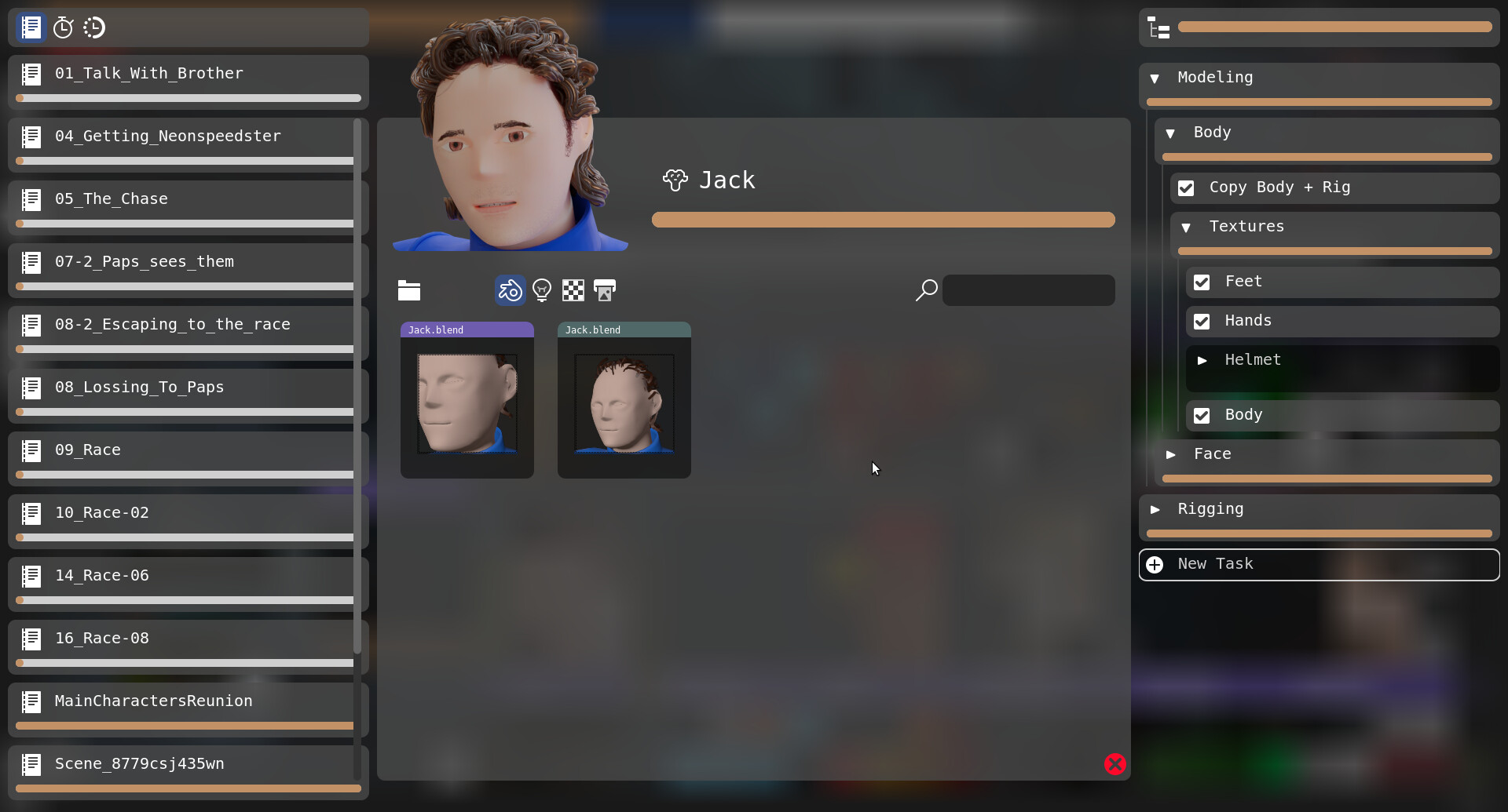
And by doing this. I’ve got very easy to use UI without putting too much text on every button.

1 Like

Not a fan personally. May I interest you in attempting a proposal to properly address T57712 / T56599 instead? j/k :slight_smile:

Yeah, agree with the above. I don’t know if its my age or not but for some, irrational, reason I hate the current popover menus with those down arrows. I try to avoid them whenever possible and dread having to precision click on them to get to various settings… exasperated because those menus, like all context menus, disappear if your cursor drifts too far outside of them.

5 Likes

yea, like redwax said, interesting indeed. but yep, without the text is a no go for me too.
i remember when they decided to remove the text in the overlays and shading buttons, it was a really really bad move. now it sux forever lol
i hope some new UI dev restores that thing in the future.

2 Likes

Now, please don’t just reply with a “just put that text back!” so we can instead talk of this specific problem without assuming a specific fix. I am also old, 57, use reading glasses when programming, etc. And I also find those arrows small. But that can’t always be addressed by padding out with text.

The dropdown button size is the same width as all the rest of the buttons. Is there a reason those seem more of a problem than other buttons? Do we just want an option of making those wider? Or do we want a minimum hit width for everything so the singleton buttons should be wider too? Or do you want different proportions between buttons and text (right now everything is scaled uniformly).

I think what they mean is that most often then not a drop down button like this comes with text values inside.
image

Like this button from Gimp. It’s a standard thing and doing something non-standard making people a little bit unconformable.

I think it’s more like a Right Mouse Button vs Left Mouse Button discussion. Or like all of those people that refuse to use Blender because it’s not “Industry Standard” .

1 Like

ah stop right there. read again what they said. its about precision. the unnecessary accuracy needed to click on a tiny button.
this is particularly a pain when its something that you need to access very often and quickly like the overlays/shading for example.
those main menus up there are accessed very often too.
stuff you don’t access very often can stay collapsed like that with no problem

2 Likes

That’s a good point. Why is it under a drop down menu in the first place if it’s such a often used thing?
But how can we know what stuff users use more often without spying on them? Then it’s like introducing telemetry data. Which is a privacy problem.

1 Like

by gathering feedback from people actually using the software.
its really that simple. no secrets here
there’s a big difference between making versus using something
feedback is mandatory, unless you’re doing something only for yourself :wink:

1 Like

Yeah that’s my point. How to you gather feedback from most users? Not only those who gives feedback. Or you just ignore those who don’t want to do feedback?

1 Like

Well…I think so, yes. That is the point of feedback. If you don’t care enough about something to provide at least an opinion, your point of view cannot be taken into account.

And it is something that happens here all the time. The people that influence the program’s design are the ones that give feedback either here or on social platforms.

3 Likes

Hello @Harleya!
Althou I find icons quite nicer compared to text buttons the menu in the first image you posted looks cluttered and a little bit unreadable. Maybe its only visual thing.
Separation file operation to 3 distinctive groups might not be clear at the first glance. The 3 buttons (new file, open file, save file) might be grouped a little better.
The conservative proposal looks solid thou.

PS: Blender logo looked much better without button border.

2 Likes

This was less about replacing the text with icons, and more about trying to get shortcut access to the most-used items. And I agree it looks cluttered. But if you think that can be addressed, just edit that first image and post it back into this thread.

Thanks about that other “real” patch. I am hoping to get at least a few changes in from that eventually.

2 Likes

I was thinking more like this. Now there is a problem that Blender icon don’t have arrow which breaks design consistency.
I’m not a very big fan of button borders in that proposition, and I think that this is the main cluttering cause. Different arrow button design might help with getting rid of it.

Increased spacing between buttons shouldn’t be a big problem, as there is a lot of space left on the right of the workspaces tabs.

1 Like

I think one good thing could be to let the user decide what the default behaviour of the button would be ( like link or append instead of open, or toggle system console instead of new window), defining one default item of the list.
E.g. I’d rather have the undo history exposed, undo and redo are very much a second-nature shortcut, I never use the buttons.
Edit: that raises the issue that not every item has an icon, though.

2 Likes

I like the idea generally, though the last two bundles on the right could stand for some more descriptive icons. Most of the others are software-agnostic already - users of any software could probably tell what the “new file” or “undo/redo” icons mean, and the render ones you could guess what they mean. But those last two (window and help) don’t look very familiar at a glance.

1 Like

On the upside, the proposal now highlights the Blender logo as a button, the poor discoverability of which came up earlier too.

2 Likes