You can use your adblocker’s picker feature.
1 Like
I think it would be good to make this stand out better, as there’s still many people posting that suffer from banner blindness.
But doing that will definitely necessitate a setting to hide it.
2 Likes
My problem is rather from the category of perfectionism. But yes, there are still people who don’t notice it.
Yeah, I think that would definitely be an improvement, there are still a ton of posts on here that are basically just feature requests…
There really is no winning solution that will work for all users, no matter how explicit or visible, you make the rules, someone will find a way to limbo dance around both the letter and intent of the rules:
user> I’d like to suggest blender adds X
devs> no feature requests on devtalk, use rightclickselect
user> bah humbug
sometimes it ends here, as it ideally would, other times however…
clever user> Ok, what do the devs think about adding X?
devs> we told you, no feature requests
clever user> technically not a request…
devs> yes… very clever…still no though…
clever user> Hi i’d like to talk about X / Are there any plans for X
devs> for the 3rd time, no feature requests!
clever user> I JUST WANT TO TALK! WHY ARE YOU LIKE THIS?!
devs> this is a developers forum, unless you’re looking to implement this your self, this is not the place
clever user> What exactly would I need to type to implement X
devs> so much bad faith here…we’re out…
clever user> You guys are mean! and very unhelpful and lazydodo is a jerk for closing all my threads…
I have seen variations of all of these, and on more than one occasion the whole limbo dance coming from a single user, it’s moderately depressing.
anyhow, if someone wants to tweak the banner, go at it, but i’ll be upfront here, it’s unlikely to work.
8 Likes
Fair enough
This seems to be the majoriy of cases? They seem to be genuine people that missed that banner cause it just doesn’t catch the eye. That second category of people just have ill intentions and I agree there’s nothing to be done.
You’re most likely right, but can’t hurt to try, right? But if devs/mods don’t mind repeatedly pointing at it, then there’s no real issue here.
There were many discussions when it was introduced and then later when it was changed. You will always have people ignoring it willingly or just because they really didn’t see or understand it. Just like the question to change the banner itself will pop up every 6 - 12 months again, I guess. 
1 Like
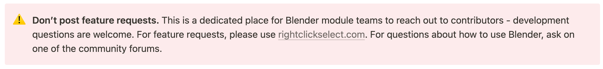
Like many things here, the banner is awkwardly worded and indirect. Who exactly is in the group of “contributors”? And if “development questions are welcome” then why can’t we ask for something to be developed? I’d change it to something less ambiguous like this:
This is a place for Blender developers to communicate with each other. For feature requests, use rightclickselect.com. For help with using Blender, use one of the community forums.
probably should also include the tracker in there, there’s the odd bug report on here as well.
Good point. This is as short and direct as I can get it:
This place is for Blender developers. Use Right-Click Select for feature requests, Community Forums for help using Blender, the Tracker for reporting bugs.
7 Likes
And I think visually it should be changed too… Maybe it is just me, but to me it reads like a generic cookie banner, instead of useful information.
Since the GDPR was introduced, the amount of those has increased so much (at least in my country, and surely all across the EU as well) that I’ve become used to just click “don’t allow”, and never reading them. I think that is one aspect of the problem.
4 Likes
I agree completely. First time I even saw the banner was when someone else was referred to it ![]()
Whoops. that was a dead thread. sorry!
1 Like