PROBLEM
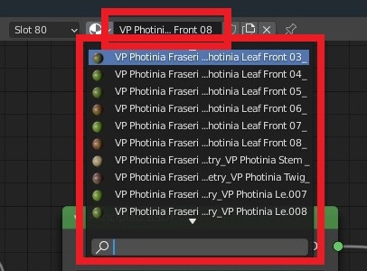
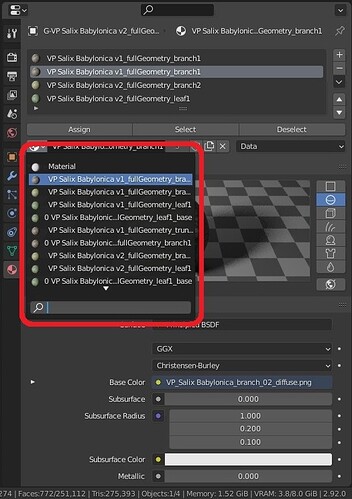
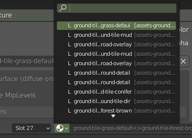
Currently, when we want to choose a material, and expand the list of materials in material properties (see the screenshot), it has fixed width, no matter how wide the properties editor is. This makes it very hard to inspect materials with long names.
The same problem is with Image Editor and Shader Editor. When you expand the image/ materials list, you cannot see their full names if they’re too long.

SOLUTION
I think that the width of the material list/ picker (you name it), should be coded as percentage (e.g. 70%) of editor (e.g. properties editor) width, so we could stretch the whole editor whenever we need more space for previewing material names.

