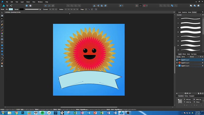
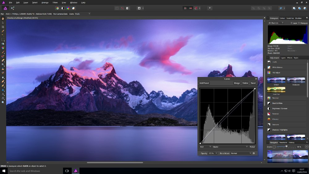
I explained exactly that quite clearly in my earlier posts. Starts with “the other choice…”
Because I originally thought that if the title bar was drawn by the application itself, it would look like Affinity Photo on Windows 7 or Windows 10.
for Windows 7
for Windows 10
Well, I’m just surprised that Chrome has almost the same window borders on all systems as they are native to the system-including the title bar, maximize, minimize, and close button controls, and——window edges and window projection. But anyway, this is what I want Blender to do——A title bar that looks like the system’s native, but has a dark appearance.Blender already has a beautiful dark appearance. The only drawback is the title bar. If we can fill this small area, I think it will be perfect.
Huh? If the title bar is drawn by the application then it can look any way the application wants it to look.
Meh. I’ve already explained that at least I have no interest in doing so. It would make Windows look different from Linux and Mac. It would necessarily mean that on Windows the title bar color would then have to be used for the blender header area too, which means also having to use OS colors for the contrasting text there too. And that would just lead to complaints from people who do want to have a custom header color. If you are not sure what I mean then make a mockup of what you think Blender could look as you wish, rather than just give captures of other software.
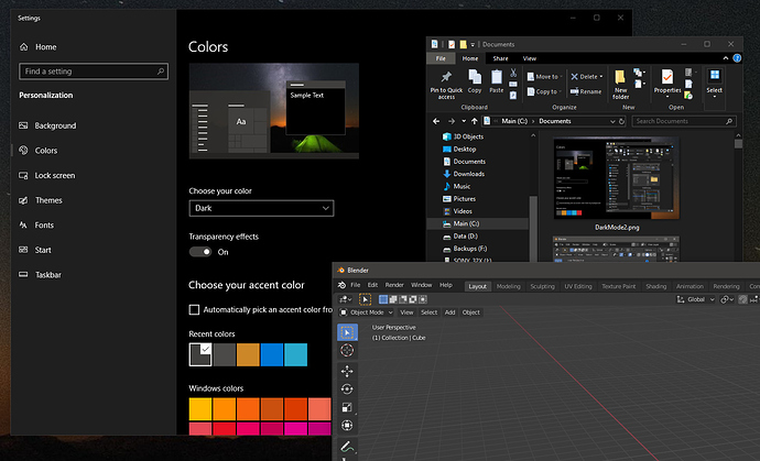
And personally, I have little concern that you can make your title bar very dark but not quite dark enough for your liking. Following shows Blender with default dark theme next to an Explorer window while using a dark theme. It looks dark enough. Certainly dark enough that I’m not going to do a bunch of work just so you can see it a bit darker. And I’m similarly not concerned that Windows itself changes that title bar color for blender when it loses focus and you use something else. LOL
Harleya
>>>Huh? If the title bar is drawn by the application then it can look any way the application wants it to look.
Yes, for windows, the title bar can be customized by handling WM_NCPAINT…
https://docs.microsoft.com/en-us/windows/win32/gdi/wm-ncpaint
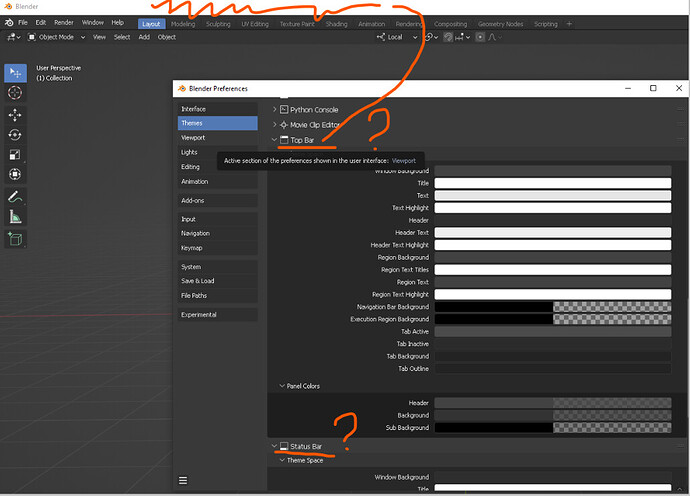
Hi. Blender 3.3 has a default “black” title (application) bar. But modifying the colors on the theme does NOTHING. If I install an old blender 3.2 theme the bar resets to “white”.
Is there a way to configure Blender to have the black default bar from its own THEME options?
Technically, the caption bar will be black if you have “Dark” colors set in the Windows control panel, or it will be white if you have selected “Light”. Or if you have set “show accent color on the following surfaces” to “Title bars and window borders” it will use your Accent color for active caption color.
I haven’t found a way to do that which works for Windows 10 or earlier. There are some newer APIs that work on Windows 11, but I’m not updating my own system any time soon so can’t test that. We could also have a completely custom title bar (by removing it and painting the entire thing and handling all options there) but that is too much work. Patches are welcome.


