I’m curious: what’s the regular procedure of bug reporting for Blender branches?
I assume the bug report page at blender.org is meant for the main Blender builds only, or not?
I’m curious: what’s the regular procedure of bug reporting for Blender branches?
I assume the bug report page at blender.org is meant for the main Blender builds only, or not?
I’m not sure what the normal procedure is but if it’s to do with spectral cycles feel free to put a description and reproduction steps here ![]()
I re-ran the barbershop test with a recent daily build and latest spectral cycles.
The spectral version actually rendered faster though with the small difference I could put that down to random error. Both rendered at 25% resolution because fullsize was going to take nearly 8 hours on this computer. I’m happy with how similar they are.
There’s only a marginal difference in the saturation of the couch now, I’m not sure whether or not that’s down to legitimate differences in the image production or another subtle bug.
Spectral: 9:51, peak memory 2656.46
RGB: 10:44, peak memory 2656.37

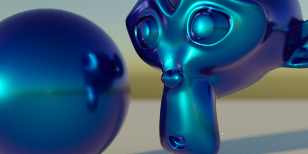
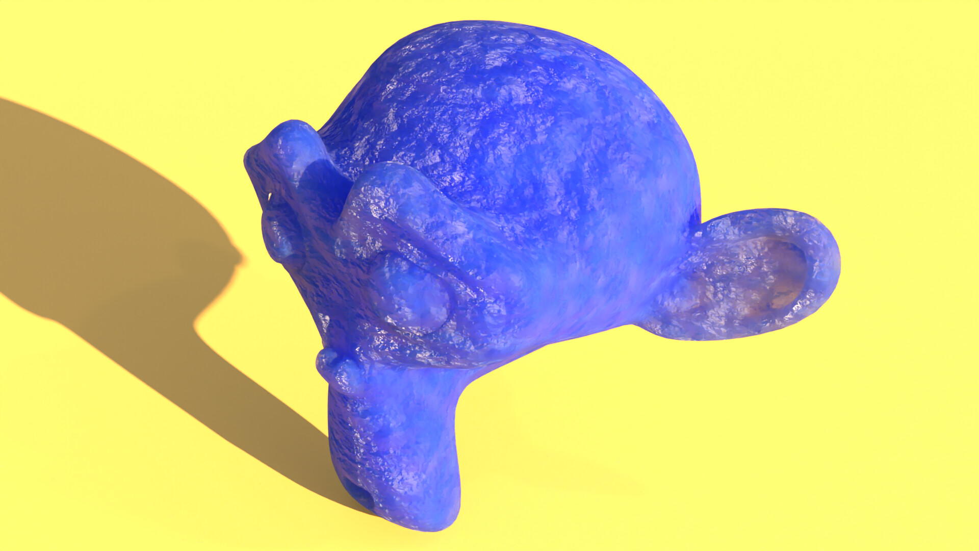
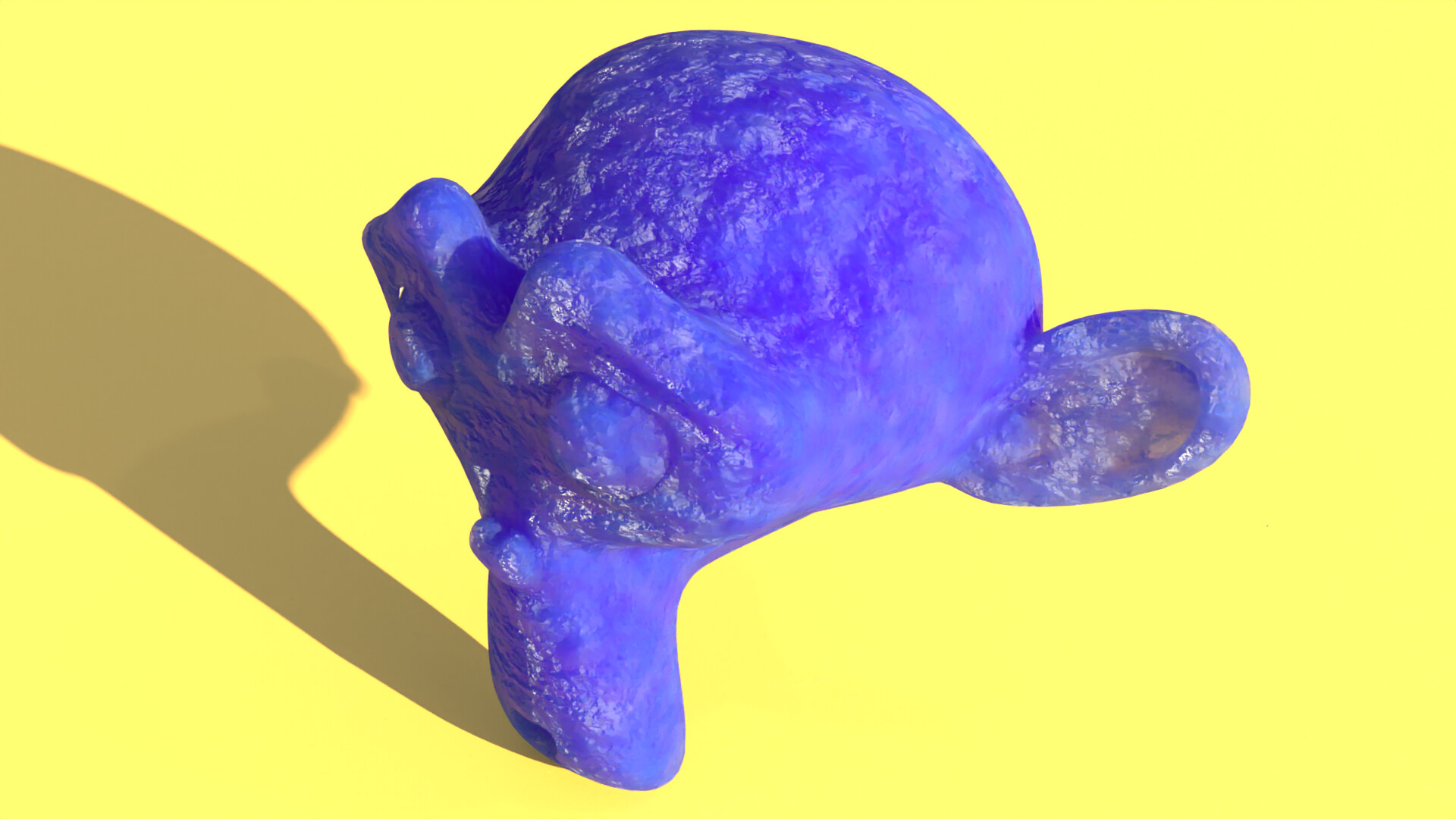
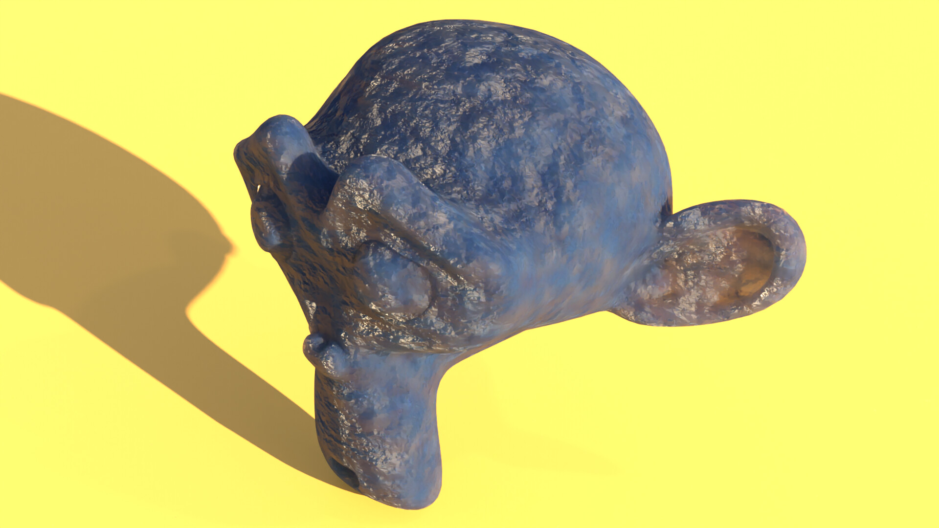
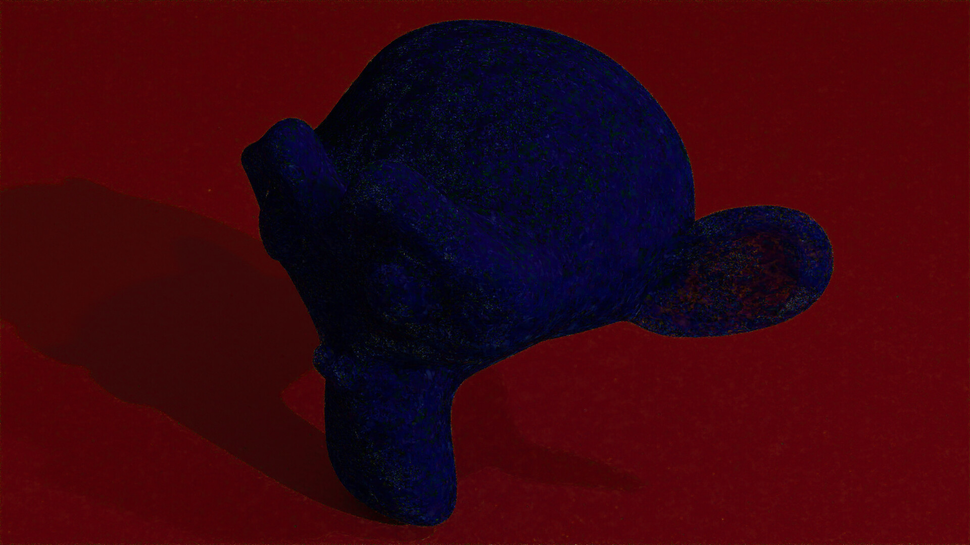
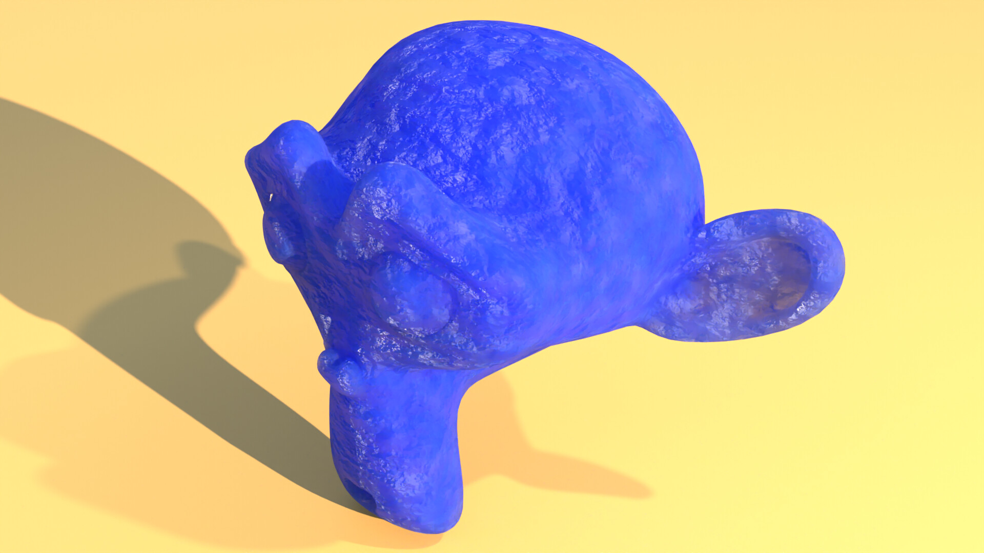
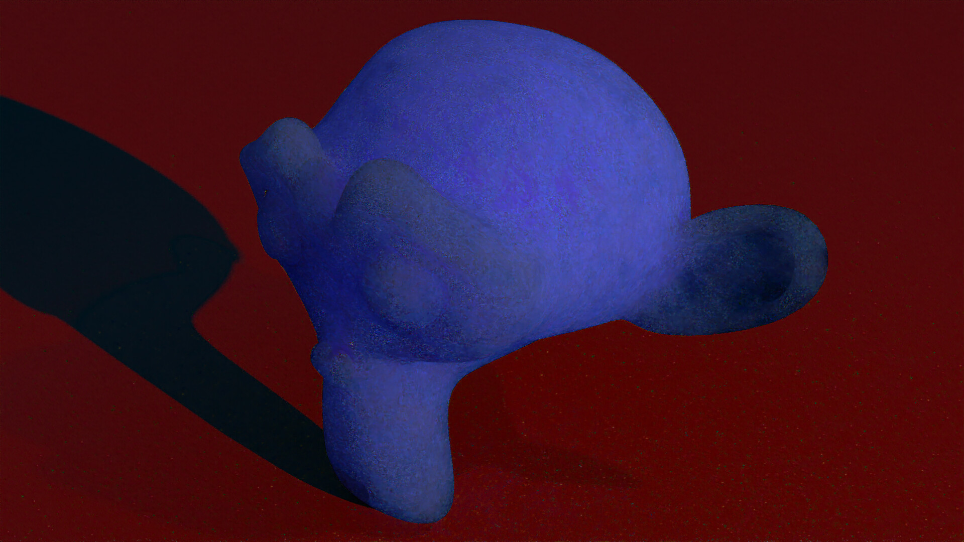
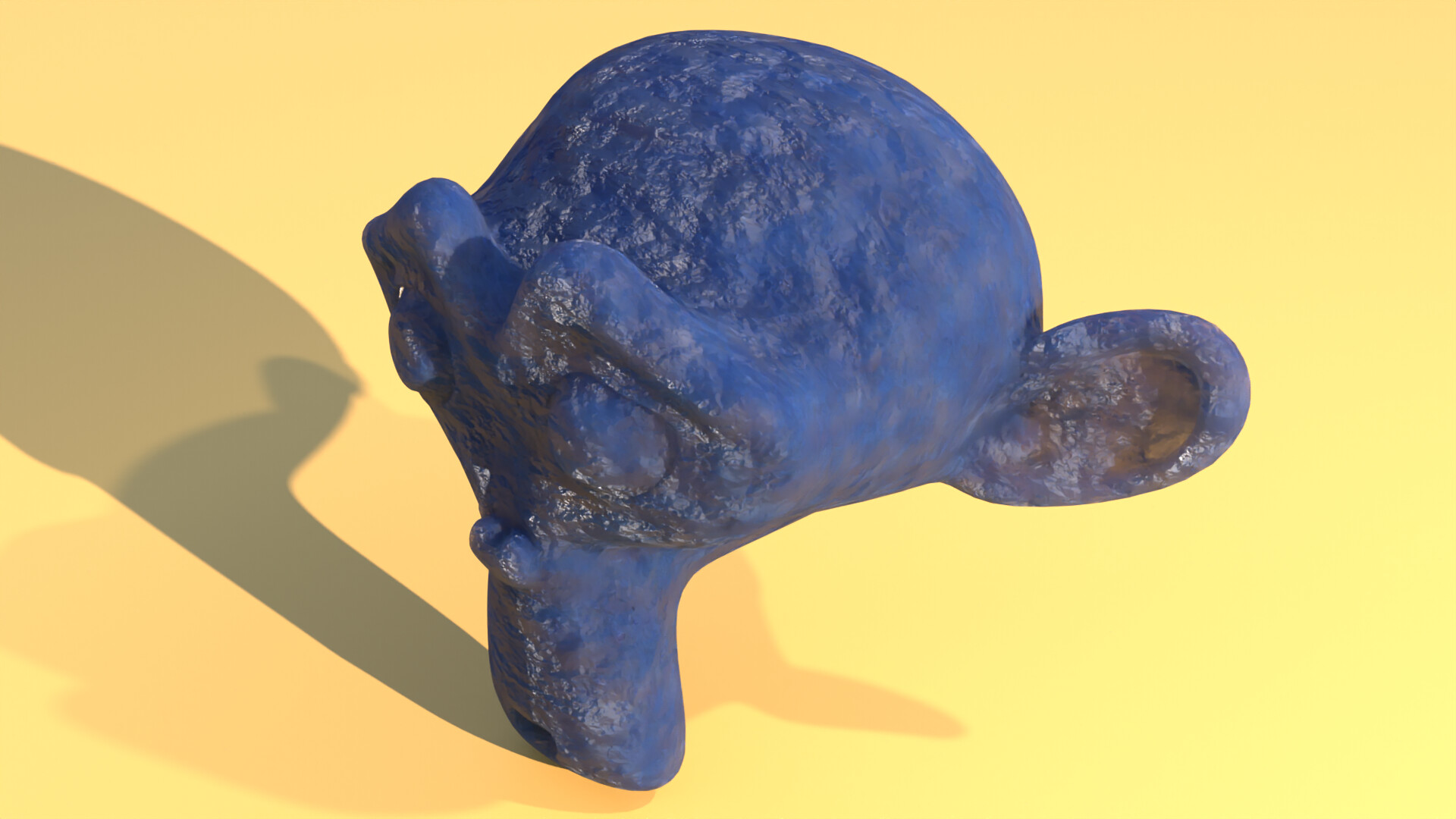
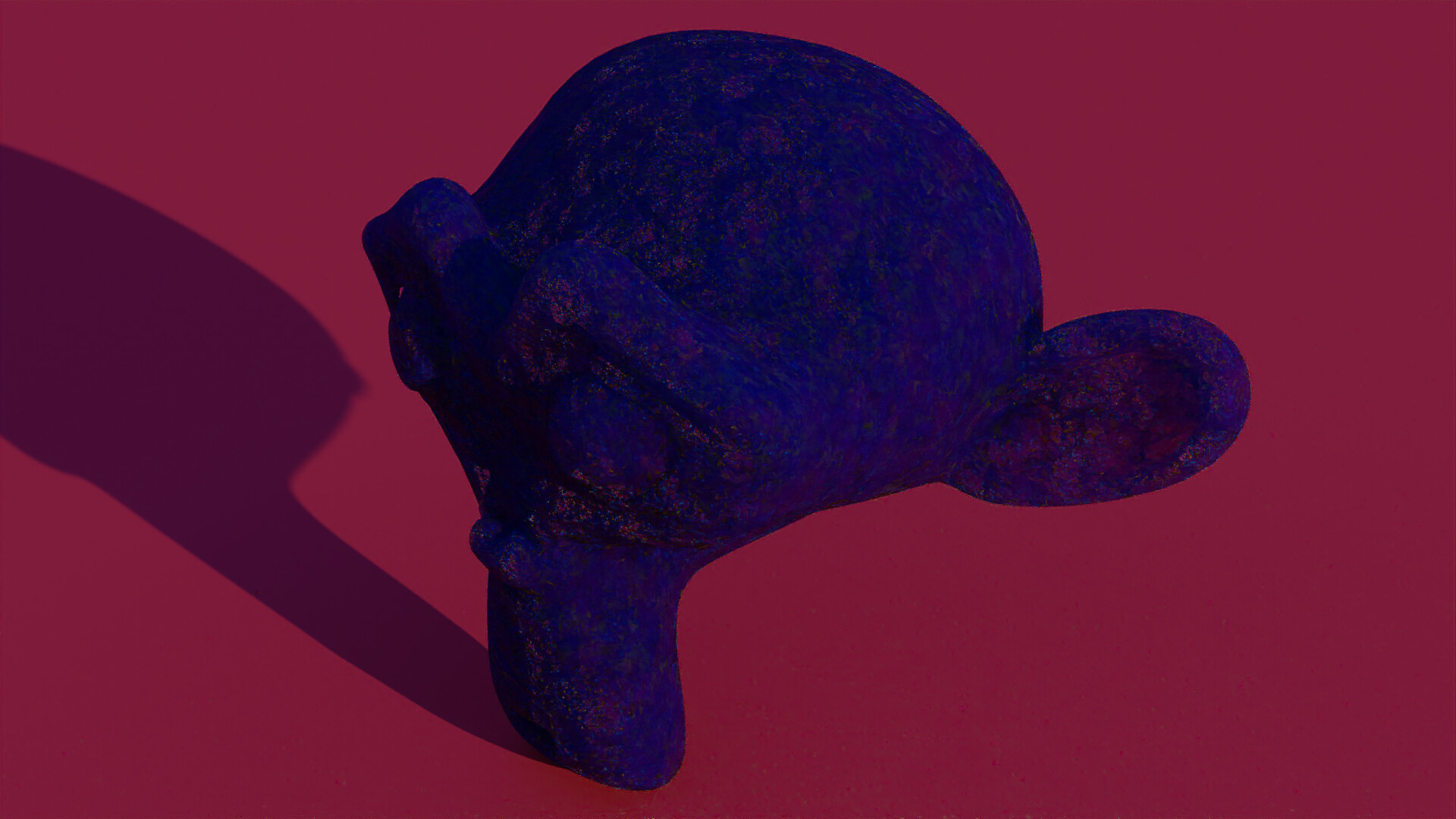
I also did a test emulating an iridescent fabric which I own. It is green/aqua when face-on, changing to purple and almost straw colour at a grazing angle. I noticed that self reflection of this cloth is an incredibly deep blue and it seems my simple model of how it works is also showing this phenomenon. I’ve put the image through Filmic to retain the highlight detail but I think some of the colours might be slightly out of gamut too.
I think that’s the sort of thing where Complex IoR might come in handy but your approximation sure looks super pretty
I finally got to do a little testing.
Here the same material four times. The only difference being the scattering color/spectrum and whether it was rendered in RGB or Spectral. Both use Nishita (the RGB version - I can’t really reliably test the Spectral version until the brightness difference is resolved)
First, in this version, the scattering color is equal to the absorption color in this pair.
RGB:
Spectral:
This image clearly exhibits the potential problem where blue looks too purple.
And second, in this version the scattering follows Rayleigh Scattering (or, in the RGB version, a three wavelengths approximation)
RGB:
Spectral:
All four images use identical settings for tonemapping (in that there isn’t any) and exposure
I think the redness issue isn’t yet resolved. It’s of course very hard to know what the ground truth ought to be, but if you check the shadows Suzanne throws on the plane in all four images, you’ll find that the RGB version’s shadow is clearly much redder. To an extent where I suspect that it’s not simply something that the spectral workflow ought to introduce. But it’s very hard to say.
It’s adapted values almost for sure. The internal working space assumes Illuminant E, and then adapts the entire image to D65.
If a model has assumptions of a different white hard coded internally somewhere, then the results will skew between the ground truths.
So are you saying this is correct then? Or that there is something deeper to change about Cycles?
I am saying that the working reference in Spectral Cycles is true equal energy 1/3 X 1/3 Y 1/3 Z. That means that all models and formulas need to be properly managed to get to the working space. Blender isn’t there yet, but these sorts of threads and education help tremendously.
What that also means is that things like the “Sky” whatever, needs to be audited to make sure that there aren’t any hard coded assumptions in the model, and that it is properly working with respect to IE. And then the final layer is folks becoming aware that they are picking colours through a display, that has a colour for achromatic, and that the achromatic colour is in fact a colour.
That is, there’s a working model and working model assumptions, and a transform that needs to account for the display’s hardware based colorimetry. In an ideal world, there’d be some control over that interstitial step to control things, such as giving an image an overall “balance” feel, but when thinking about things like white balance, there are a remarkable number of little details that folks frequently miss. These little details accumulate when there are absolute values being mix and matched with relative display considerations,.
This isn’t to say there might not be a bug in some matrix in the config etc. but more that things are vastly more nuanced than some folks see.
I can certainly try rerendering this with an HDR just to see. If there is an issue with specifically the Nishita sky model right now (whether in general or only specific to the Spectral branch), that should reveal this, right?
I can also try some more or less analogous light setup using just a sun light in a few colors or something instead of environmental maps to see if the problem lies with environment lights.
It’s too late right now but I’ll try that tomorrow.
The thing to remember is that there are two states of chromatic adaptation along the path to image formation currently:
So the working rendering space is IE, and for example, if you used a Blackbody node or spectral curves to define 6500k, the 6500k stands relative to the Illuminant E white point of the working rendering space. That is, it’s “blue-ish” relative to IE. So when the IE is transformed to the display’s white point, the IE is transformed to R=G=B at the display, which makes the 6500k values appear “blue-ish”.
This is the only real sane option here, as most folks who make imagery expect 6500k to be slightly blue-ish, even though on a proper sRGB-like display their display is literally dumping out 6500k-ish values, and they have simply adapted to the 6500k of their display.
TL;DR: It’s fundamentally the wrong idea to expect absolute-to-the-rendering-working space values to dump out of the display as absolute values.
I redid these tests with a regular exr instead of Nishita. Here are the results:
With the scattering spectrum being the same RGB color as the absorption color spectrum:
With the scattering spectrum being based on Rayleigh scattering (or a three wavelength approximation for the RGB version):
This really shows off the massively different out-of gamut behavior (which isn’t surprising) as well as just how much redder the RGB version ends up being over the spectral version (which may not be surprising given the whitepoint dark magic going on either but still)
Clearly all environment lights have this issue. I’ll try some regular lighting too just to see if it also occurs there. Maybe it’s somehow specific to light textures or something.
Looks like this effect just happens in any case no matter the light source.
This is lit with two sun lamps that approximate the sun and the sky:
Scattering spectrum = Absorption spectrum:
RGB:
This second one is quite different mainly due to my own doing. I probably should redo it to be more comparable. But basically, every aspect I could make spectral (in that I’m not relying on an upsampled RGB spectrum but instead I’m using some custom spectrum) I made spectral here. I could just make them 1:1 by always using the RGB value I’d be using in regular Blender instead.
But anyway, in this one the scattering spectrum is the Rayleigh spectrum.
RGB:
Seems to me the spectral lighting here is slightly paler than its RGB counterpart. But definitely it is a whole lot less red. That’s the one constant throughout all of these tests. That more spectral version (in that the lighting is also not RGB-based) is clearly even more blue though so yeah, as said, probably not fair.

I like the color richness and hue variation in the spectral renderings.
Yeah it’s interesting to see that variation there, I wonder what it comes down to. I would hope/expect the trivial cases still come out right, like white background on coloured diffuse or glossy should match the base colour exactly. If those still pass I’m happy accepting this level of difference
Same here, they are close but this tiny difference makes it look infintely more natural to my eyes.
The sky color is ““more correct”” in a sense in the spectral image, though it’s a super crude approximation regardless. As said, that’s not entirely comparable because I’m using features to achieve this, which I can’t even really attempt to match in the RGB version. If I actually use the same material colors, it’s gonna be less of a difference. (though not none)
Ok here is a fair three way comparison using sun lamps. Two of these images you have already seen:
All of them use the Rayleigh scattering spectrum (at least approximately) as the scattering spectrum.
Pure RGB:
It’s clear that the spectral version, even with backward compatible materials, is slightly paler. The reason probably at least partially is that the orange ground color still manages to reflect more of the blue light than in case of RGB rendering. - Using actual spectra for the color only pronounces that though, as can be seen in the third image.
And here are the three way comparisons of these to make the differences even more obvious:
Diff RGB - Spec backward:
Here you can see that, if you use backward compatible materials (i.e. only RGB colors), Suzanne is actually really close. The differences are pretty even between R G B with actually quite a bit of difference in the green and pretty little in the red. She’s pretty dark too. Though not actually super close to black.
Meanwhile, the ground plane is way different. And clearly primarily in the red. So the difference is mostly NOT that there is more blue reflected (as might be expected due to spectral overlap) but somehow that red is missing. And I think that part is wrong.
The question is where exactly that difference lies tho. It may in fact somehow be an issue with current Cycles.
Meanwhile the two Diffs that involve the spectral (non-backwards compatible) materials both look quite similar, suggesting that these spectra have a bigger influence on the appearance than the fact that it’s rendered using more than three lights. That part is encouraging and expected.
The differences I can see suggest that Spectral also is slightly closer to itself than to RGB Cycles. (The Spec - Spec backward image is slightly darker than the RGB - Spec one). There also seems to be a hint more red in that one. And very noticeably, one of the shadows - the one from the sky lamp - just doesn’t show up at all in the Spec - Spec backwards inage when it’s still discernible in the third image. There also don’t seem to be any green noise spots or at least they are much rarer / weaker.
Anyway, main takeaway is that Spectral contains significantly less red than RGB Cycles does.
I wouldn’t spend much time on the Sky Texture (Nishita) at this point. Actually I’m figuring out a way to implement Multiple Scattering for the next Sky Texture  and maybe also make it instantly compatible with this Spectral branch. We will see, I’m still in the learning process. Meanwhile, again, don’t spend much time on the actual sky model, really I would let it RGB as is like the other 2 models.
To be clear, while some of the above tests used the sky texture, in these last few I “faked” a sky by simply using a sun-colored sun lamp with small angle and a sky-colored sun lamp with wide (but not too wide) angle (something seems wrong with going for the full 180°. The light just renders WAY darker then. I’m guessing it’s an Importance Sampling issue? - it works fine with 120° and it’s not just a Spectral Cycles problem)
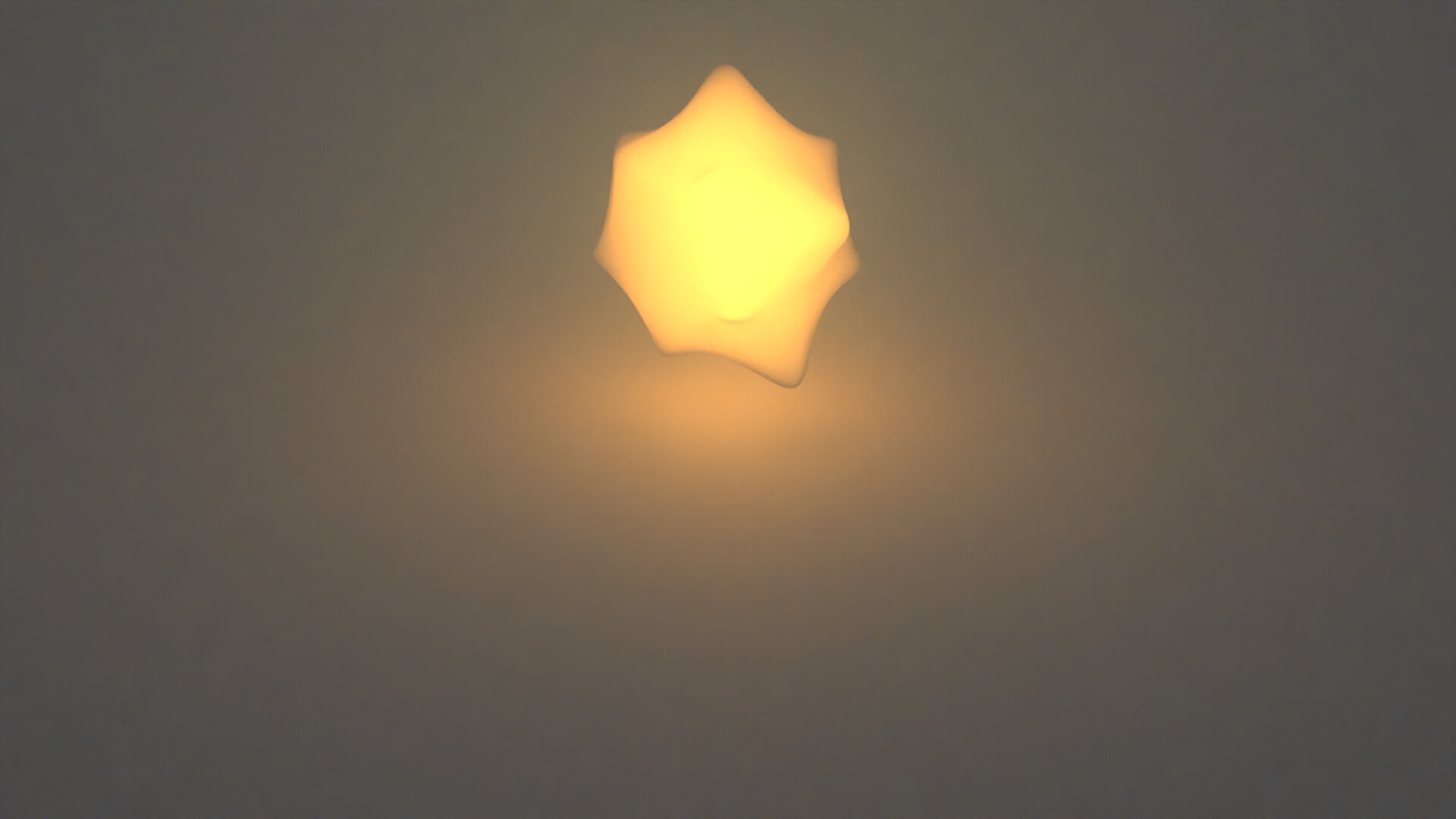
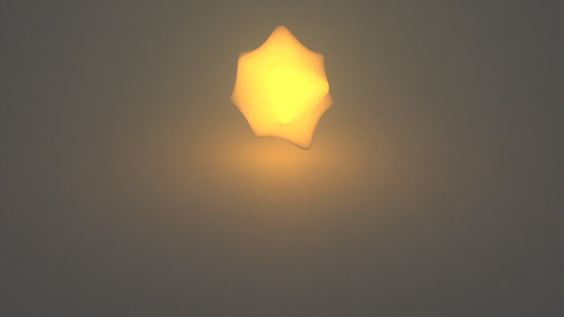
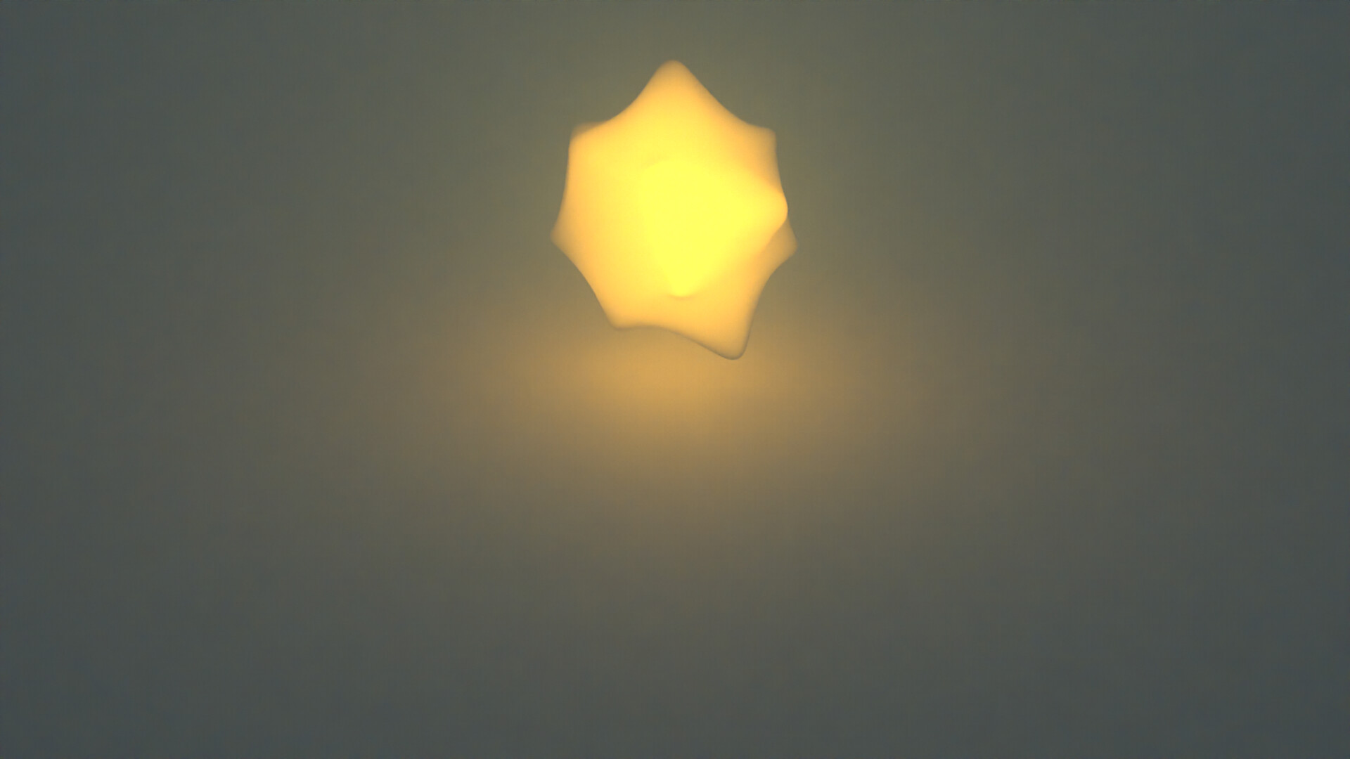
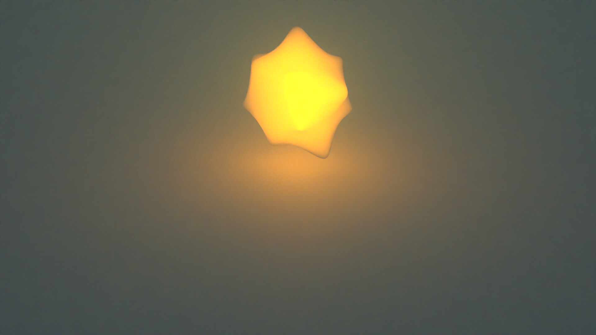
A somewhat similar experiment. Here the only light source is the glowing star thing. It’s placed in a scattering medium with the rayleigh scattering spectrum (or an approximation). The color of the star is the 5777K blackbody spectrum (or RGB equvialent) approximating the sun.
(The ground plane is just a regular light grey 0.8 diffuse/ white 1.0 glossy material so it should have no influence on the scene’s hues)
RGB render:
Quite interesting and a little unintuitive how these colors come together:
The reason for the second fact is simple enough: The RGB-approximated blackbody emitter simply doesn’t have a whole lot of blue to scatter away compared to the true spectrum. So of course it could never show up in the distance.
And I suppose similarly, the natural Rayleigh spectrum is more capable at affecting the emitter? It’s a bit more mysterious, to me at least, how that works, but it’s clearly quite important the overall image.
Either way this is a great showcase of how different results might get using this workflow.
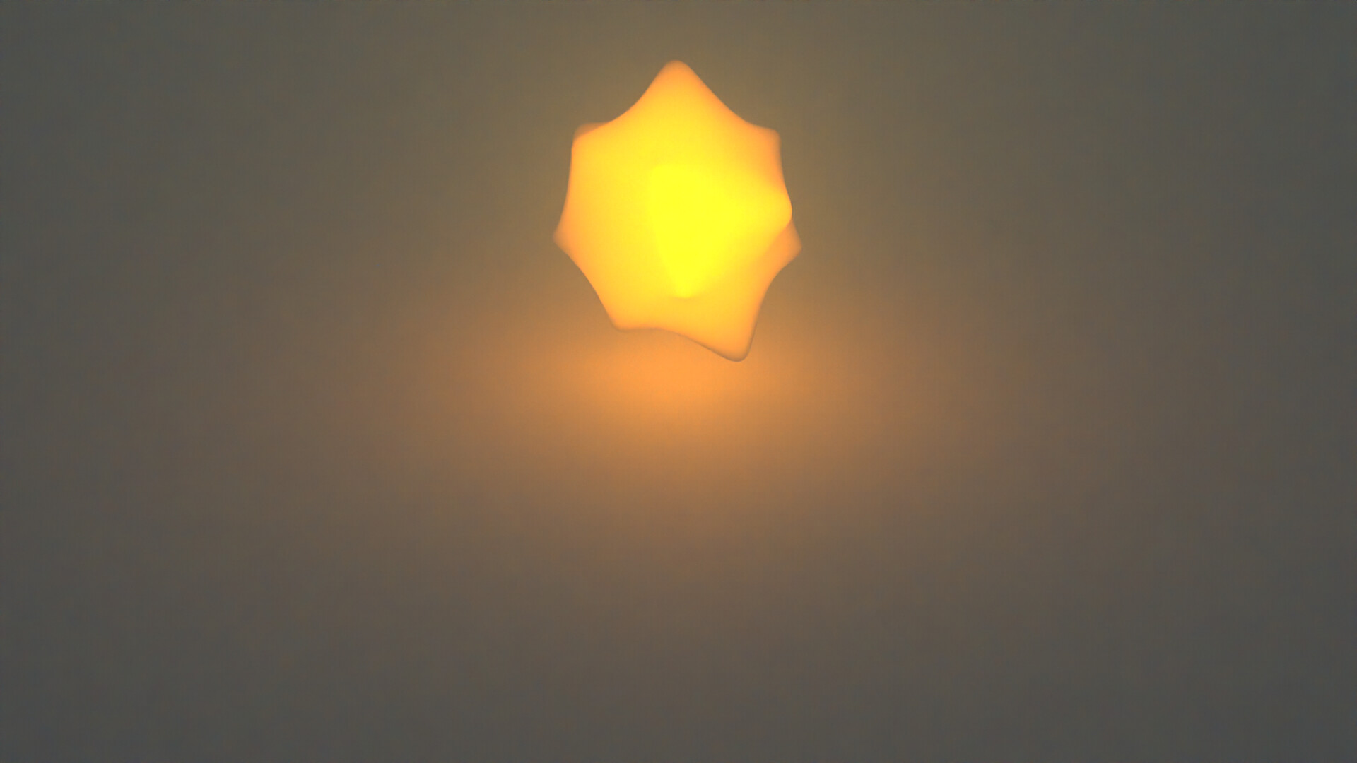
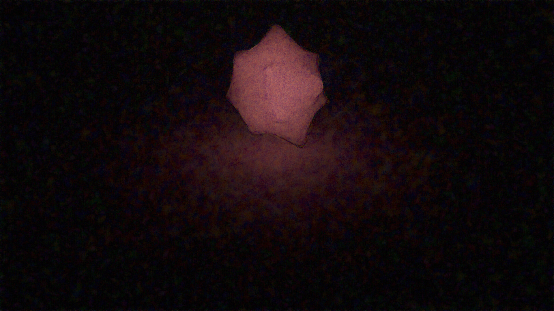
Finally, here is a diff between the RGB version and Spectral match, showing where the differences lie in these renders.
It’s actually very close, especially further away from the star where scattered light dominates. Where there is more direct light, the discrepancies are once again greatest in the red channel but it’s at least a bit more even than previous tests suggested. In the raw images RGB and Spectral match you can clearly see that the star looks a good deal more saturated in the spectral version. This might have to do with the inherently smoother scattering spectrum from RGB upsampling. It’s not as smooth as the Rayleigh spectrum, but it’s smoother than the three lamps spectrum.