I simply disagree here. It was dumb eight years ago, and it’s more dumb now.
Also, the whole point of those spectral flourishes is lost on such a dinky gamut.
It just seems unfortunate to sink in all this work and end up more or less right where it is now. It strikes me that Blender is in a position free of quite a few ball and chains, to simply forge ahead and do the right thing, technical bobbles notwithstanding.
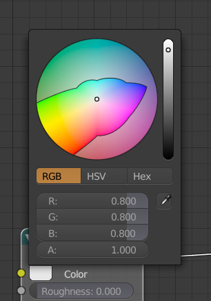
Yeah, that’s a good point. Let’s do it properly. It’s going to probably involve some pretty significant changes in the UI, I’d imagine. For example, how does the colour picker work in wide-gamut? Give the user an xy colour chart and let them deal with the consequences if they pick extreme colours? Or maybe they’d just choose a ‘working space’ somewhere which then defines the colour coming out of any colour node.
Exactly. I don’t think this requires disrupting the existing paradigm at all.
Simply make the gamut sufficiently wide in RGB to permit them to choose as they always have, with the additional caveat that it requires the UI to be managed so there is a “as close as your display can show” for interactions. The person can still exploit the wide gamut in the working reference, they just see the gamut mapped output, knowing that there is more goodness inside if they are in a context to see it.
I still don’t see a good way without some sort of clever and speedy upsampling that works with wide spectral primaries; we are back in the same conundrum that we have with wide gamut RGB in a way.
This I feel is the next unanswered question. It needs to be really fast, and ideally doesn’t involve much runtime precomputation.
This is another issue. It would be nice to give people the option of a few colour display modes so they can better understand the colour they’re dealing with. The default I imagine would work as it does now, but as you said, that won’t show them the colours they’re actually dealing with.
An alternate view could potentially show the colours in the picker managed so that chromaticities are correct for everything the screen can display, then there’s a dotted line at the boundary. I’ll see if I can make a mockup.
This is the sort of idea I was thinking about when it came to giving users an indication of the colours they’re dealing with. If you display this image in sRGB it should look as intended (most browsers will ignore image profiles - well done web). Colours which can be displayed given the current colour management config will be displayed accurately. Colours which are out of gamut would be displayed greyed out.
This example is as if the user is using an sRGB monitor while trying to work in a colour space much larger than that.
I would imagine this would be a toggle just as a sanity check, as limiting users to using only the colours that they can reproduce would be pretty awful.
@smilebags, to get this implementation correct it helps to most simple case work correctly, and then you add more as you go. For example you can start from kernel_path_integrate and comment out most of the code, and make just the case where the camera is directly looking at an emissive surface work correctly. And then add and verify more and more functionality as you go.
Further, there should be a new spectral color datatype that contains a float3/float4 rather than passing those around directly. And then you can create conversion functions between that and scene linear RGB. That way you will get compile errors whenever a conversion is missing. If you make throughput and PathRadiance spectral colors then, it should become more clear where changes are needed.
I don’t know off-hand where the best place is to put each conversion between scene linear RGB and spectral, that kind of thing becomes more clear when implementing and you see which way ends up being most elegant.
This seems like a good idea and also helps to abstract the number of other channels/wavelengths used in hero wavelength sampling.
It seems 8 channels can be evaluated in almost the same time as 1 or 3 using SIMD, but I’m not familiar how much of that is done automatically at compile time, or if it has to be explicitly ‘used’. Do you have any info on that? I recall reading that the current make_float3 doesn’t help to do this, is that the case?
I think this will help clear things up hopefully. My struggle with lights came from the fact that how the colour is retrieved is different to how it is done in other places.
On the GPU there is no SIMD so 8 will be slower than 1 or 3. On the CPU some operations can indeed be done with little performance difference using SIMD, but not all and there will still be a performance impact. I wouldn’t worry about that kind of optimization at this point.
float3 in the Cycles kernel on the CPU does use SIMD instructions.
Alright, looking at a paper I read which came out of the research for Manuka, they found there was the best noise to performance ratio using 4 wavelengths, but at least if changing it can be done isolated to one area of the code later it’ll make it easier to maintain and improve in the future.
I’ll give it a shot using a new data type for wavelength intensities. Is there a way I can structure the data type as if it was a class, such that there’s methods on the instances of the data type? Or do we only have access to functions?
So I slapped a solver for the primaries approach together with @briend on Google’s Colab. Seems to be working, and you can adjust the tolerances down.
While I am 70% confident that the solved primaries is a dead end, I thought I’d post it here. It even has a graph printout via Colour which you can watch on Colab and it animates the solve, which is sort of fun. You can of course change the primaries and Illuminant as well. If @Scott_Burns has a moment, he could toss the tangent solve that @kram1032 suggested into it.
Anyways, it seems some good process is being made. Hopefully with @brecht’s help, this can turn into something.
I’m still stumped with how to upsample from wide spectral RGB though. It’s a challenging problem. The best guess I have is to perhaps create primaries from the spectral locus, inward toward the reference Illuminant, gradually decreasing in saturation. With perhaps five sets of solved primaries, it might be feasible to sample between them and derive a suitable quickie spectral.
Awesome, I’ll take a look at this. Thanks for your time on it.
The more I think about it, the more convinced I am that having different spectrum generation procedures for different use cases might be the way to go. A parametric approach with wavelength and width controls (could still give the user visual feedback) works for all colours but doesn’t work so well for textures. For tristimulus values in a larger colour space, I can’t think of a good solution. Maybe there’s some non-linear combination which could expand the gamut available. Otherwise using different spectra based on the input as you said might expand it slightly, but still won’t cover all colours.
I think what it probably will end up being is something like:
Construct a LUT for a wide range of values, perceptually evenly distributed on in the full color space. Probably in roughly a triangular pattern
find the three (or so) closest point to the target color. Weigh them together to derive the target color spectrum
It’d be kinda like what’s already happening now, just with more possible light sources, including ones that are far more saturated. - those will inevitably generate far more peaked spectra, but by having a denser sampling it should work out.
We probably couldn’t quite reach all pure spectral values, but we could come pretty close to that. The stuff that’s missing could be mapped to “perceptually closest match” but I suspect that would be rare: People rarely actually want pure spectral light but if they actually do, there is a node for that which does the job just fine. And for reflectance spectra, it’s even less likely that people would actually want a pure wavelength. A material like that would come out almost black.
It’s either that or some clever parametrization that’s somehow cheap to compute and capable to approximately match pretty much any color you throw at it with a reasonable spectrum.
I guess one way to arrive at that would be through machine learning approaches: Train up a network - it has to be small so it’s fast - to find a spectrum given any valid XYZ coordinates. No idea how successful that would actually be but at least the training set would be trivial to come by, since the other direction, spectral to XYZ, is easy to do. It would probably be pretty fiddly though: Gotta try out various regularization methods so you don’t end up with a peaky mess but rather get relatively flat spectra.
That would be a very different project though.
In case of the LUT (so effectively memoization) approach, it’s mostly a matter of what the memory budget would be. The finer the space could be presampled the better but eventually you’d hit diminishing returns or memory issues.
That also sounds like a good variant.
I have this rough idea of an advanced color swatch in mind. It’d be like a gradient where on the leftmost side you have the result of a single bounce and as you go further right, deeper bounces are simulated (i.e. just multiply the spectrum with itself, aka do an exponential falloff) - that should make visually identical-in-direct-light colors distinguishable from each other.
There could also be an utilization of the up/down direction for different light sources so you see how this material behaves in candle light vs. under an overcast sky or what ever.
This seems smart. It wouldn’t even necessarily need to be triangular, it could be any mesh which covers a majority of the spectral locus, but triangle does seem like a good idea. Come up with spectra for each vertex on the ‘triangle mesh’, then use trilinear interpolation of the result to get the final spectrum. As long as each point satisfies the constraints for an ideal spectrum, any trilinear combination of them should also. The ‘sums to 1 across the spectrum’ constraint doesn’t need to exist, but I’m not sure whether we need an alternate one in it’s place…
Yeah this would be a great tool for understanding spectral colours, but this will only be of use once we can construct the colours spectrally (by hand). Being able to tease apart metameric colours through their self-reflection would be awesome. In the current system (spectra coming from tristimulus values) a pair of colours with the same XYZ coordinates but different spectra are impossible to create.
This did give me an idea for UI for the gaussian distribution colour, which could utilise X for wavelength and Y for saturation, then use the same luminance slider as we do with the current RGB colour wheel. It would look pretty, too.
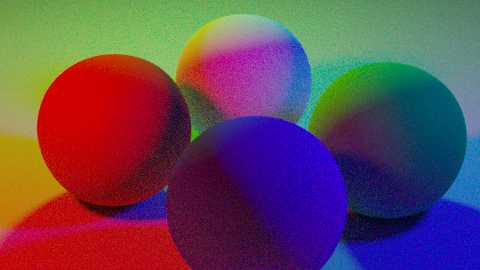
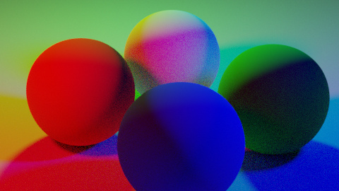
Here’s saturated RGB lights on saturated RGB and white materials (principled with 1 roughness) on my branch and master with identical settings. I’m going back to step 1 (again) this time tackling the simplest case first with a better structure to the code.
Note I’m still not doing any chromatic adaptation to get colours into the correct white point on export so the primaries and white will be a bit shifted. @troy_s What do you think is the most suitable way to handle white chromatic adaptation? Output XYZ data and be done with it, just let OCIO deal with it? crossing fingers
Now we’re talking! As expected, not all that much difference on red and blue - although there is some red light in the spectral blue ball that’s not in Master - but on green it makes a big difference. Obviously that’s mostly a result of the reflectance spectra used, with green having pretty large overlaps with both red and blue.
Yep. I suspect once I iron out all the bugs it’ll make a noticeable but subtle difference in scenes with extremely saturated colours but almost no difference in a majority of scenes. Willing to be proven wrong but that’s my hunch.
That would require that I know Python! I’m an old-school programmer ('70s Basic, '80 Fortran and C, and since then Matlab). But I suspect that we would get the same result with the hyp-tan approach, just as we saw when I followed up on @kram1032’s suggestion.
But while on the subject of Python programming, I would be delighted to have some assistance in converting my reflectance reconstruction code from Matlab to Python, so that it can be incorporated into the Colour library. Here is the function. The only tricky part is to solve a system of linear equations, which I understand can be done very efficiently using the Python implementation of LAPACK that is in SciPy. It would reconstruct reflectance from tristimulus values MUCH more quickly than the Meng code, which uses a general-purpose optimizer. Any interest in doing that?