But this too would be broken.
- Camera sensor captures are closer to capturing tristimulus data, but still are subject to clipping.
- Tristimulus data is not an image.
TL;DR: Rolling through the spectral sensitivity of a digital camera can only help us match CGI to the mechanism a digital camera captured an equivalent spectral stimulus, but not closer to forming an image. While useful, emulating a digital camera is a complete dead end.
We can skip that and assume that the tristimulus render values are “idealized”, plus or minus spectral model rendering versus tristimulus model rendering.
They don’t. Electronic sensors are more or less linear. Again, digital sensors capture camera observer tristimulus, that we transform to standard observer tristimulus. That challenge of image formation is in the realization that tristimulus data is not an image, and can be visualized quickly via the blue ball / cube example.
EG:
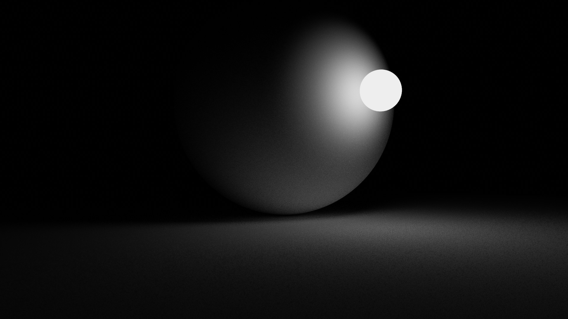
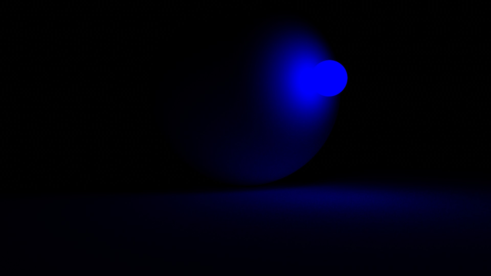
Sadly, this answer is flatly false. Standard observer “Brightness” for lack of a better word, is directly related to hue. This is part of the problem present in the blue sphere example.
100% correct here! The problem is that when forming an image we are straddling a representation inspired by radiometry, as transformed through photometry and visual appearance. The latter is the part that makes this extremely challenging. The hard science side is trivial!
Equally sadly is that the definition is a rather archaic definition of “brightness” that leans solely on luminous intensity as the sole facet of brightness. More contemporary research has shown this is false.
200% this.
If one goes through the transforms, and avoids the complexities of spectral versus tristimulus nuances of differences, one ends up at open domain tristimulus values.
We can skip all of that complexity and focus on pure BT.709 renders and see that the problem, even with well defined tristimulus values that can at least have the primary match perfectly, remain the crux of the problem to solve.
As above, in comparing the two images formed.
Indeed. Camera captures should be considered an additional complexity / problem layer. They provide no help for the core question as to “How to form an image?” and most certainly only confuse the subject. For all intents and purposes, it can be helpful to consider a camera capture as nothing more than linearized tristimulus values, subject to clipping.
100% correct as best as I can tell. To start with the canon, it’s always prudent to start with the CIE definitions, as they are the authorities on the matters at hand. They too have some ambiguities of course, because it is a damn challenging surface!
The three primary, and still somewhat problematic terms are:
brightness
attribute of a visual perception according to which an area appears to emit, transmit or reflect, more or less light
lightness, <of a related colour>
brightness of an area judged relative to the brightness of a similarly illuminated area that appears to be white or highly transmitting
luminance
Lv; L
density of luminous intensity with respect to projected area in a specified direction at a specified point on a real or imaginary surface
where Iv is luminous intensity, A is area and α is the angle between the normal to the surface at the specified point and the specified direction
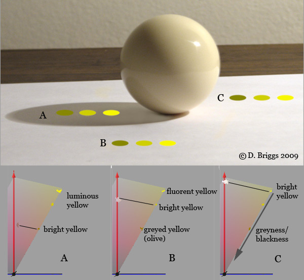
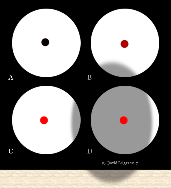
David Briggs has some incredible demonstrations on his website worth looking at while pondering the subject. He is a painter, so it should be no surprise that he has explored this area rather extensively; most folks who are trained in image work study and have an acute awareness of these issues.
TCAM V2 has a chromatic attenuation component as the values move up in terms of their radiometric-like output. Note that there are still appearance based issues here, such as Abney effect that would need to be corrected for (blue strip will appear purple as the chroma is attenuated).
Also note that the attenuation in TCAM V2, while solid, somewhat still doesn’t address overall brightness concepts, as we can see with yellows being attenuated potentially too rapidly with respect to other mixtures. Still, arguably one of the more solid offerings at the moment. Still, a massive amount of room for improvement.
This is again, avoiding the problem of forming the image! It’s seductive, but the simple problem is that a display cannot represent the tristimulus of what is in front of us, and further… it shouldn’t!
Think about standing next to a camera and looking at a light as it gets brighter and brighter. Your visual system would constantly adapt! This isn’t great when we consider the years and years of incredible photography printed to mediums that have beautiful imagery, with smooth transitions from no exposure, through middling values, and gradually depleting to paper or projected achromatic.
This is why all attempts that get too bogged down in the visual system lose sight of the medium. A watercolour is a wonderful medium not in spite of it’s representation limitations, but because of; it’s the watercolour response to paper, and the limitations within that, that make the formulation of imagery within it incredible.
“Hue skews” are tricky. “Hue” is a perceptual term, meaning it is based on our sensation of appearances. Arguably, relative to our sensations, hues do not skew, and rather it is a flaw in how we formulate our imagery. Abney effect on blue is trivial to see for example. That too could be considered a “skew”, albeit arising for a different reason. Should it be “corrected” or not? Where does this fit into the protocol and pipeline?
Sadly not the case as said above. Those answers are tragically devoid of study.
Filmic skews too! This is why the monumental shift away from accidents is required to move forward in a contemporary manner.
Way back when I was trying to create a transform for the small group of image makers working on their own creative stuffs, I explored the attenuation using chromaticity linear approaches and wider gamut rendering etc. For a number reasons, I was never able to make it work in a way that I could reasonably justify. It was just more garbage. It is at least feasible to address the issues, but the solutions are not exactly as straightforward as some might believe. And plenty of open questions!
Hue is a tricky one and we have to make sure that we aren’t lumping all of the manifestations of “hue skew” under the same umbrella; the causes and needs vary. If we were to iron-fistedly assert that the tristimulus chromaticity angle “never skews”, it would result in perceptual hue skews. Conversely, if we assert that the perceptual hue “never skews”, the chromaticity angle in terms of light transport-like mechanics would indeed skew!
Skim through it and see if it addresses brightness in the fundamental manner David Briggs addresses above. It is a well identified subject, with virtually zero to no explorations in terms of implications on “tone mapping”. Likely because the authors often fail to do their due diligence and explore what the term “tone” means.
Sadly, that loops back to the century of research from people like Jones, MacAdam, and Judd… who were specifically interrogating the nature of image formation!
It’s always ironic when the very people who criticize questions and interrogation are the very folks who should be doing so.
Feel free to do whatever you think “works”.
For the rest of the folks who actually care about their work and forming imagery, they will hopefully find the subject fascinating, as others have for over a century plus.
After all, if it doesn’t matter, just turn your display or lights off.