Thoughts on making Cycles into a spectral renderer

For too-bright colours, yes, it desaturates them, but it won’t do anything for not-too-bright but out-of-gamut colours. You have the right questions.

Your general approach to the problem is pretty similar to what I had in mind, but the devil lies in the details. Believe it or not, current desaturation approaches have some significant flaws which become more evident in wider colour spaces (Abney effect is one, if you’re interested). On top of that, there’s not a well-defined way of giving any colour a saturation value from 0-1 across the entire visible spectrum; relatively easy to do so within a colour space, but significantly harder to do in the general ‘human vision’ case. That’s what I’ve been working on, but it’s a challenging problem.

I see, that makes sense.

This effect, I see. It compresses hues in non-trivial ways.
Somewhere between that orange and red there must be a cutoff where colors start looking increasingly pink instead of increasingly yellow…

oh one minor thing that still needs fixing (I suspect it won’t be too difficult?) is the material preview render, right? That just is completely off right now

So the question would be how to correctly handle something like this, right?

Yeah, I’m a Luxcore aficionado. :slightly_smiling_face: Love its caustics.

1 Like

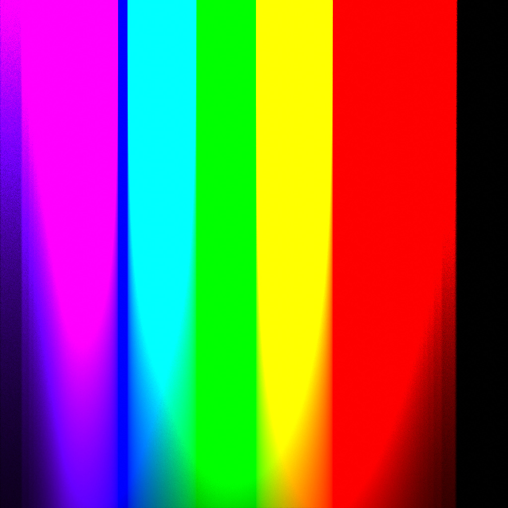
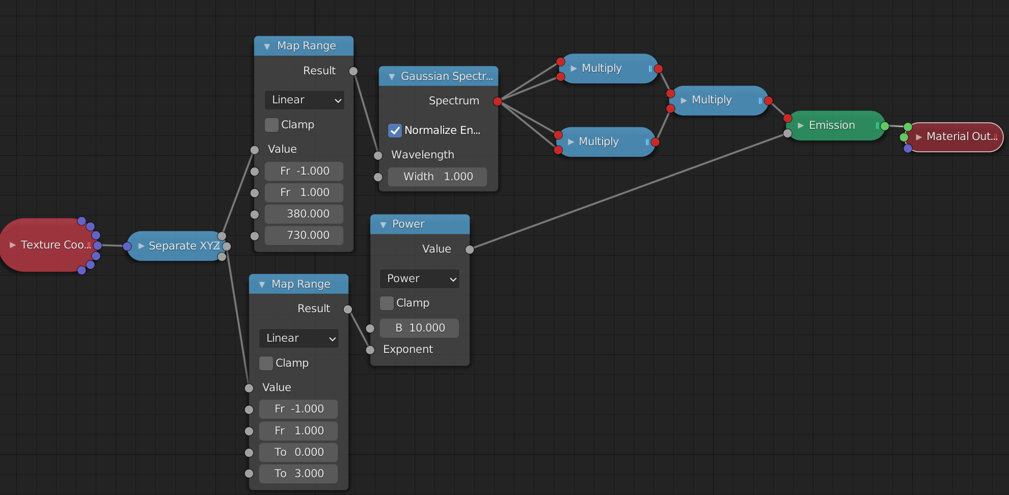
A very similar test with just raw spectral colors without any whitening

Not sure if these are of any use but I’m guessing these are demonstrations of where some of the problems lie. (By the way, the extreme ends of the spectrum seem to get cut off quite suddenly. These wavelengths barely contribute to the outcome anymore, and floating point errors may well be at fault here, but assuming that’s not the issue, I suspect that wouldn’t be wanted like this?)

Basically you are staring at the tip of the iceberg of all display rendering issues. While they are, at the core, aesthetic / creative questions, they also clearly have odd behaviour that some might rule as “completely batshit crazy wrong” output. :wink:

  1. What is a sane output for a colour that is too intense to be mapped to the display?
  2. How do psychophysical sensations such as Abney effect play a role?
  3. How do historical technological solutions such as per-channel lookups for the gamut compression of high volume values play a role?
  4. What should be the goal for output in terms of “accuracy” given that answers to the above questions are largely perceptual / aesthetic based?

It’s quite a fascinating tip-of-proverbial-iceberg that has gone literally unnoticed and unquestioned by the larger audience of image makers for a long, long time.

As a final note, if you roll the last test through a traditional RGB pipeline the results should skew radically worse. The delineating posterization band is out of gamut with respect to the display.

4 Likes

This is probably due to the wavelength importance sampling and potentially to the limited sampling range. Before merge the sampling range will be extended and that will likely necessitate a higher importance sampling CDF resolution

The sampling range should be 380-730, right? That’s also what I fit on that plane. (See the material nodes)
You can also clearly see that the purple end starts much darker and then slowly goes bright, suggesting it does sample light in that range, it’s just suddenly way darker.
On the red side, if I increase brightness by an insane amount (I’m talking up to near the limits of floating point numbers), I can get colors to be visible to up to about 706 nanometers. Anything past that remains black even at that intensity.

There’s an arbitrarily selected CDF resolution which is used for importance sampling of the wavelength - this is what I suspect to be the issue due to the variable ‘width’ of the regions of constant brightness. The sampling range you have is correct currently, but there are also non-zero responses outside of that range, so I will increase the sampling range along with introducing new CMFs which were sampled with the extended range.

1 Like

I wonder if you make the calculation of intensity based on lightwave physics.Here as example the amplitude of a light wave is based on photons per second being emitted.(The last post in the link)

For the most part, that’s a shader question. No such base shader currently exists in Cycles. Polarization and interference are not taken into account by the base path tracing algorithm. And thus far, the full spectrum of light wasn’t either. It was merely possible, in principle, to write shaders that could approximate spectral effects. (No such shader was in Cycles by default though)

Polarization and interference effects very rarely matter in the end, and so it’s gonna mostly be limited to shaders. (Polarization is kinda faked by a glass shader where, technically, the light that’s reflected and the light that’s refracted should have different polarizations, but the renderer forgets about this information. Interference and stuff that relies on phase would be part of a thin-film shader which Cycles doesn’t yet have)

Right.I was asking,because i was thinking if the wave equation with the Planck constant gives a different Energy curve vs the exponential test ie (the test with the equation used vs not used) gives a different result.

The lack of possibility of Total internal reflections in the current Glass shader and refraction shader, makes the most different to Luxcore or other renderengines with better glass reflections out of the box.

There are some good Thinfilm shader groups for Cycles,these are pretty accurate within a few nm.Most devations are due different lambda/IOR values.

If you want to simulate a wave interference.you can make it with wave textures to some degree ofc,we have testet a bit some years ago at blenderartists.This can not replace a sinusoidal light wave ofc.

yeah you can build stuff that emulates it. But there isn’t a base shader that does it for you, perhaps with a variety of physical guarantees you might like to have

1 Like

Here a example i was thinking of,that could be interesting.The measured Dynamic Range of many Cameras in log2(EV)
https://www.photonstophotos.net/Charts/PDR.htm

this EV Electronvolts can be calculated to E photon Energy.Or from E to EV.

maybe this is a way for a better Energy calculation for display Wavelengths in Blender.

I guess this is related to blackbody color tmp?

The renderer already calculates the correct energy. The issue of how to display the result is very different from that and has a lot to do with
a) how we perceive colors (many effects are a result of the way our brain processes and interprets how the receptors in our eyes are excited by any given pattern of incoming light, rather than a result of the light itself) and
b) how monitors actually display colors (monitors cannot ever display all the colors we can actually see. Most monitors today even only cover a rather tiny range. So how to display colors that fall outside the range they can show faithfully?)

Like, if you look at the image I posted above,

literally none of the colors in this image actually fit on your monitor. They are extremely tight. Each pixel is very nearly a single wavelength. Like laser light. Except for very particular wavelengths on some very high end monitor (there are, for instance, projectors that use three colored lasers to create their images - so at least those three pure colors it could display faithfully), there is simply no way to display these objectively correctly. You can throw physics at it all day. Your monitor is just fundamentally limited.

So the question is, how to cheat as little as possible, keeping in mind how we actually perceive color. How to define what is a “sensible” way to display these extreme colors.
Right now, all it does, I think, is to clamp any color channel that would be out of gamut. Set it to full 0 or full 1, basically. (I’m simplifying here)
That causes, as you can see, the bands to become ever less smooth as you go further up the image. Which is certainly a valid choice, but probably not what you actually want. Intuitively, you’d perhaps expect the colors here to remain smooth and gradual, even at very high brightness, so you end up with more than just six colors at the top.

But how to actually turn that intuition into a reality is what the current problem is.

4 Likes

I think you have described perfectly, that it is not possible to display the whole dynamic range on a display.
There was that slogan “If you can make a Photo from it,you can render it”.And i think this would be a good starting point.Yes the energy might be right.As you know lightwaves are invisible most the time.What we see are mostly the blackbody tungtsen light ,the Sun blackbody,Stars blackbody in the night,Fire or welding ect.And the particles or objects that get the radiation from this lightsources,absorbing and reflecting/scattering the light.
From all this you can make a Photo.It should be treated like HDRIs i guess.You select the EV range within maybe 2 Stops which can be displayed,done.From Black to White.If its underexposed you go higher and so on.
Filmic was a great help to get a smoother look at higher dynamic ranges.Maybe this would be usefull for spectral rendering too.

Cameras are construced like the human eye,with the lens and the pupil.If you take a Photo against the direct sun,then you close the aperture,like the pupil, to get lesser light on the sensor.

If i am not wrong the spectral eye sensitive curve is allready in the colormanagment in use?

Here i found this interesting paper about Encoding High Dynamic Range and Wide Color Gamut Imagery


The ICACB and ICTCP colorspaces looking good

Yes, that is the point. That’s what the main missing component is.

The issue is that no matter what color space we may choose (including sRGB which is still the most commonly used one), the end result should look reasonable. What use is a wide gamut colorspace if you can’t display it?
By being spectral, internally, in a sense Cycles already uses the ideal color space: precisely the space of all perceivable colors.
Well, I guess, the thing next to ideal anyway. We can’t easily store exact wavelengths for every pixel. That’d be way too memory intense very quickly. So each wavelength is converted into XYZ color coordinates and then all contributions are added up in that space and finally converted to whatever desired display colorspace.
And that is where the struggle lies. How to sensibly make use of what you have in that final colorspace, throwing away as little as possible (in terms of relevance to human perception) of the full gamut full dynamic range image.

Frostbite is useing ICtCp too in they research.

And similar topic with Unreal engine

From what I remember from Troy_S’ detailed posts about how color transforms should work, I believe “smoother look” is a massive oversimplification of what the math does. Filmic impacts everything from how intense highlights look to the general saturation and/or hue of your materials. To manage everything in a realistic manner is like a lot of other things in Blender development, it is more complex than it looks.