There are two things I’d like to be themeable:
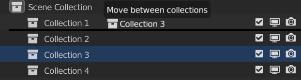
1- The separation line when changing the position of collections, currently it’s hardcoded in black and sometimes with long lists of objects it’s hard to see, being able to change it to lighter colors would be helpful.
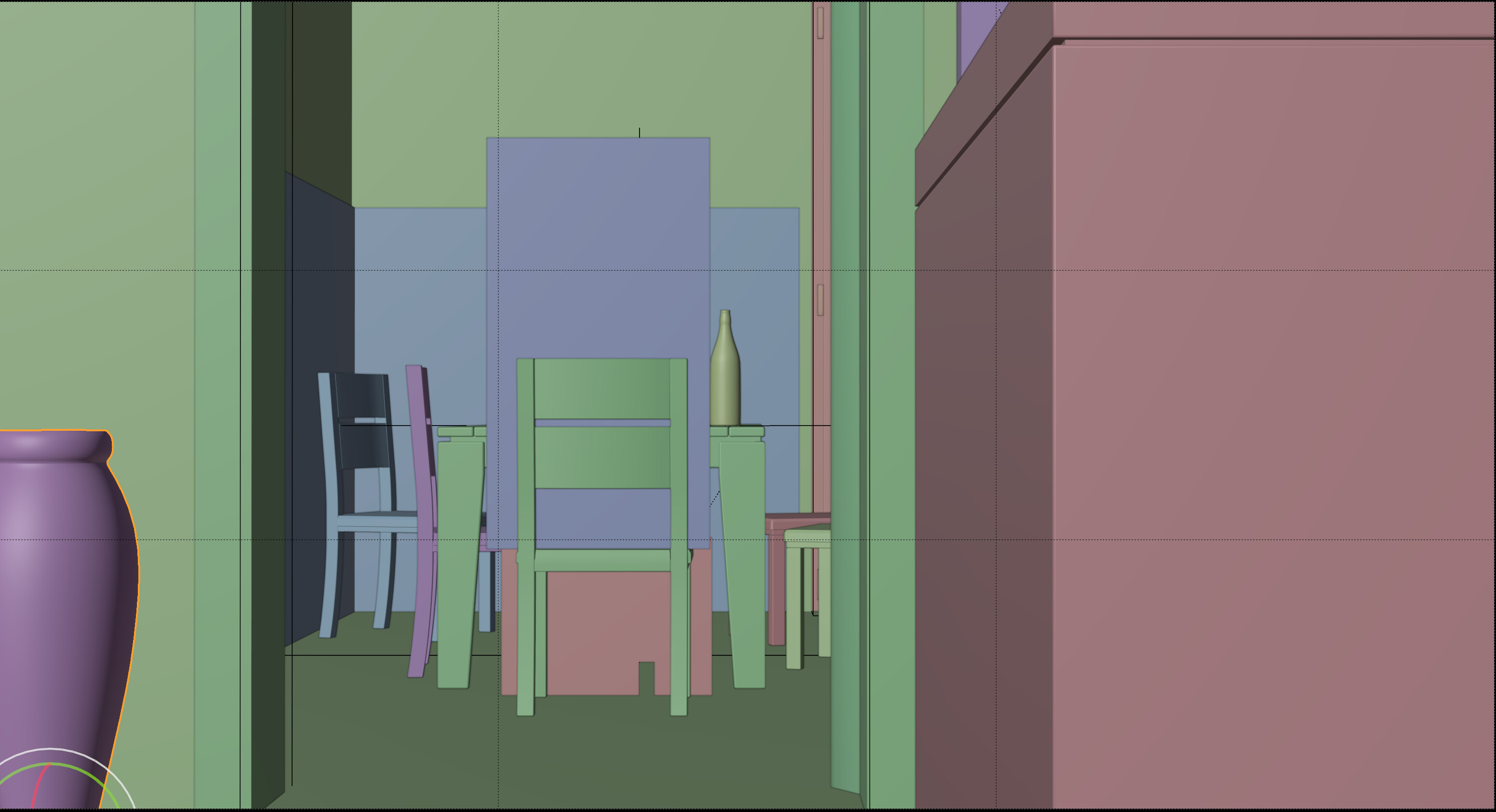
2- Color and thickness of camera’s Composition Guides. Also they are hardcoded to black, plus with large resolution monitors they appear very thin even when you change the general line width to thick in the interface preferences.
1 Like
For the color, you can go to Themes > 3D Viewport > View Overlay.
Regarding the outliner sorting, I found this from 2019 - https://developer.blender.org/T68502
We draw small black bars between items to indicate a sort dragdrop, and we shade the line dark when dropping into an item. We could improve on this.
1 Like
Wow, totally missed that one, thanks!
Yeah, I remember the free sorting proposal, it was one of the objectives of last year’s GSoC. Unfortunately, coding wise it was harder than imagined and Nathan never managed to develop it on time, plus now that he already worked twice in a GSoC project he can’t do that again so his work on the outliner it’s very limited since last year. let’s hope he can find time to work on it and improve it again.
1 Like