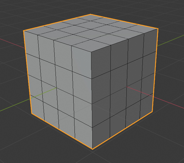
I was talking about nodes, not links
A theme setting to adjust the roundness of those tabs.
Is there one already? I can’t find it.
I can’t find it either, I’ll put it on the list. I think it makes sense to share the same settings as User Interface > Tab > Roundness
Could you please share a screenshot of the issue? Currently, we have:
User Interface > 3D View > Wire
User Interface > 3D View > Wire Edit
User Interface > 3D View > Active Object
(outline?)
User Interface > 3D View > Object Selected
(outline?)
[Object Mode]
In the overlays we have those options “outline selected” and “wireframe”.
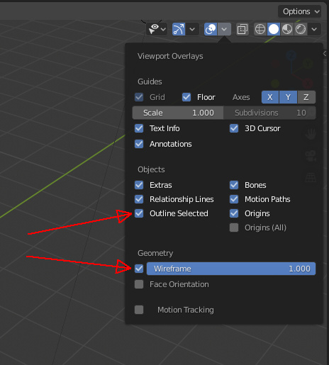
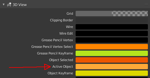
They are both linked to “3D View > Active Object” color
When you enable both of them, you get this:
Which is undesirable. People might be used to this in blender, but it’s not great.
So, ideally, the “wireframe” overlay should have it’s own separate color property, for more freedom (set to black by default)
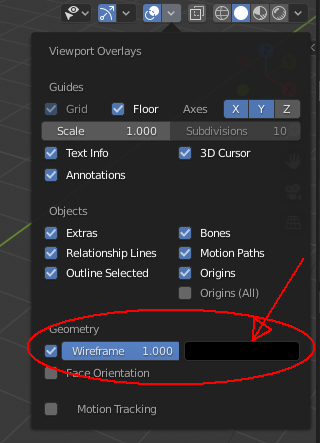
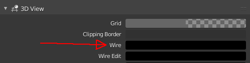
Or it should at least be linked to “3D View > Wire” color. (In fact, it is actually linked to it, but in a buggy way. Somehow the"wire" color is affected by the “active object” color. There’s some weird mixing happening there. Maybe this is the thing that needs to be fixed)
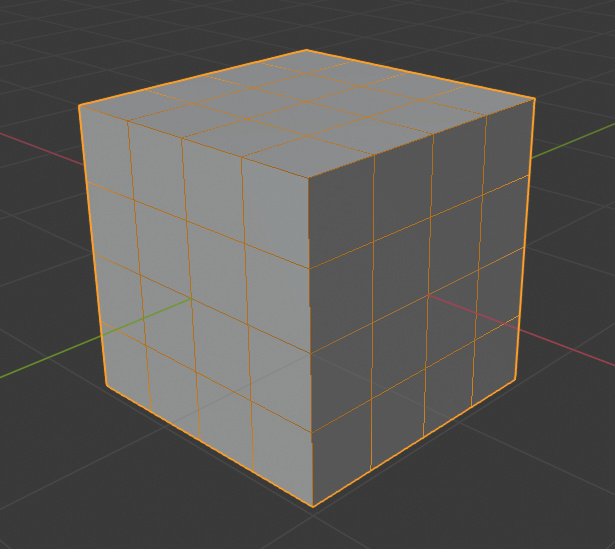
So, with any of the above done or fixed, we would have the more pleasant and expected result, which is this:
nice investigation dude
Thank you for explaining this ThinkingPolygons! And I think you are right that the Active Object
or Object Selected
should not affect the Wireframe viewport overlay color
. It sounds like a straightforward solution to me.
There is no option to adjust the color only of the grid in the node editor.
More detail would be helpful. A screenshot, and which existing theme color you think it should follow?
Unable to theme the sockets of nodes.
Please use map the sockets to the corresponding node colors:
Color socket
to Node Editor > Color Node
Vector socket
to Node Editor > Vector Node
Shader socket
to Node Editor > Shader node
I don’t know yet what will be the best color to use for the Number socket
since there is really no such node. I’m thinking the Node Editor > Wires
color makes the most sense if we don’t want to add an extra option in the Theme Editor. Any thoughts?
And does anyone know what the Node Editor > Selected Text
controls?
Unable to control the shadows of nodes.
If no new settings are possible please use User Interface > Styles > Menu Shadow Strength
& User Interface > Styles > Menu Shadow Width
to at least have consistent shadows in the theme.
the text color of the top bar menus should be separated from the text color of the 3d view menus (and perhaps other areas)
it is currently an unique color and is found in
themes > user interface > puldown > Text
Currently the Background of the Node Editor is stored here:
You can’t change the color of the grid itself instead i think it is half transparent and changes with the window background underneath.
The Solution would be to add like in the 3D View section of the Theme Editor the ability to change the Grid separately:
The color tab of the workspaces should be separated from the color tab of the property buttons
actually is unique color in Themes > user interface > Tab > inner
these elements are called Text, they should have the right name,
they also affect multiple areas, should be separated and moved to their right with a better recognizable name.
Currently they are a unique color located in Themes > user interface > regular
this, background color at the icon is not possible to manipulate it, and with certain themes it is ugly
(I’m not sure but maybe you can change between black and white, along with other icons, but I can’t no more find where it can be manipulated, and in any case it influences other areas that have nothing to do with and it’s a mess to change it without breaking other parts of the theme.)
if someone finds what manipulates it, highlight it.
I think this background indicates the active camera. And I can’t find a setting for it either. Do you know if there are other scenarios for this background to appear behind icons in the outliner?
if you notice carefully, even the lamp and the collection has this “exaltation circle” …
and honestly I do not understand the purpose
I find it only boring in some themes
edit:
better investigated
indicates the active Camera …
it should definitely be themeable