This is my very first post here, and I don’t know if I’m in the right place?
I discovered programming with blender. So my best friend is the API documentation. it is very good, there is all the info.
However the function declarations and the comments of the parameters are enormously compressed.
This makes it difficult to find information when there are many parameters.
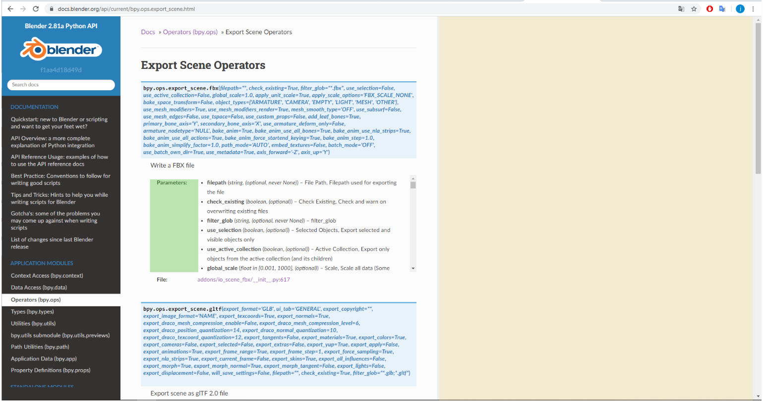
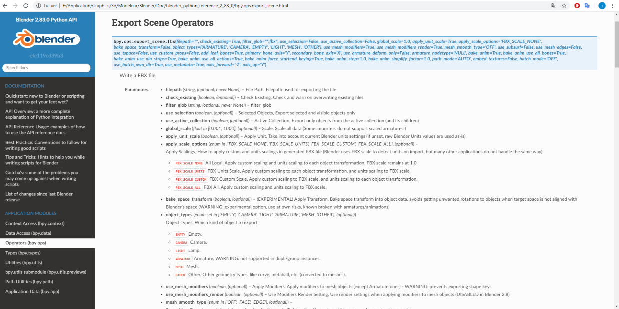
For example, for a function like “bpy.ops.export_scene.fbx”, the area displayed on my desktop computer is barely 10% of the screen size.
There is also double scrolling, that of the argument list and that of the page itself, which makes navigation sometimes surprising.
(For this point, I was able to download the documentation in html and disabled the line 5 “max-height: 245px;” of “css / theme_overrides.css”)
However, I don’t know how to modify the template.
I would like to suggest these few points to improve reading:
have a more “responsive” page (in yellow)
(and or) Do not lose an entire column reserved for the label “Parameters:” (in green)
(and/or) Place the default values with the list of parameters rather than in a mono-block without space (in light blue)
(and/or)Do not have the list of parameters in a scrollable box. if not have the possibility of unfolding it.
I hope this will help improve the arrival of a novice like me.
Thanks for what you do.
jmv.
While it is easy to fix in some senses what happens for people who have huge 32:9 aspect ratio monitors. At that point, a whole paragraph would only take up one line which hurts readability. So a proper solution would account for this as well. I would be in favor of making the content a little bit wider but don’t want to go to .wy-nav-content { max-width: none !important; }.
isn’t solving display edge cases like this what frameworks like Bootstrap were developed for?
anecdotally- anybody I’ve ever seen who uses a crazy ultrawide curved monitor is partitioning their screen space as if they had two or three monitors side by side. I can’t say I’ve ever seen a browser maximized to full screen on a display like that- but that doesn’t mean somebody out there isn’t doing it.
Personally, the width of the content area is a plus, but it’s not what makes it difficult for me to find information.
These are mainly the parameters in a scrollable list, there is no longer a question of whether they are readable or not, you have to go find them, hidden in their block.
I created a new task for this not long ago. I would be happy to get some
feedback from the initial work I started. I don’t pretend to be a visual style expert, my focus is actually on using doxygen to it’s full potential, which I have some professional experience with.
Yes, however, the theme that we use is based on a very uncommon framework: https://github.com/snide/wyrm There is talk to move away from this / start a new theme but both are a lot of work. But might be something I may consider doing this summer.
These are mainly the parameters in a scrollable list, there is no longer a question of whether they are readable or not, you have to go find them, hidden in their block.
Yeah, I could see that, although it’s not bad on my 4k monitor I could imagine it’s not great at 1080p. One possible solution would be to give lengthy property lists a special class that constrains it to a max-height (icons seem to be an outlier). At that point a scroll bar would be tolerable, but a better solution would be to have a “Show More” link at the bottom, and after clicking the rest would be visible. something like this:
Yes, indeed for the type UILayout, a complete list is not suitable.
The idea of testure seems to be a good compromise, however, automatic code generation is excellent for batch processing, and bad on a case-by-case basis.
Suddenly, we would have a “Show more” for all definitions.
Whereas with the current “max-height”, the browser chooses itself to display or not a scrollable list.
with something like jquery though it’s fairly trivial and doesn’t require any type of change to automatic documentation. A simple selector like this would give you access to the problematic list items, and then you could do whatever you wanted with them (add a class, append new HTML, etc):
$("td.field-body li:contains('enum in [')").addClass('max_height_controlled')
Yes, with javascript, we can have anything we want.
You can also modify the entire structure inside the browser with a script.
But, if I’m not mistaken @Blendify , the documentation is intended to be a static site, to be viewed on small machines (tablet, laptop, smartphone)
Yes I see.
This is the minimum for browser compatibility, navigation and the search bar,
note: your proposal is good.
but it is on a case by case basis. Like a bandage. Over time, we may end up with several different cases that change the whole appearance of the site.
unfortunately this is a fundamental reality of web development, you have to decide if you want to solve edge cases or be satisfied with an imperfect result.