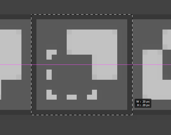
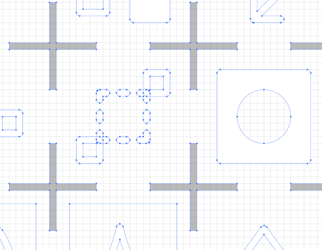
As for the 20×20px sizing, I’m just copying the grid system from the original SVG file, here’s an example screenshot from that file in Illustrator with the pixel grid turned on.
When used in Blender on a 72ppi screen the size of the buttons appears to match this size of 20×20px? I figured this was the reasoning for the padding but anyone more familiar with the original sheet should weigh in here. While I haven’t looked at every icon closely they all appear to stay within the 3px padding so I don’t think switching them to 16×16px would pose any issues but personally I like having padding when designing icons.

