bpy.ops.view3d.cursor3d(‘INVOKE_DEFAULT’, use_depth=True, orientation=‘GEOM’)
It is sort of a bit different. Yes, 3dcursor tool has options but regular 3dcursor doesnot have them, and tool’s settings doesnot influence it.
Also Shift+S only translates 3dcursor without rotation, so you have to
- select ngon
- switch to 3dcursor tool
- set its option to Geometry if it wasnt set
- pick a point on selected ngon with LMB to set 3dcursor rotation
- Shift+S to set 3dcursor position.
- Select selection tool back.
For sure it is technically possible, but such kind of a combo is quite heavily discoverable, I guess it wasnt thought out well.
Also Shift+S - selection to cursor doesnot align but only translates the selected object, so you have to
- set transform orientation = 3dcursor
- then follow object - transform - align to transform orientation.
making the resulting combo even more complex.
At the time we succeed to make it a bit faster and more versatile by designing Get Orientation function, as it could be seen from this video
It is a separate design task from what this thread is supposed to be used for though.
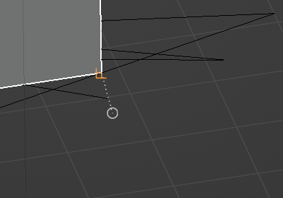
Well, I often like to rotate the view, for instance when I snap to a vertex that is not visible in the current view. It may make sense to pause the transform and resume it when the new view position becomes static again. The reason is, if you have to cancel the operation to change the view and then invoke the operation again, it get’s annoying.
1 Like
Perhaps it would be of value to see a video, of why you need to rotate the view during the snap, instead of establishing a view before starting the snap.
Well, it’s simple really. I first think, okay, I have to move/ rotate the object. Then I realise my view was not right or can’t find the proper point to snap to so I have to change my view. It’s the order of thinking, if I can navigate with transforms, as I am used to in all other 3d software I use, I can be more flexible using it.
2 Likes
Thank you for your continued engagement on this forum. Your suggestions are certainly being considered.
The “Snapping to the middle of faces” feature has been added to our list of future improvements:
Snapping & Precision Modeling Improvements
Another point I’d like to discuss here is the topic of: Snap Symbols for Blender.
See the proposal:
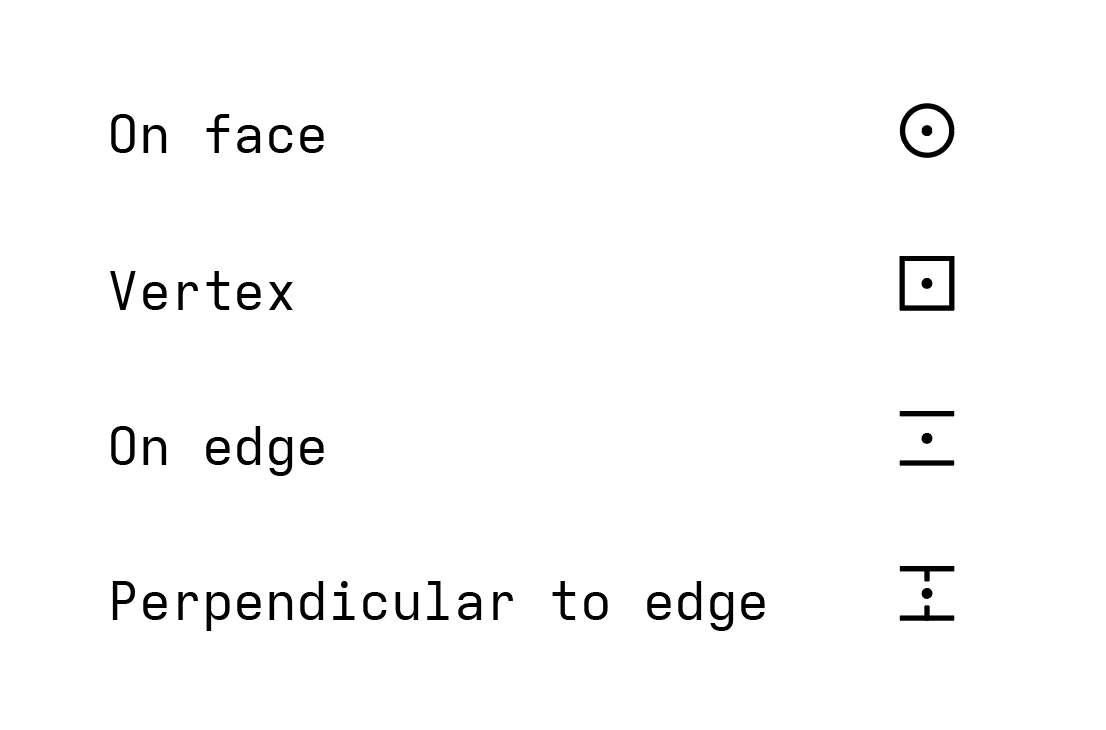
Opinions within the team vary, but we are leaning towards implementing CAD-style symbols.
If there’s little opposition, this will be the style we move forward with.
If the topic proves to be controversial, we can offer an option to use both styles.
12 Likes
Thank you for the PR, looks sleek !
In my opinion both options should be kept. I not only find the Minimalist version more pleasing but also more descriptive and friendlier for new users (indicating face and edge orientation, pointing out edge)
I was surprised to read @pablovazquez’s comment about “using whatever others are using already”, after hearing him say multiple times on stream others doing something shouldn’t stop us from finding Blender’s way.
I also want want to point out how terrible most CAD software UI is. Most are the result of incremental decisions that have been built up upon since the 90s, probably because being technical software there is little incentive to overhaul the UIs.
I think the proposed solution of having both solution works well. People coming from other software with little time to change their muscle memory can just flip the switch.
A dropdown could also be added in the splash screen when Blender is opened for the first time, below the keymap one (Blender Default / Industry Standard).
EDIT: typo
EDIT 2: One thing I don’t think works well in the Minimalist set up is “If the ends of these lines are closed □ (forming a square) it means that the snap is to a part of the edge, either center or perpendicular.” Looking at the GIF i couldn’t make the connection that the □ (perpendicular/edge center) is in fact the = with two added lines. That also made the orientation look strange. How about エ ?
3 Likes
Minimalist icons make so much visual sense. I couldn’t tell what the industry standard icons were supposed to represent. An hourglass icon? Anyway I would definitely prefer to use the minimalist icons.
3 Likes
I have no experience with CAD, so the fact that the icons match those in CAD tools is lost on me. I can only say I love the fact that the minimalist symbols are aligned to the geometry/normal. They’re also somewhat continuous with Blender’s existing & previous icons for snap targets. I’m not sure why CAD symbols are especially relevant to Blender ?
The build crashes when hitting ctrl for snap
4 Likes
Thank you for the heads-up @Hadriscus. The bug has been fixed.
For everyone’s information, the final decision will need to be made by Friday.
Anybody with a CAD background will be instantly at home with CAD-like icons (and I assume that’s the sort of people who will use different snaps the most).
I come from a CAD background and I’m familiar with the industry standard icons, but I have to say I really like how informative the minimalist ones are.
The normal indicator for the face snap help visualize what face it sits on, and the lines parallel to the edge indicate what edge is being snapped to.
Maybe some sort of middle ground can be met, like say use CAD like icons for point snaps (Zero degrees of Freedom like vertex, perpendicular, middlepoint, etc) but keep the minimalist when there is more than one DOF like line plane snaps (edge, face, etc)
1 Like
The CAD style symbols (industry standard) are entirely meaningless without a CAD background, and the majority of Blender users are hobbyists without formal training or extended experience in other software. The people who contribute on this forum are a highly skewed sample of Blender users, and I would hesitate to trust any major decision made by the voices here.
As someone with no CAD background myself, I find the industry standard meaningless. The minimalist seems more intuitive
6 Likes
I work every day with CAD, so I’m used to the industry standard.
But I think Minimalist looks pretty intuitive, I don’t think it’s worth keeping both at the same time.
I think having just Minimalist is enough.
1 Like
CAD style is a widespread industry solution.
For example, 3dsmax uses them being not CAD application.
The main flaw of a minimalistic style is that parallel lines sign does not depict the precise point on the edge, which makes it hard to determine which edge it snaps in case of dense meshes.
It better be a cross sign.
In industry standard setup the perpendicular base is marked as circle which has the same problem - it better be a cross, like in minimalistic one.
Also the sign seems to be thick on GIFs, which could be sort of distracting, will there be an option to control the thickness and size of a sign? They are mostly covered with the cursor sign, which makes it harder to read them. Maybe a slightly bigger default size could work well.

The brightest orange color by default could be also a nice option for better readability.
By default they are very dim, however, it is sort of an overall UI contrast problem (gizmos are also dim for example)
The default-like option with the circle sign only could be welcome.
In overall, it is hard to detect the necessity in Minimalistic setup, since it works pretty much the same way, just show almost the same symbols but in different order, which brings unnecessary confusion and possibility of a community split (for example, for video tutorials, which is bad for branding)
Can’t they just be merged into one, with “rotate snap sign to geometry” option?
How about to add "Snap to “3Dcursor” as well, to solve self base-snapping?
While I appreciate your input and mean no disrespect, you are exactly the kind of user that I meant when I said:
You are not a normal Blender user. The vast majority of Blender users do not have your experience, have not used 3DSMax, and don’t work in professional settings using Blender
2 Likes
Most of the pure Blender users in my environment are mostly trained by me, I work a lot with Blender users that has no other software experience since I hired them.
Snapping symbols are pretty easy to learn, the only question is which icons set to get used to, to avoid possible fractioning and confusion.
Also, there is a reason I proposed this option:
1 Like
I agree not indicating the precise point where the cursor is snapping to is not helpful. How about adding a dot symbol ? That would follow Blender’s existing vertex symbol:
Quick mockup:
7 Likes
Thanks for the suggestions. They are not bad, and they can be implemented.
But with or without a dot in the middle, the new symbols don’t look any worse than the circle being replaced.
Given the current deadline (Friday). I think it’s best to refrain from proposing changes to the design for now.
Afterwards, we can think about tweaks to the new symbols.
(Perhaps the original circle symbol was thought of in such a way as not to obstruct the view of whatever is being transformed?)
2 Likes
Big win here ![]()
It’s called forward thinking, and you should be happy he’s finally thinking like that.
Nothing good comes from trying to be weird or do things the blender way, all it does is hurt blender in the long run. Blender would be light years ahead if they followed the standards.
Having said that, I don’t care about the snap symbols. I’d be fine with just a circle for everything.
Will it be an overlay setting that we can turn it off?
1 Like