When you first open Blender
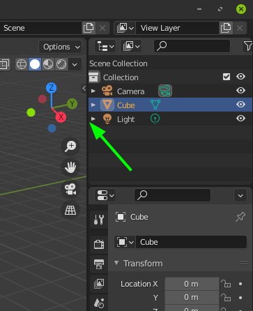
When you try to select an object in the outliner
It’s trippy…idk if it’s something on my side or if it’s intended, but it would be better expanded by default when you open blender.
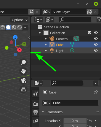
Another one
everything is inline expect those two, is there a reason why ?
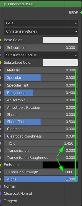
This one is UX related
Pressing “Shift + A”
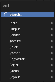
clicking the “search” field
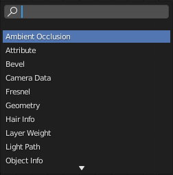
In my opinion, pressing “Shift +A” should defaults to the cursor already in the search field while keeping the first layout, and only changing to the second layout after something is typed in, saving us extra unnecessary clicks.
I might be nitpicking, but it’s those small “annoyances” that add up on top of each other, that can give a product a premium feel or a clunky loose screws feel if left unchecked.