alright, I’ve taken a second, more in depth though and look about this while sort of “feeling it out” playing with sculpting (not that I have made changes, just imagining it,) and I wouldn’t be opposed to this in its entirety- so if you got the idea that I wouldn’t like it, you can ignore that- as a whole, almost all of these ideas are a definite quality-of-life improvement for sculpting, compared to what exists now.
As for the radial menus, I’ve given it more thought, and some feeling it out, and it seems I was a little misinformed about my own experience here- Radial menus are generally fine- but some of the issue is that their common implementation reverses the standard “use a hotkey then click to select” paradigm, and changes it to “move the mouse, and let go of the hotkey, it selects itself” paradigm.
Because every other menu in blender has clear edges, clicking produces a result, and mousing away cancels it, if there is a radial menu, it should obey the same rules to avoid cognitive dissonance. This means a click to select an option, clear areas that define where the menu is and is not, and therefore where moving your mouse will cancel the selection.
New users also truly benefit from static menu buttons- being aware of all the tools at their disposal, so long as their use is self-evident- that’s why the buttons are on the side of the screen in the 3D viewport in the first place! Being presented with a screen and needing to know hotkeys or which menu to access to begin doing anything is a good way to confuse newcomers- we learned that from 2.6-2.7! I don’t think the buttons for brush types need a change for that reason alone, really. If they seem to take up too much space, you can even make them clearer or smaller.
That about sums up my thoughts on the radial menus. As for the actual settings and exposure of options, I do prefer menus to simply be there on the side while I’m working… but also, I find it very important, even as a novice 3D sculptor, to have all the options available from the get-go, as noted above.
To me, this means no “beginner, intermediate, pro” distinction in the UI, even in a soft sense. The UI should always be useable and helpful to both a beginner and expert. Though an expert will likely prefer a hotkey heavy workflow, there should ideally be no feature that limits functionality or access to information, techniques, or tools. Remember- new users are rarely aware of more than one way to access a tool without some experience with it.
My first real use of blender’s sculpting, ever, (there was no realistic alternative to get the detail I needed) required me to make my own brush heightmap in an art software, and it was a weird uneven rake- and it was a wonderful experience once I did figure the menu out, thanks to tooltips. My only real frustration was that ctrl-z reset my last change when I tested the brush- but that could be a paper cut suggestion maybe?
Simply put, it wouldn’t be fair to hide away some of that functionality just because “they aren’t ready for it yet”. Limiting what a user sees also limits experimentation, curiosity, and mistakes, and therefore learning. Many users would probably prefer being able to see all the possible brush settings at once if they could, too, rather than having to scroll through a small window of large settings, close some to see others, or having more specific ones in a totally different menu. Switching to a new UI as you get more familiar with the workflow also introduces a bumpy learning curve, and often is not worth the trouble compared to a steep learning curve for a very functional UI. It makes more sense to highlight the important settings in some way, and have the very niche ones in a well-labeled dropdown or sub-menu nearby.
I’m someone who won’t add ask for new menu types without an exceptionally good reason. Brushes aren’t used outside the sculpting workflow at the moment, and cannot have an effect unless you’re using them, as far as I know. Therefore, it doesn’t make too much sense to have a different menu outside of sculpt mode handle their properties and so on.
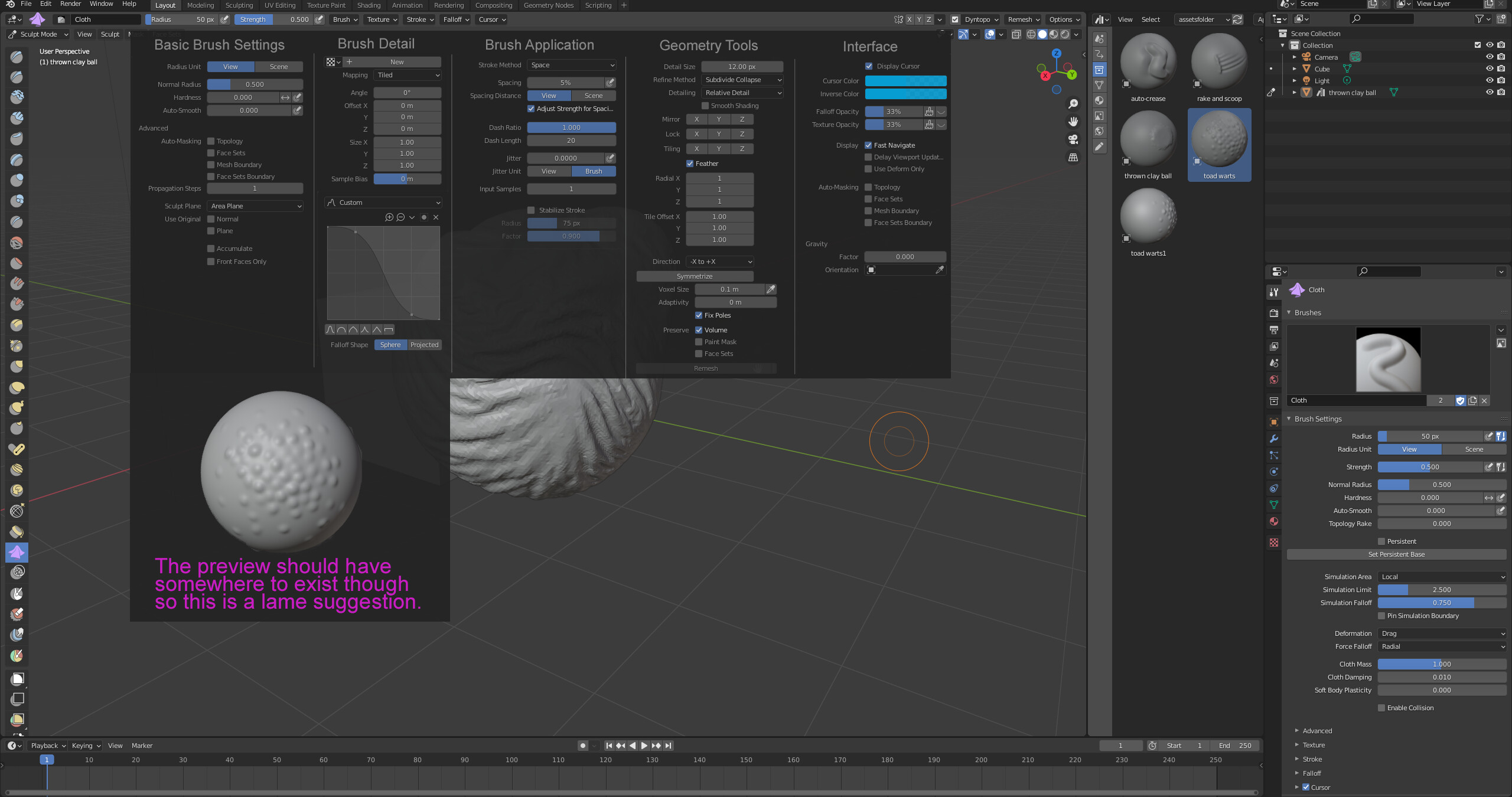
so… the context menu makes sense! it’s just terribly laid out for something like brush settings… as we’re all aware:
the primary issue is the poorly used context menu. the content reads poorly in such a claustrophobic menu, and the sliders barely have enough space unless you let it take up a lot of the screen. The menus up top, though, are actually REALLY GOOD, all things considered. everything is accessible and you can see the setting section you’re looking for without using a single button.
As for how to display brush settings, here’s my two cents, based on the brush settings up top.
I simply composited all the brush options into this image, side by side, organized by purpose. There are some missing for the texture, but overall, it’s not impossible to show it all at once, not by a longshot!
Even just like this, the options themselves don’t take up half of the workspace, so it’s not altogether silly to suggest simply opening all of them at once, whatever UI may do so, I think. I know people will poke holes in this, so I’ll just remind that it’s not an actual suggestion, but more an alternate visualization of the issue, and saying “maybe we should look to make all these options available all together, rather than a bunch of small dropdowns or having a dedicated brush editor or multiple menus of some sort… or maybe a dedicated brush editor IS the place to put these, I don’t know, but there are definitely ways to expose it all to the user.”
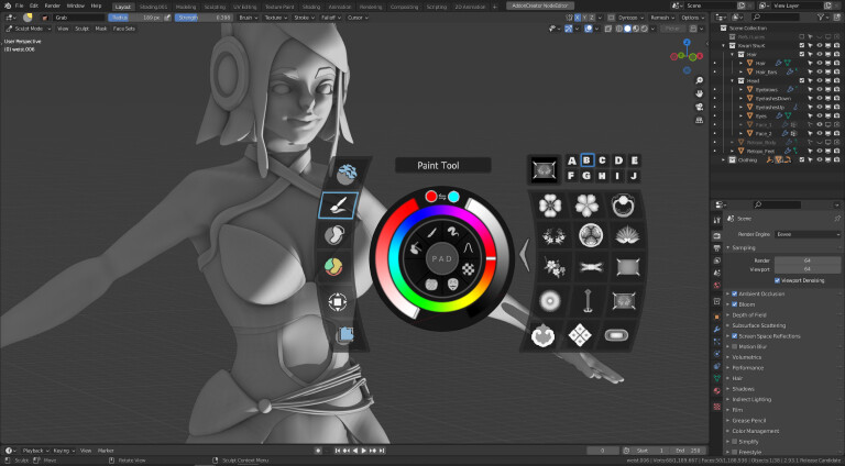
 ) I guess it is cause the sculpt wheel and other crazy sculpt/paint things I made?