I’m reaching out to the developers (specifically the ones assigned to UI / UX / Geometry nodes)
I’ve just noticed that in the geometry node editor there is a green colour assigned to the input pins.
Regarding this colour, I wanted to let you know that this is visually difficult to read for the colourblind, especially for those who suffer from ‘‘Deuteranopia’’ (like me).
Is it possible to add this observation to a blender developer meeting and maybe come up with a solution/small tweak?
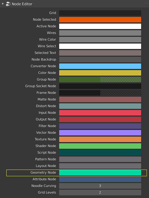
Hello, is this green color already exposed as a theme setting? Is it the one marked below?
My experience with accessibility is that folks typically appreciate, and deserve, a dedicated color palette instead of attempting to find a middle ground for everyone in a single theme. If there’s many such sets of changes that would help folks like yourself, I can see the potential with shipping an entire specialized theme for instance. Though community members like yourself would have to help create it.
1 Like
Correct, it is that exposed colour.
I’m not sure how the colours are picked and assigned by the devs.
It just came to my attention and seemed a good idea to point this out.
I know people can change it manually or choose a different theme but I felt that optimizing this for the default blender theme could only be beneficial. Maybe it’s just as simple as changing the brightness or intensity of the colour to stand out more from the mid greys. The shader node for example is a better shade of readable green and will never be used in conjunction with the geometry nodes.
Just my 2 cents
There was some discussion about socket colors in https://developer.blender.org/T82689 and maybe in other places. In general this is not really my field of expertise. Do you have a suggestion for how the colors should be tweaked?
Afaik, we don’t support changing socket colors as part of the theme. We could support it, but I’m not sure if it is worth the complexity. @pablovazquez what do you think?