Indeed, it is not clear what is the point of a redesign decisions that will cause 100% predictable usability issues.
It happens too often.
1 Like
Yes, the 2.8 dynamics was big and maybe quite overwhelming. It was probably important for the project’s general success, but wasn’t without trade-offs. And I don’t think such a dynamic process is sustainable long term, at least not while the core UI team is still comparably small.
When I took over the UI module ownership, I pushed for focusing more on fewer projects. So we put a number of projects and ideas aside. The projects we kept going were of the following categories:
- Involvements in the big 2020 projects (nodes, assets, library overrides).
- Projects to wrap up 2.8 (toolsystem, layout polishes).
- Ongoing projects that were close to being finished (Outliner GSoC, properties search, possibly other GSoCs).
- Regular operative/maintenance work (contributed patches, helping other modules, small improvements, fixes, etc).
- Ongoing work on Human Interface Guidelines.
The more focused process should allow us to evaluate and iterate much better. Opening feedback threads after merging changes is now part of the process.
This is documented in multiple of the UI meeting notes, e.g. 2020-10-14 & 2020-10-21.
Another big topic are general contributions:
There is a huge inflow of patches for the UI module, I think it’s around or close to 15 per week. Smaller design changes in all kinds of places. So each release, a lot of design changes are by volunteer contributors – which should be looked at as a strength, not a weakness.
This is a dynamics that is hard to influence. Some people suggested we kinda close the patch tracker and just welcome contributions to active projects. That is something I do not want to see in an open project. But we do want to get contributors much more involved with the core projects.
So basically, I really hear you but beg to disagree when looking at just the recent months. Creating feedback threads and keeping track of them became regular part of the development and I think we’re doing pretty fine with that. Every design has trade-offs and there will always be people who disagree with design choices. But the process is very different from how it used to be.
8 Likes
The design must be functional in order to determine workflows.
We perform a wide range of workflows, like 50 km2 architectural visualizations, realtime solutions and UNESCO heritage historical reconstructions, therefore, we properly check every software used for every aspect of the workflow, because there isn’t a lot of software exist that can properly handle such a deep and wide range of workflows.
As a result we have pretty decent requirements for the systems we use because even the smallest nuances become valuable at this scale.
As a diamond blenderfund donator, who was donating an RTX graphics card to software on a monthly basis and then hiring local Python developers to compensate for the critical workflow issues we encounter during workflow testing is a rather expensive and unreliable business strategy. We are still fixing them though, but we don’t have a chance to grow to the level of commercial donations for software that we can barely use for massive production.
So, please, be careful with a wide range workflow design, it is made up of a very fragile matter, especially on a large scale.
Thank you for your attention.
2 Likes
I read all topic and did not understand, numbers of fake users will be returned or not?
If not…then it’s time to make addon for it if developers cant get that this is so important for users.
2 Likes
It will most likely be moved back. Tthe feedback was clearly against it - which I’m not surprised about.
4 Likes
simple example
as the instanced and usual object have no different in outliner, I only with this number can understand this…
You create a problem out of the blue, while the more important things not changed since 2.8
4 Likes
I would definitely agree with the majority here to say that it’s important to know number of data users, and it should be really easy to create a unique duplicate, without going through the submenu, and yes, if there is a fake user (although to my knowledge, with the non-automatic purge post 2.8 there’s no real need for fake users any more?),
It would also be indeed useful to have a better way of indicating instanced datablocks in the outliner.
1 Like
This is the situation where, I think, color may be of help. People worry not so much about seeing the actual user count or fake user status, but the fact that this is really the last reference to the datablock. This can be communicated simply, with color. For example, red X button - last reference; green/default white X button - not last reference (incl. fake user). Perhaps with confirmation popping up if you’re about to unlink last reference. No extra buttons in the selector required, the most important facts are communicated, the gritty details can stay in the menu.
2 Likes
I agree with all the posters above. The new behavior is a bad idea.
It took me a while to understand what is a fake use in Blender and how to use it. Once I did it was fine but the ability to use fake user should be exposed because you have to use it so many times especially when working with materials/groups. It’s just one too many extra clicks and mouse movements.
I also like to see the number of users. It’s quite helpful in some situations when you need to sort a messy scene.
Once people explained what the garbage collector is and how it’s helpful I now even better understand Blender  Before I also wanted to suggest to remove this concept of fake user.
Still I think the name is non-descriptive. I would rather use something like “Keep” instead of fake user. I don’t have with “fake user” now but when I first met this term a year ago it didn’t click with me at all what it could mean.
Like someone who mentioned above I agree that maybe it’s a good idea to approach some parts of design based on user’s intention. I would totally expect that the materials I create are save by default.
I know it can become a very messy file when you import other files with materials etc. But I think I would rather deal with intelligent clean up tool once in a while then to have a non-reliable system (from artist perspective) where you create something that can vanish because you forgot to save it. Come to think of this you actually have an extra “save” layer you have to use for you materials you should remember to use it. Kind of counter intuitive.
At the very least it would indeed be helpful to have a warning about all orphan materials(other orphan data?) that can be lost when you close the file.
7 Likes
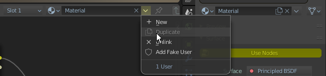
With the Fake User issue out of the way, I wonder, should operations in the datablock selector be limited to how that datablock relates to the active object, or could broader things fit in there that affect things outside the active object? After all, we already had a “Clear All Users” operation on Shift+Click. I think that could become a separate button, since the Shift+Click thing is a bit hard to discover. Then there’s a Remap Users operator which I find really handy but currently only available from the Outliner. What about Mark Asset & co, would those operators fit in here?
I also think that things that exist outside the drop-down menu shouldn’t be duplicated inside the drop-down menu. Currently Duplicate and Unlink action are in both places, I wonder how people feel about that?
Ok, so I’ve had a bit more play with the new data block selector and also i have been more concious on how i use the old one. One of the main arguments that was mentioned was that the new one provides more less clutter to see more of the name of the data. However, in my experience, the UI always seems to be wide enough to display most of the datablock’s name. I also noticed that I am constantly removing materials with the X button in the old datablock selector. Also I am constantly duplicating existing materials. With the new design, something as simple as getting rid of a datablock will take longer, by having to go into a dropdown menu.
So the question here is the following - do the usability cases require more of the datablock’s name exposed or more of the buttons being immediately available?
In my case, it’s most definitely the latter - it’s much more important to have the buttons at hand than to go into a submenu for the sake of seeing more of the datablock’s name.
Just a though here, instead of having the dropdown menu, could the regular state be clean with ghosted icons (or no icons at all) and on mouse hover, the icons appearing 100% opaque? And if not, then I much prefer the usability of the old design.
6 Likes
That is not an argument that I remember mentioning. It was not a goal of this redesign to make more space for the name. Although I think it did get slightly better in some cases.
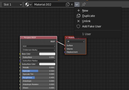
But just to show that space is in fact an issue:
(For the first two I did nothing but add an image node and opening the sidebar in the Texture Paint workspace. So these are not manually constructed corner-cases.)
What was an issue however is scalability: What if we need to add more operations there? And for library overrides, we do need to add more (the main reason for this redesign). We can’t just keep adding little icon buttons. Now to address that, idea was to add a menu, but that would take up space. And people wanted to see the more and more important library status (linked, broken link, indirectly linked, overridden, is-asset) in the button, i.e. with the icons we use elsewhere. That requires further space.
So it wasn’t a goal to make more space for the name, but to not make things worse because of the new design requirements.
Both the x icon to unlink (which is not deleting/removing) and the duplicate icon are still next to, or actually inside the text button. No need to open the menu:
I also think that the number of datablock users and fake user must be visible immediately and they must be clickable, they will slow down a lot and we will loose a lot of visual control of what’s happening with our scene.
6 Likes
I don’t have a strong opinion on adding general user management operators there. If they really are useful - why not.
Mark Asset and Clear Asset should indeed be available there. I planned to do that anyway.
I think it can be helpful to see a simple and complete list of the available operations, especially with their names. E.g. if the menu contains both, unlink and delete, users may look at the tooltips and learn about the difference. If the menu contains only delete, and unlink is an icon in a place that’s not the current “locus of attention”, they may not realize they are different, complementary operations. Same for duplicate and new.
Some designers I’ve spoken to were generally in favor of duplication/redundancy if it helps users understand things. I see a chance to do just that here too.
1 Like
drop-down menu is two times slower then icons set
1 first click - to drop menu
2 second - run command
for icon set
1 click to run command
don t undestand why UI become more complicated than it was before
P.S
IMHO this drop-down menus doubles time of access to command too
Header bar has enough room for icons set.
And if it will be option for example to change type of this menus from drop-down to icons set -it will be great.
4 Likes
What was an issue however is scalability: What if we need to add more operations there? And for library overrides, we do need to add more (the main reason for this redesign). We can’t just keep adding little icon buttons. Now to address that, idea was to add a menu, but that would take up space. And people wanted to see the more and more important library status (linked, broken link, indirectly linked, overridden, is-asset) in the button, i.e. with the icons we use elsewhere. That requires further space.
So it wasn’t a goal to make more space for the name, but to not make things worse because of the new design requirements.
I see. Thanks for clarifying. I guess it makes sense as long as the most important functions stay visible like number of users, duplicate, and delete
1 Like
That makes sense. But I strongly believe we do need the most commonly used features exposed.
I also don’t mind duplication in the menu. It should help with learning for those who new to Blender.
I disagree with this. If it were up to three menu items per menu, then maybe it could make sense to expose it as icons. But as there can be more items in the list I don’t see an issue here and never felt like it slowed me down in any way. The frequency I need to use these menus is rather low so it’s fine with extra click.
3 Likes
Where is «make single user» now?
And why duplicate do not work for material, mesh, etc?
Duplicate in property tab have exposed icon/button, but node editor have disabled option.
Bug?
2 Likes
I think that the better is to keep the classic idea with users numbers and when you click in the number show the menu with different options.
The problem with datablocks users is not the concept, is the name. Fake user must be rename to a more common term.
5 Likes
Looks like duplicate="material.duplicate" is missing for shader editor. Not sure if this was on purpose or not.
Material Properties
row.template_ID(ob, "active_material", new="material.new", duplicate="material.duplicate")
Shader Editor
row.template_ID(ob, "active_material", new="material.new")
1 Like