The point is exactly that in Blender we are used to this behavior where you need to assign a material to an object, and it’s this behavior that needs to change, not simply creating a new “blank” material. As rightfully stated, this is a big proposal, as it wants to change some fundamental behaviors of Blender itself, That’s also why agree with @Lichen that it needs new workflows and new editors. In my proposal of the Material Library, I say that we don’t simply need an editor to create and have a view of all the materials present in the scene, we need to change the fact that the Shader Editor and the material tab in the Properties should show you the material parameters not by clicking on the object to which the material is assigned, but on the material itself. For example, the material tab in the Properties editor shouldn’t be a tab that appears only when an object is created, and be dependent on it, but when a material is created in the Material Library. As for the material slots window, where you can have more materials assigned to the same object, it should appear only when we decide to assign one or more materials to an object.
The properties window displays only the properties of the selected object. It cannot show the options of a material when you have nothing selected.
It would be like asking that when you select an object you can see the UVs of other objects in its UV list.
This makes no sense. If they have a geometry node tree, they have an object. And if they have an object, they have as many material slots as they want. Either I’m missing something or the tutors you refer to don’t seem to know this.
Afaik It’s already possible to create an orphan material without any object in the scene:
bpy.data.materials.new(name='test')
It’s just that there’s no UI for this, because Blender hides the New Material button when no object is selected.
Quick Tangent: When deselecting everything, the new material button is still available, but it still applies to the last thing you selected before deselecting all. This definitely needs fixing as it is truly illogical.
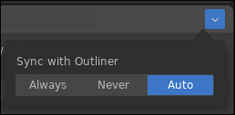
This is the first good argument I’ve read and an interesting use case. Additionally I see a material editor separate from the selection as a fairly simple QoL change. It solves the issue that you don’t have to select an object anymore to edit it’s materials. I often work with rendered view and all overlays turned off while tweak a material. But if I wanna tweak another material I have to turn overlays on, select the other material, turn overlays off again and start working in the shader editor. I think in this personal use case a simple toggle that syncs or un-syncs the editor to the object selection would be sufficient. I believe I read that proposal somewhere already.

Re: teams: Has anyone done a proper user workflow mapping about this? Maybe we’re looking at this from the wrong perspective. I can’t help but feel like there’s deeper issues than mentioned in this thread where we can solve teamwork in general in a better way.
Generally though, all I read are partial solutions, which will definitely be helpful in building the puzzle. But, dictated by most design processes: what’s needed first is solid analysis of the problems and workflows.
Apologies for the wall of text.
I generally disagree with Alberto but I have to agree here. The material slots are integral part of the mesh object datablock. They can’t be separated.
This would be a limitation, but just a small one and acceptable one - That you would be able to edit material parameters in the properties panel only if you have an object selected (which is the current Blender behavior).
I guess that in theory, it’d be possible to come up with some solution to decouple also properties panel material editing from the object selection, but that solution would probably be overcomplicated and ultimately not worth it. Especially given that most users use shader editor anyway, as panel based UI is just not sufficient to interact with the power of node based workflow.
It has been five years since I proposed that the material editor should not be forced to have an object selected to edit its material. Simply a sync button.
Nothing, impossible to make understand.I did a whole redesign of the shaders part. As always with little effect.
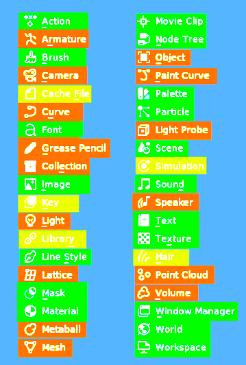
For if anyone else is as colorblind as me.

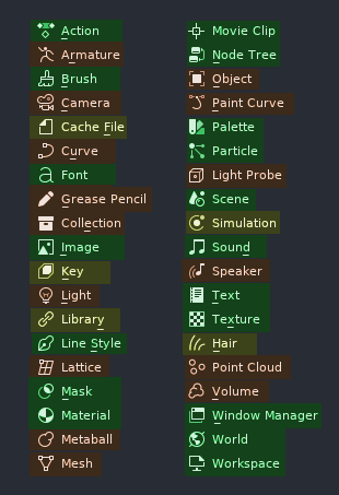
Marked Green are the datablocks I am fairly certain to have their distinct place for creation and editing.
Marked Orange are the datablocks I am fairly certain can only be edited/interacted with in a viewport
Marked Yellow are the datablocks I was not certain about. I could not find for sure if they are the type of datablock someone would want to store for later use.
There should be a printable version as well I guess, because such set of rules is too massive to remember and keep in mind during work.
This flew under my radar…, great proposal, should be acted on as soon as possible.
