With the recent, very active development pace of Geometry Nodes (GN) in Blender, lack of features is slowly ceasing to be the limiting factor of GN potential and user productivity. However, this potential is still being inhibited by the accumulation of various, relatively minor UX issues. These issues together significantly impact user productivity when using this new, promising system so many development resources are spent on. This document is intended to be a compilation of these issues, with explanations, examples as well as proposed solutions.
Solved by: https://developer.blender.org/D16244
Connecting a wire to already occupied single-input node socket will automatically reconnect the existing wire into a next node input, if there is one present (and is of same data type).
Blender currently always assumes that when the user wants to connect a wire to single-input node socket which is already occupied by a wire, the user intends to reconnect the existing wire to another node socket on the given node.
To an average user with no knowledge of Blender’s source code, it will seem that the automatic reconnection is based on a opaque, difficult to predict combination of some (or all?) of the following rules:
- The node socket is right next to the socket that is being replaced.
- The node socket is not occupied.
- The node socket is of the same data type.
- There is another, unoccupied node socket actually present on the given node.
Upon closer investigation however, it is clear this is not the case. Rather, each node socket has some hardcoded “alternative candidates” for a wire reconnection. For example, connecting a wire to an occupied “Specular Tint” node socked of Principled BSDF shader will reconnect the existing wire into a “Specular” input, even though both are quite distinct, different features of the shader which require different types of input.
This also demonstrates it is quite difficult for the user to anticipate the behavior of this feature in advance, as there is no simple rule of the thumb list, like on the example above, which would allow the user to reliably expect the outcome, instead of being forced to employ trial and error approach.
Lastly, this is inconsistent with the behavior found in majority of other Computer Graphics (CG) industry software. With the significant increase of Blender’s popularity in past few years, the idea of Blender being used as a part of pipeline, instead of standalone, full CG production suite is a lot more common. Inconsistencies like these make the use of Blender alongside other CG pipeline software a bit frustrating experience.
Of course, the point here is not to hammer Blender’s UI interaction model into a shape of other mainstream software just for the sake of it. In this particular case, it is just mentioned as another benefit of changing this behavior, complementing the other benefits mentioned above.
Proposed solutions:
- Preferred: Make the use of this feature explicit by requiring a modifier key press
- Pros:
- No more frustration from unintended, unmodifiable behavior, resulting in both expected and unexpected user errors.
- Relatively easy to avoid keymap conflict as dragging a wire is a modal process, allowing restriction of the modifier key use to its scope, avoiding potential conflict with both default keymap as well as node wrangler.
- Behavioral consistency with other CG software utilizing node based systems.
- The feature remains existing, and may even become more useful when the user can more explicitly communicate the intent in advance using the modifier key
- Cons:
- Slight increase in complexity of the keymap, and therefore leaning curve.
- Small learning curve step for existing Blender users.
- Remove the feature altogether:
- Pros:
- Same as 1.
- Cons:
- The minority of users with the skill of anticipating the complex behavior and utilizing this controversial feature to their advantage will miss it.
Solved by: https://developer.blender.org/D14457
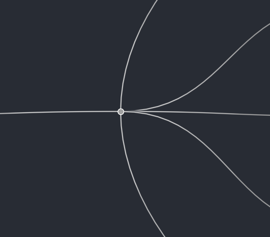
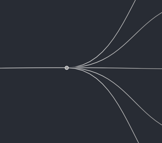
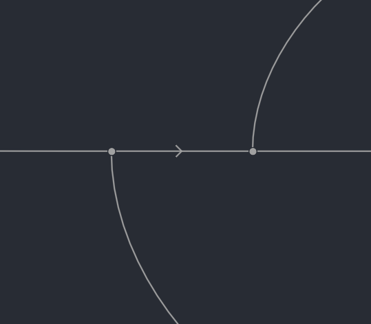
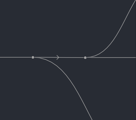
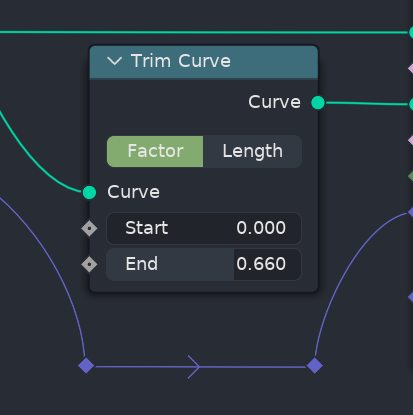
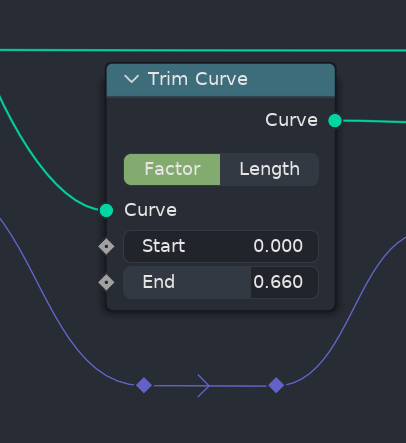
Reroute nodes switch between horizontal and vertical bezier curve tangents based on their location in relation to their input and output wires source location.
With the advent of node based workflow focus in Blender, it is inevitable that dealing with relatively complex node based graphs will be quite common for Blender users. Reroute nodes are important tool, allowing users to manage and improve readability of complex node based graphs by allowing them to be more specific and precise when it comes to routing the connections between the nodes in complex graphs. The means of aiding the readability of complex node networks is achieved through improvement of visual aesthetic, therefore this should be the priority.
Text formatting rules have evolved over time to aid readability of the text based interfaces, through the various means, such as spacing, character size, character colors, styles and so on. Visual interfaces, such as the one utilized by GN, should also facilitate easy readability of the node graphs, through similar means formatting. Bezier based node wire curving, already implemented in Blender, puts emphasis on the left to right horizontal flow of the node network data.
It’s working very well with the exception of the reroute node, which breaks one important rule; That Blender’s node based system are designed to be laid out horizontally. There are currently no node systems present in Blender, which utilize vertical node based layout, with node inputs and outputs placed on top or the bottom of the rectangular shapes representing the nodes.
As a consequence, every time a reroute node decides to switch its tangent direction to vertical, it becomes jarring experience for majority of users. It feels like finding a right aligned paragraph of text in a book populated by otherwise right aligned paragraphs, or stumbling upon a piece of source code, which blatantly disregards established formatting guidelines in a middle of otherwise pristinely formatted codebase.
While there may be some corner cases, where switching to vertical tangents could actually improve the visual aesthetic of the node graphs, even in those cases, the consistent approach of always horizontal tangents does not come off much worse:
Synthetic examples aside, below is a video showcasing the current state (on the left) compared to proposed state (on the right) on a non trivial node graph of average production scenario complexity:
https://www.youtube.com/watch?v=XKf5dVBHCNoLastly, current behavior, where user can not affect the direction of the reroute node tangents in a deliberate way creates often very difficult, frustrating choice of either compromising on visual aesthetic (and therefore readability) of the node graphs by having node wires overlap the nodes, or having vertical node tangent direction in exclusively horizontal node graph:
A tough choice between reroutes being vertically aligned with the node pins but having unappealing tangents versus visually pleasing tangents but vertical misalignment. There is no win here, just two different types of loss.Proposed solutions:
- Preferred: Remove the feature altogether
- Pros:
- More pleasant visual aesthetic of the node graphs
- Improved readability
- Cons:
- Some existing node graphs may need some readjustments
- Add user preference to toggle the “dynamic” aspect of reroute node tangents
- Pros:
- Preserving the functionality for the users who prefer the inconsistent vertical tangent aesthetic (is there substantial amount of them?)
- Cons:
- Overpopulating already overloaded user preferences by most likely underused option.
It is not always possible to place new nodes onto node editor area occupied by connection wires without connecting them to the overlapped wire.
As per the point already made above - With the advent of node based workflow focus in Blender, it is inevitable that dealing with relatively complex node based graphs will be quite common for Blender users. This also means it’s a lot more common for the users to run into a situation where they are working with a node graph, where the entire visible area of the node editor is occupied by nodes and wires.
In such case, it often becomes very difficult to add a new node to the graph without accidentally connecting it to a random, existing node wire, due to a feature which automatically connects nodes when placed on top of existing wires. This is, once again, an example of faulty user intention prediction, where Blender can not reliably assume this is really what the user wants to do.
The workaround for this becomes a frustrating chore of adding a node, scrolling away to find an empty space for node to place, hooking the remotely placed node to distant inputs/outputs, and the moving the connected node back to the place it was originally supposed to be.
One could make an argument, that in a modern software, which properly supports undo feature, this should not be much of an issue. In reality, unfortunately, unintentional connection of a new node to already existing graph can often trigger recomputation of heavy, expensive to compute operations, resulting in noticeable, frustrating delay, until the operation is complete, and then another, comparable delay until the operation is undone.
Proposed solution:
- Make the use of this feature explicit by requiring a modifier key press
- Pros:
- No more unintentional connection of newly added nodes or when moving existing nodes.
- Behavioral consistency with other CG software utilizing node based systems.
- Relatively easy to avoid keymap conflict as moving a node is a modal process, allowing restriction of the modifier key use to its scope, avoiding potential conflict with both default keymap as well as node wrangler. While Ctrl key currently snaps the node movement, and Shift key improves the transform precision, the Alt key seems an ideal candidate, as it is unoccupied.
- Functionality is preserved
- Cons:
- Slight increase in complexity of the keymap, and therefore leaning curve.
- Small learning curve step for existing Blender users.
- Pros:
The “Auto-offset” feature state is stored per editor area, not user preferences.
Once again, with the high complexity node graph creation and integration becoming increasingly common occurrence in Blender, users who want to maintain their productivity high, even when dealing with significant node graph complexity, are often required to put some effort into arrangement of their graphs.
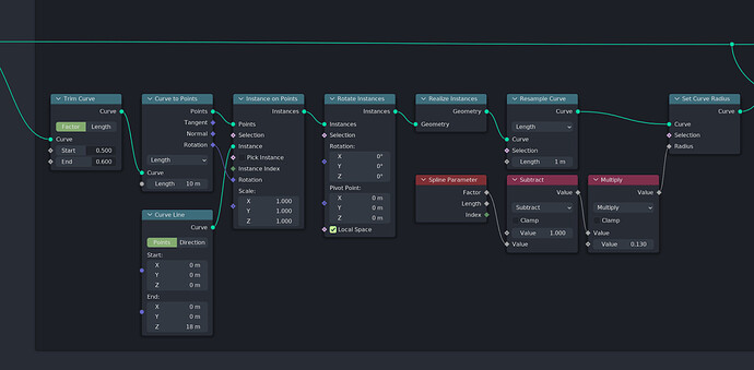
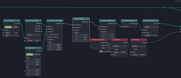
While Auto-offset feature may be useful during rapid initial prototyping of the node based system, it often becomes a hindrance in the stage where the backbone of the node system is finished, and parts of the graph are now manually cleaned up and arranged to facilitate good readability. In such case, it is preferred to turn of the Auto-offset to prevent breaking the meticulous existing node arrangements, like on the example below:
The addition of “Set Position” node with the Auto-offset feature has created more problems than it solved.
Unlike the issues mentioned above, this one can be solved as Auto-offset feature can be disabled. The problem here stems from the fact that the Auto-offset feature has been incorrectly categorized as a scene setting, rather than user preference. Usage of this feature is mostly a preference of how user wants to work.
Anticipation of the effects of this feature will sooner or later be embedded into the user’s muscle memory, so it does not make much sense for the on/off state of this feature to be unique across multiple different editors in single Blender file, or across multiple blender files opened by the same Blender installation.
One could make an argument, that the great flexibility of Blender allows you to change the state of this feature, and save the state in the startup file. The problem here is that the state is really stored per editor area, not just per file. Even in the case of changing the Auto-offset state in all of the open node editors present in the startup file, the change will be reset to the default ON state for any newly opened node editor, or even for the node editors closed and reopened in the same editor area.
Proposed Solutions:
- Preferred: Move the Auto-offset setting from the Node Editor(s) into User Preferences
- Pros:
- What is clearly a workflow preference will now remain in the same state across different editors and different Blender files, reducing the amount of unpredicted, unintended errors requiring undo.
- Removal of one UI element from the Node Editor UI (which is also in an inappropriate place called View. Toggling this feature does not affect how the contents of the node editor are viewed)
- Currently, the Editing section of User preferences contains multiple panels for individual editors, such as Text Editor. It also contains a setting directly related to the Auto-Offset feature - the Auto-Offset margin, but it’s currently present in the ambiguous “Miscellaneous” pane. This change could be executed aesthetically well by creating a new “Node Editor” panel, and putting both Auto-Offset toggle and Auto-Offset margin value there. This would improve user experience by grouping both of these related UI elements next to each other.
- Cons:
- Users relying on the per editor state of this feature will be disappointed (are there any?)
- Existing users will have a bit of learning curve, having to find the new location of the feature.
- Synchronize the Auto-offset setting between all the node editors of the same type in the given Blender file (including editors created in the future).
- Pros:
- What is clearly a workflow preference will now remain in the same state across different editors, reducing the amount of unpredicted, unintended errors requiring undo.
- The option stays in the same place, not adding to the learning curve for existing users.
- Cons:
- What is clearly a workflow preference will be stored within a file, not user preferences.
- Related “Auto-Offset margin” setting will still be present in an unrelated place.
Solved by: https://developer.blender.org/D14458
It is not possible to apply existing GN data block to an object which does not contain existing GN modifier without unintentionally creating a new data block.
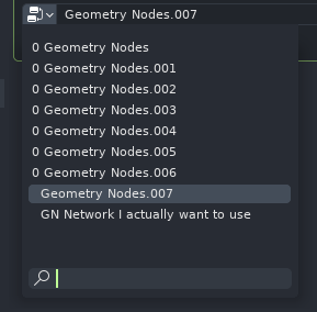
This is yet another example of unreliable user intention prediction. Currently, once the user has authored a GN asset in form of reusable data block, which they want to use on another mesh, the only way to do so is to create a new GN modifier on the target mesh. The GN modifier, unfortunately, always creates a new data block, incorrectly assuming that every time user creates a GN modifier, they are doing it for the purpose of authoring a new GN node network. In such case, a simple task of adding a GN modifier to 8 scene objects can up polluting the data block list like on the example below:
This can result in a state where the maximum width of the data block selector UI popover gets overpopulated by the generated garbage data blocks, and user has to resort to text search or scrolling to actually find the one they want to use.This creates uncomfortable duty of either manually cleaning up the unused data blocks using the Blend File mode of the Outliner editor, or by saving the Blender file and reopening it. Neither is optimal, and distracts the user from the desired workflow attention.
One could make an argument that GN modifier coming with a GN data block by default simplifies the learning curve and user experience. However, GN is relatively advanced, technical feature of the software, requiring at least moderate technical experience to utilize properly. So if a model user is unable to figure out it is required to click a big “New” button after the GN modifier is created, it’s hardly imaginable they will be able to do anything productive with GN:
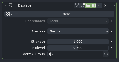
Furthermore, this behavior is also inconsistent with other modifiers. For example the Displace modifier does not come with a new Texture data block by default. So the argument for easier out of the box experience does not hold up here either:
Proposed solution:
- Do not automatically create a new GN data block when creating a GN modifier
- Pros:
- The blend file is not populated with unintended data blocks
- Users are not required to go through the chore of manually cleaning up these data blocks.
- Cons:
- In the case where user specifically intends to create a new GN data block through the Properties editor, one additional mouse click is required.
