Thank you for your reply ![]()
![]() , it turns out that I just learned that the
, it turns out that I just learned that the
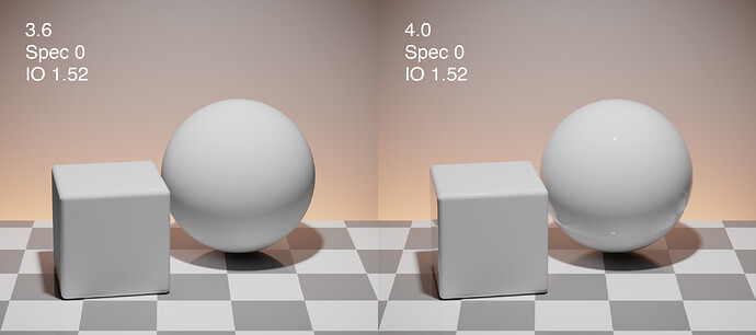
There’s a big brightness difference between 4.0 and 3.6.2 renderings of this scene
Nordic small living room project documents:https://drive.google.com/file/d/1LDKrsxdQzY22f_NHaPIJYCrNE7fXFd7q/view?usp=sharing
The energy conservation has changed between the Principled BSDF in 3.6 and 4.0. This is expected because 3.6 has various areas where energy conservation was incorrect where they are now more correct in 4.0. Based on testing by Lukas Stockner, scenes typically need their exposure increased by 0.2 to match the general brightness of Blender 3.6.
Yes, any glossy+diffuse surface (or metallic + coat) will be energy conserved now. 3.6 was allowing too much energy to reflect on these surfaces. 4.0 is now correct. I did several videos on my youtube channel that shows what’s happening if you want to see what’s happening.
This is pretty old comment from @lukasstockner97 here: #107958 - Cycles: Remove MultiGGX code, replace with albedo scaling - blender - Blender Projects
Is it the match between multiscatter and albedo scaling or something else?
I think he means between combined render and direct color pass
Will the 4.0 release include support for khr_materials_specular in materials imported from gltf?
I tried the latest build and my materials coming from gltf look correct in eevee, but not cycles. I understand that the material needs to support it, and then the importer needs to setup the material correctly.
I really like how 4.0 now handles glossy reflections via the IOR, while maintaining backward compatibility with older materials by keeping the Specular variable. However, there’s one scenario that’s going to catch people off guard and I’m wondering if something can be engineered to help.
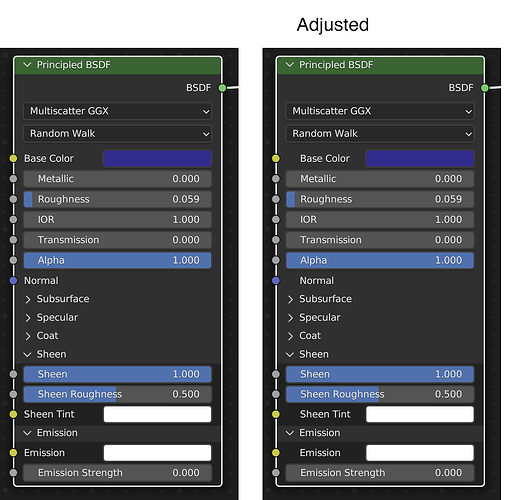
Many people create a diffuse only material by setting Spec to 0. In 3.6, this does exactly that. But opening that file in 4,0, since the default for the IOR is 1.52, it now creates glancing angle reflections with F0 being the only part of the surface to trend down to diffuse.
I wonder if 4.0 could detect this situation upon opening the file and set the IOR to 1.0 for any material with this condition. This would preserve the appearance of the materials.
I’ve just downloaded the latest 4.0 build that now contains panels in the node editor. I really like it, but I’d also like to propose a few tweaks to clean up the look a bit.
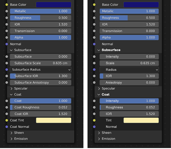
There are some visible text alignment things going on that to my eye make for a more cluttered look. The text is aligned left with the edge of the slider bars, but I think all the text should be aligned with other text elements, not the bars. My mockup shows this to be a cleaner looking appearance which is important for quick look ease of use.
Your mockup definitely is easier to read ![]()
Yea this is a general issue in the UI, but I wholeheartedly agree, this would go a long way for readability and is applicable to all nodes. Also would do the same for dropdowns and booleans, and perhaps unindent the panel titles as well to communicate hierarchy
I agree this is an issue. Actually beyond the text misalignment paper cut, I find it very difficult to understand the hierarchy: panel titles really look like sub-items to me. Probably because of 1. the sockets 2. the indentation 3. the highlighted slider background. That’s a lot of conventions to break:
- TRANSMISSION
- ALPHA
- NORMAL
> Subsurface
Aligning text does make it a bit better, but it would be strange for other nodes to have this indentation if they are not using panels. And it seems important that the indentation is consistant across different nodes.
How about making a kind of collapsible super socket ?

Basically turning the > symbol into a socket, that could also indicate if there are connections even if the panel is collapsed.
one difference here is that the types may vary. The sheen parameters in the above, for instance, take both colors and scalars depending on the parameter.
Might not actually be a big deal tho
Right - what i imagine is a kind of higher level socket that could take different inputs. Maybe it could also be useful for Geometry Nodes (when lists/arrays are integrated?). Eventually you could plug things into it, for instance plugging a float input into the Specular super-socket would connect it to the Specular Factor, and a Vector Input to the Tangent Input.
Visually, it’s would work just like an item list (with no indentation):
- Item 1
- Sub item 1
- Sub item 2
- Item 2
- Sub item 3
- Sub item 4
As a more general UI concept, it would also help avoid having to set up all these kind of sockets manually:
First of all, sorry for not paying attention to this thread ![]()
Regarding the Panel UI discussion: Yeah, there’s still room for improvement. As far as I know, there’s still work planned on this, but I don’t really know enough about the UI area to contribute much there.
Good point, thanks for catching that!
To address it, there’s actually two options, and I’m not sure which one is better:
- Use versioning: Detect any Principled BSDF nodes with fixed (non-connected) Specular and Transmission=0, compute the corresponding adjusted IOR, set the IOR input to that, and reset Specular to 0.5. For the example case of Specular=0, this would result in an IOR of 1.0 regardless of what the original IOR was.
- Implement the Specular input as an IOR adjustment, not as a F0 multiplier: In the original 3.6 code, the specular reflection component completely ignored the IOR input, and instead computed its own IOR based on the Specular input. In the current 4.0 code, it uses the IOR input, but tweaks F0 based on the Specular input. Instead, we could do what e.g. OpenPBR does: Compute an adjusted IOR based on both the IOR and the Specular input, and then use that for both specular and transmission. That would naturally result in the shader using IOR 1.0 if Specular=0, it would be compliant with OpenPBR, and it would integrate nicely with e.g. the Nested Dielectrics in the future. The downside is that the Specular slider would affect refraction, which might be unintuitive.
I’m leaning towards 2), especially since we should rename the Specular input anyways to reduce confusion, so we could make it clear that this is just a legacy/alternative way to tweak IOR.
Any opinions?
Also, side note: Depending on the material, a more realistic approach to get rid of the specular highlight might be to just turn the roughness up to 1.0.
EDIT: Actually, here’s a PR for approach 2), seems to work nicely: #112552 - Cycles/EEVEE: Change Specular input on Principled BSDF to affect IOR - blender - Blender Projects
Ok, sounds intriguing. I will test this first thing in the morning. My only concern is that it functions similar to how the current 4.0A is because it’s fairly logical from a backward compatibility and forward looking approach. I had a discussion with a user who was upset that things were changing from the 3.6 methodology and I told him that he could continue to adjust spec/reflections via the specular channel if that’s what he wanted to do (and because he has a lot of old files that he doesn’t want to break in 4.0).
In 4.0 doesn’t setting the IOR to 1 create a fully diffuse material. I don’t think we need to muck things up linking the specular slider with refraction. Seems like just a slight knowledge adjustment for blender user. “instead of spec 0 IOR 0 for diffuse only”. Or am I wrong about this
Yes, setting the IOR to 1.0 will remove all specular reflections from opaque materials.
I did some more visual exploration for ways to improve the paneling to produce something that’s perhaps more visually clear.
In the attached mockup, all the text is aligned unless a section is expanded where then the sub-entries are indented. All the bars are aligned. For expanded panels, I bolded the name. To me that’s what lets me glance at the panel and know there’s an active area of the node. It’s where I’ve put my attention and so the expansion is highlighted until I collapse it.
For expanded entries, I removed the redundant section name since for instance, Subsurface is states twice in a row, one being a section marker the other a functional entry whose purpose is actually scalar, so I’ve called that Intensity.
I would also remove the darkening behind expanded entries and would use the same background color throughout. I think the darkening just add visual clutter.
One other note about the top down organization that came to mind as I think out loud here. Could it make sense to order things like this:
- Core BSDF functions (base color, metallic, roughness, etc.).
- Sheen
- Coat
- Specular
- Emission
- SSS
My thought process is that since from a functional standpoint each of these material layers sits above or below each other from a reflectance standpoint, why not try and order them that way in the node? Strictly speaking you wouldn’t put the core BSDF at the top, but I think those are very handy up there. Otherwise the ordering seems haphazard to me.
It also makes me wonder why we couldn’t also put those core BSDF functions at the top inside their own panel and call it something like “Base”, with it being expanded by default.


