6 month later, but i just tested the build, and i also found unintuitive that the clearcoat tint can have an influence on color, even if the clearcoat mask is at 0.
I personnaly agree with Eary’s second message and would prefer to see the tint influence multiplied by the clearcoat mask by default.
One of the usecase would be if you have let’s say varnish on wood, the varnish is slightly tinted, but it’s worn out on some edges. With the current build, you have to mix your varnish color map with white depending on the varnish mask, which is just an additional mix node, but in my opinion, should be working without it.
I thought a lot before making this type interface (in both the addons you mentioned)
I agree it seems the best way in the current Blender UI but if something better was proposed wouldn’t be against it. Just haven’t seen a better idea yet.
Hey Lukas. I loved what you did there. Thank you for the newer build. The node got bigger when using all the panels, which is rare, but it got way more compact overall. beautiful. I think green is not a good color for the sections tho. I know it matches the “shaders” color, but I guess some dark gray should be more suitable, less distractive.
Regarding the november 29th build. What exactly changed besides the ui? I see the thin film seems to be fully functioning now. I noticed the specular section have metalic edge and anisotropic configurations there, is this correct or is it temporary?
Regarding the project as a whole: Why does the IOR doesnt affect the metalness? Metals still have IOR correct? since you are unifiying IOR, what is a great thing in my opinion, shouldn’t Metals use the same IOR? if not, the where is the IOR slider for the metals?
Also, would it be possible to have a checkbox on the IOR for legacy behavior, aka specular, for compatibility? I have made a IOR to specular converter using the ((ior-1)/(ior+1)^2)/0.08 in order to account for that and lots of my materials have this. would be nice.
Anyways. keep up the good work. I think UI is perfect now. I really miss transmission roughness, I think it should be preserved for artistic purposes, I have lots of hacky photographic props using transmission roughness. the metal thing confuses me a little but I hope you can explain it.
edit: I also noticed, since we used to use sheen to account for the darkening effect when using the old BSDF, when changing from the GGX to Principled v2 the materials look really off, since now sheen is proper cloth sheen. Would it be great if, at changing from GGX to principled, the sheen was set back to 0.
Metals actually have a completely different way for IoR to be correctly handled. The regular IoR is not actually a good match for them.
You need the more general Complex IoR for proper metals. And if you look what IoR values some metals like, say, silver actually have, it’s actually quite surprising: For certain wavelengths in the visible range, silver will in fact have an IoR smaller than 1. That normally is not something you’d expect to see.
I think this is already in this node though, and it’s handled by a combination of the Base Color, and the Metallic Edge. Those two colors together give you an approximate Complex IoR internally.
Metals can use a single IOR value, usually very high values like 50 to 70, but more accurately they use a complex ior + extinction co-effecient. Those complex IORs are usually less than one and I honestly don’t think this would be super user friendly and their benefit would also be marginal for those who know to look up these values. I tend to think the more novie/artist friendly mechanism now in place works better.
I see. thank you. I imagined the metallic edge had something to do with it, but couldnt tell.
Yeah, lower than 1 IOR is a thing apparently. gold is 0.47 according to (insert random first page google search result website here). But then I think you are correct in saying it wouldn’t help to have the IOR affect the metals.
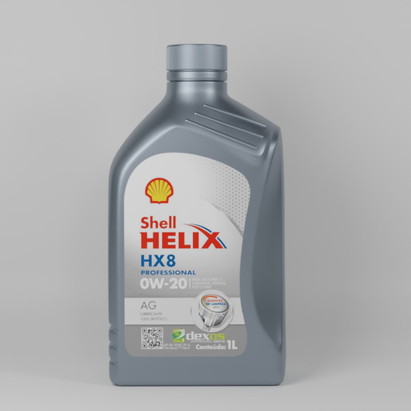
Since we are here, I have a question. Most people say you should use the metalic slider wither all the way to 1, or then 0. However, these days I was trying to match the material on a plastic car oil bottle. those Shell Helix ones. They have a amost metallic reflection and the only way I could match it was using the metalic slider at like 0.5 and roughness around 0.35. I tried with metalic all the way to 1 and without it, only specular, but nothing was quite matching. Any opinions?
There’s nothing wrong with that. It’s just mixing a diffuse version and metallic version together to get those in-between values. If that produces the look you need go for it.
Artistically speaking, yeah, nothing wrong with that. Realistically speaking though, that would not be correct. Nacre would probably best be done with some thin film effects
Hey guys,
for me as an experienced user, there is an huge need for better quality of shaders in blender, if the UI becomes a bit bigger, tbh i dont care.
Just check other awesome renderengines, where you create hyperrealistic materials with physical accuracy
I swapped back to another Engine instead of Blender / Cycles just to have the ability to create better shaders and a higher photoreaslism in my renderings.
Just focus on the integration of the functions first, usability is coming later i guess.
@lukasstockner97 , @brecht If you happen to like this, I would be honored if you’d like to use this as a Principled V2 Sheen showcase in the Release Notes.
I would agree, and that’s what’s happening with PV2. The new energy conservation is a big part of this. If you get a chance to watch the presentation about all the work going into PV2, it’s really worth watching.
Thanks! Seeing it back for the first time since late last evening, I think you’re right about the mineral impression.
The bounced color effects have become exaggerated by post-processing. This is the rendering without post-processing, maybe I should have left it as it was:
Could you be more specific?
What is it exactly, that you find lacking in the shaders?
Maybe what you’re thinking of isn’t a shader problem, but rather color management or Cycles inability for Light spectrum dispersion?
yeah, if doing a mixture gets the job done, that’s artistically completely fine. I’m pretty sure that’s not correct if you strive for complete realism though. That requires different shaders to “do right”, I think.


