Does the light scatter need to be visible in the shader window?
If not, could it be moved to a N-panel with its drop down options, as it feels like it’s using up valuable space.
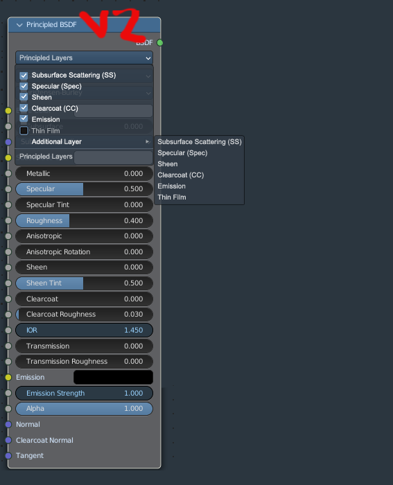
Also i did a small variation @lsscpp, the idea here is to make the closed sections inputs less stand out as they are closed (hence they are in the background more.
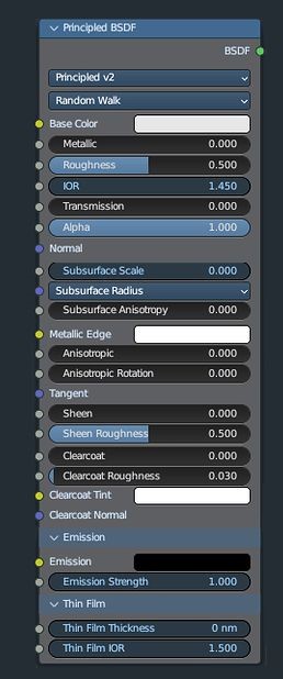
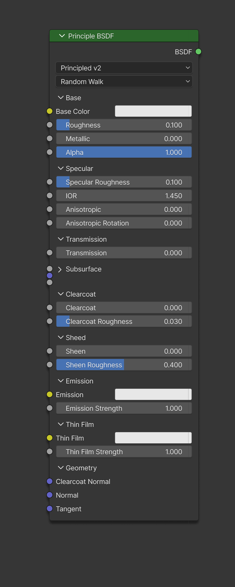
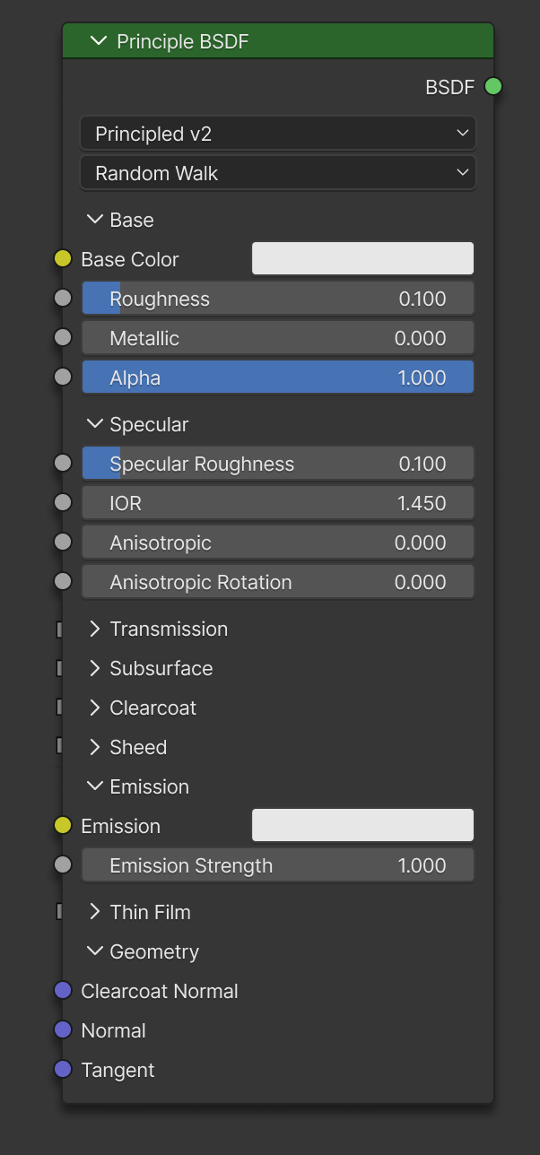
Sockets in collapsed subpanels are at half spacing and have no labels.
Optionally, it could also hide any unconnected sockets, but that has its own tradeoffs.
This is a bit off-topic.
An instanced node, as you depict, is the same thing as a nodegroup with a single node inside, the only difference being visible and editable settings. Speaking of cleaniness, that’s debatable.
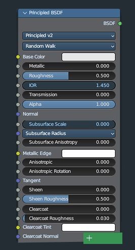
Its still a waste of space, so it conflicts with the purpose of making node shorter, since it waste space by blank space under. I think AMD Radeon or Renderman logic of adding new sections by clicking panels is better than collapsable headers if headers will waste so much space I wish it was used instead of collapsables
I checked the new branch, the additional 6 headers/subheaders almost make it 6 row longer than the principled without any header, so I dont understand the point of making headers if it will make it longer for someone who will use all the features of principled at the same time, it will make it longer.
Can someone add checkbox on N-Panel or on the node to disable categories? so some can have the option to disable this subcategorizing system, because it can cause more trouble than benefit for some people.
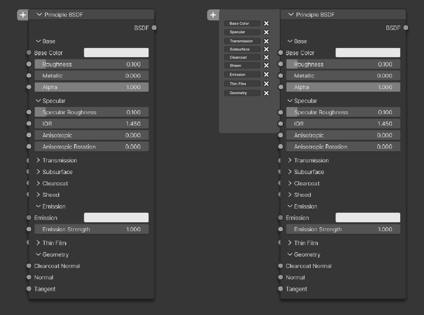
The + Button is easy to see and it does not intrude on the node itself or the rest of the tree.
The window saves space, it’s easy to use and intuitive(maybe) as it offloads clutter to an extra window which you can expand if you want to add more options down the line, this would only be for the Uber BSDF shader.
You could even place the toggle options in the N-panel as well.
There’s really no need for a dropdown window that takes up extra space.
its a good idea too but devs might be against new symbols and prefer the regular drop down more because it is more like a functionality that is found in UI of blender already . Thats why I try to find designs that already found in UI, but this design is cool too I think .
By the way, 1-2 dropdown is not what I was talking about wasted space.
the problem I was trying to adress is the headers/subcategories that waste space (like 6 row extra length ) when they are all in open form it make node longer than regular BSDF without subcategories system, so if my dropdown checkbox or your Plus sign method is used, then headers/subcategories will be gone and it will make node shorter and still be able to change or add new layers/categories.
Since the screen space is at a premium, trying to figure out how to make the windows more efficient/smaller without losing perspective over them with all the potential options available is what i’m thinking about.
So, since the Uber BSDF node is rather very tall, even when you consider how much option’s it has, i just logically assumed that adding more verticality might not be the solution, so i added the +window that would open horizontally to balance it out,
reason is, our screens are horizontally wider than vertically, so the most efficient solution is to use the horizontal space to it’s maxium, or as much as possible .
I fully agree, so I really dont like vertically alligned new UI of Blender 2.8, which make even properties editor longer than ever by many subcategories of advanced options compared to good old parameters that are side by side, so I also dont understand that point of adding sub-headers to every part of UI that make things logner than ever.
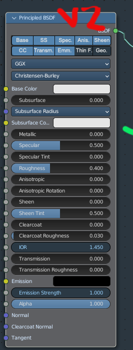
Princpled BSDF is almost turning into this with subcategories, with all that loss of space and making things so long vertically when u open each category
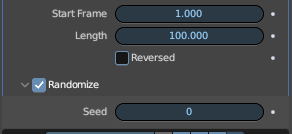
Look at it, just to turn off randomize on seed in a modifier, it has a subcategory and seed is placed under subcategory, so I have no words for that… Instead of just putting randomize in same row, everything is too much categorized into subcategories when its not needed.
So I feel ur concerns, thats why I am against adding subpanels to principled BSDF which will make things harder to see big picture in a compact and design with efficient use of space instead of many blank spaces or unnecessary subcategories. If subpanels are added, I am sure I will make a node group of principled BSDF to get rid of that subpanels that make things longer,
So when Blender try to make things more organized it always end up being vertical and wasted space, when it should use horizontal space,
This solution - as well as the others - to make Principled BSDF a kind of modular node, brings to my mind the Occam’s razor.
Why putting in more in order to have less?
Well, since there are many workflows and some depend on efficient use of space and functions it would be interesting to have toggle functions in the Uber node or a way to make the node smaller, modularity and all that.
The screenspace is at a premium after all, and the node will only get taller (i guess), so it would make sense to optimize it somehow. Shrug
I like the idea of the new vertical UI. But it’s just unfinished.
What it lacks is breaking things into more columns, if the panel is wide enough, which is why it’s wasting so much vertical space… it also wastes horizontal space, by aligning the text and the value to the middle:
Especially bad with horizontal space wasting with checkboxes…
Such text alignment also makes it harder to read quickly, because the first letter of any title is not aligned vertically, so the eyes go in zigzags…
Back to topic, Talkin about the long Principled node: It never bothered me that it’s long. At all. I am ok with how it is. if stuff overwhelms me in the shader editor, a quick solution: I put it in a group and I expose the inputs I need.
And if the material tab in the properties is solved (That is where, i’d say, collapsing options are important), as I described before, the user will not need to spend so much time in the shader editor, so it matters even less…
Kind of. But there are specific differences that make instanced nodes better than a single node in a nodegroup:
The settings of a node in a nodegroup cannot be accessed on the top level. You’d have to go inside the node group to change them. All settings of the one node would be exposed on the instanced node.
Making a node group, adds it to the list of nodegroups. An instance node wouldn’t.
Yes I agree, Thats what I mean, it should be flexible, they keep removing columns from everywhere absolutely instead of removing columns in flexible way by letting interface decide to have them horizontal or vertical depending on width,
as u showed in screenshot, so much blanks space, even webdesigns has flexbox or grid system or other methods to align text vertically if its narrow and align text horizontally when its wide , but blender only use vertical alignment even when its long, it becomes meaningless, So its unfinished due to having ‘‘absolutely vertical alignment’’ rather than ‘‘flexible vertical- horizontal interchanging alignments depending on width’’. So for me, I cant say I liked it there should be a middle way between 2.79 and 2.8, two of them are too absolute, like black and white,
Yes, long node wouldnt bother me if there were no add additional collapsable subcategories that cause extra longness like 6 row but , only blank headers that waste space bothers me that. So I hope there will be node options on N-Panel for people who dont wanna have any collapsable subcategories on nodes,
In all seriousness, if you drag out the width of the properties editor like in your screenshot then “wasted space” is certainly not the fault of the vertical UI layout.
This was already discussed to death several years ago when Blender switched to the new layout. Dig it up.
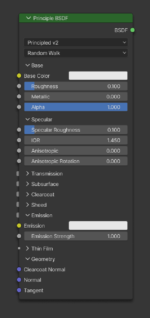
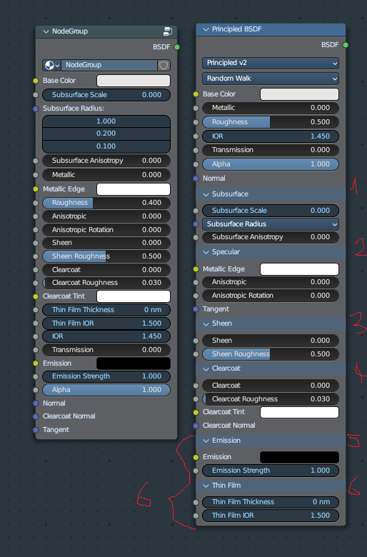
This is my simple mockup- basically emission and thin film are hidden behind a plus button that when clicked the node expands at the bottom of those options. Feels more like the original principled node in size for most use cases.
and expanded with plus bottom button
a node group is still far more powerful since it can hold more than one node. Yes an “instance node” features parameters in front of your face, but then a new problem arise: how to show the relationship of twin nodes? And when there are many different instances?
you can just add a . (dot) at the beginning of the nodegroup name to hide it from the list
 .
.