Portal Links Exploration

I made a little mockup how I liked this to behave. I thought using reroutes would make some sense

or just make the reroute dots expandable to a node with ‘h’, in noncompact display it could have a setting to select the receiving node and an option to show/hide the noodle or change its hue and opacity

edit: like this

5 Likes

I really like this idea. Expanding reroutes to become portals when hit with a hotkey we’re already all familiar with… that needs visual design but I think this is spot-on

1 Like

Having some sort of “jump to source/destination” operation - for all sockets rather than just reroutes - would be really generally useful!

I personally would like “portals” to just be hidden node links; preferably activated with a similar swipe gesture to cutting/muting and displayed similar to Erindale’s mock up. I think that could make cleaning up node trees a breeze.
Maybe with some kind of debug overlay to show links despite being hidden.


I also prototyped auto-propagating reroute labels from connected sockets/reroutes and together with hidden links (or D13675) I could see this being handy:

4 Likes

If we get node instancing functionality, we can instance a reroute node and get the same result as portals.

2 Likes

I am so excited for this functionality!
It would make nodes so much more organized :crossed_fingers:t2:

I’ve been thinking about this, and the main issue I worry about is that when people start using this to make node networks, hidden links will inevitably create some confusion. The idea of node based workflows is that the connections actually show you how the data flows. If you give users option to hide these connections, node networks turn into clouds of randomly floating disconnected node rectangles, especially if people overuse it.

I think it can be useful, but most of the proposals for the portal design above fluctuate between two extremes:

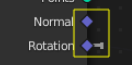
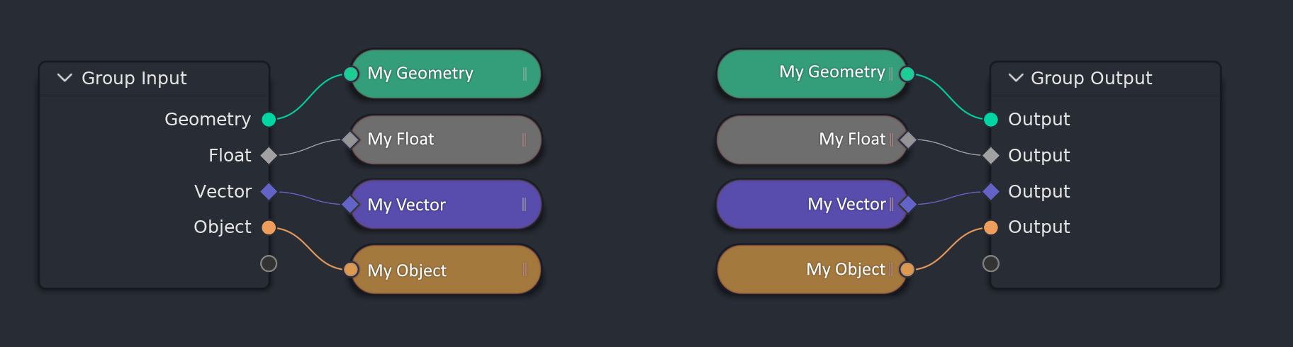
  1. Too unobvious design, where usage of portals is not visible enough, and they just look very similar to disconnected reroutes. It’s doesn’t sufficiently communicate at glance that the connection exist, but goes through a portal.
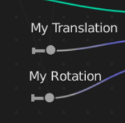
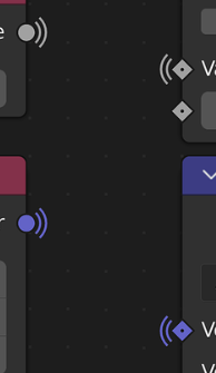
    image
    image
    image
    image
    Those would be bad.
  2. The other extreme of turning this utility feature into an actual node, causing tons of visual clutter, and confusion, since it no longer appears it’s just a portal, but instead looks like full fledged terminal output node:

I think rather than having to choose between the two extremes, we should have something in between. Something that’s more obvious than a simple named reroute circle, but something that’s not as visually and mechanically complex as a full node.
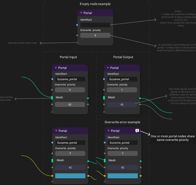
Here’s my idea:

Mechanically, there are some unanswered questions still:

  • What would happen if you have multiple portal inputs and one portal output of same name? This implies that simple portals should be always limited to a single instance of input of a given name.

  • We may need additional type of portal - a multi-socket portal, similar to the socke type for example the join geometry node has. This portal type would allow multiple instances of input of a given name, so that you could use multiple portal inputs in your node tree, and just single output feeding into for example the join geometry node.

That way, you would not need to have a large vertical column of multiple, individually named portal outputs next to your join geometry node.

On the other hand, this could actually be a good thing. Having multiple portal outputs labeled for example “Roof”, “Walls”, “Floors”, “Windows”, etc… feeding into a join geometry node is more communicative than just having one “My Geometry stuff” portal output feeding into it. So when you want to collect geometry outputs from multiple places across your node network to join them together at some terminal point, to prevent node graphs like these:


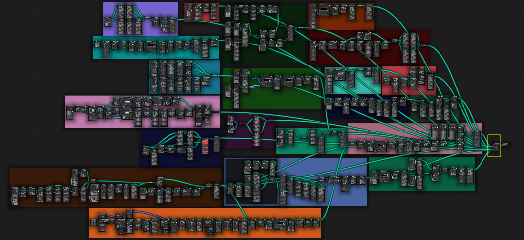
It would make more sense to have unique portal for each of the sections you are joining together, rather than using single multi-input portal of same name. So in the end, limitation of not having multi-input portals could actually be benficial.

13 Likes

I rather like this mockup. 1 thing I’d like to see on top of this is noodles being drawn between the portal ‘labels’ on mouse-hover, to ease finding the corresponding portal in a big tree. Or maybe even a small button/toggle which you can use to (temporarily) turn drawing of noodles on.

I think it could be as simple as making double clicking any of the output portal nodes automatically select the corresponding portal input and pan the view to it (as there would be only one input allowed), and double clicking the input would select and pan to the output. If there were multiple output, double clicking the input would select all the outputs, and use “Frame selected” operation to show them all in one view.

Alternatively, if double click would cause some conflict, the portal nodes could have just a simple icon button for this task, something like small magnifier glass icon button.

1 Like

So just by passing a name? it could work, I only worry about it being noticeable, otherwise I think it can make sharing and reading/understanding node trees more difficult instead.

I made this new mockup today… portal link by magnet looking portal /thin lightning bolt as node wire (the lightning bolt wire you could turn on or off) magnets could also be coloured perhaps. Magnets might be a good design shape, since people know that a magnet attracts something else.
basic
with colours
magnets with colours

with bolt
With thin electric bolt node wires.

Most simple, straightforward, and best solution imo. Also pretty similar to how “Stamps” are used inside Nuke in several vfx companies.

8 Likes

It would be great if it had a different unique visual shape, cause atm they look like collapsed nodes

3 Likes

That’s the point. Reusing existing visual language instead of introducing new one.

That being said, I think collapsed nodes should go away. They often look odd and ugly, especially those with many inputs. Ideally, the arrow button, which currently collapses the node would be changed to perform hiding unused node sockets, and the hide unused node sockets feature would get option to make nodes even more compact, to approach the level of the current collapsed node compactness.

The main reason people collapse node more often than they hide unused node sockets is that the hide unused node sockets feature is hidden under hardly discoverable keyboard shortcut while the collapse node is available as an arrow icon button right on the nodes.

Right now, the button turns this:


Into this:

Which isn’t that great.

Ideally, the arrow button would do the “hide unused node sockets” operation - this:

And the “hide unused node sockets” operator would get an “extra compact” option, which would do this:

EDIT:

Here’s another example of current node collapsing vs hide unused node sockets with proposed extra compact option:

Uncollapsed:

Collapsed:

Hide unused node sockets (currently available in vanilla blender):

Hide unused node sockets with proposed extra compact option:

So the little arrow on each node would be changed to perform “hide unused node sockets” operation with “extra compact” proposed option. This would remove the ugly collapsed nodes, and leave the visual language of round nodes for portal nodes.

Notice how the extra compacted socket-hidden nodes don’t take much more space than the collapsed nodes, but give you much more information at glance (names of the sockets).

12 Likes

Totally agree that! The gigantic principled BSDF node looks so ugly and useless when being “Collapsed”.

Hiding is very useful for math nodes and stuff like that. Basically small nodes whose inputs are clear.

3 Likes

I think you mean collapsing?

I like the collapsing feature. But imo collapsing should by default also always hide the unused sockets.

Ah, yes, sorry, of course. Collapsing is very usful for small nodes like math nodes and should not go away.

I don’t see much difference between this:
image
and this:
image

Collapsed node gives you information that it has two inputs, hidden compact node gives you an information of the input names. It’s a tradeoff, one is not really any better than the other, because in both cases, you can not see the value of the other input. Ultimately the compact hidden one wins, because it looks less ugly and the node links remain more straight.

1 Like

I disagree. The collapsed one is better because it indicates that it has two inputs, is smaller and with its distinct shape tells the user that there is hidden stuff.
Knowing the inputs names is not useful when it comes to math nodes.

3 Likes

Geonodes have introduced new data types, multi-input sockets, there are now string fields in some nodes, etc… I believe this complexity calls for a reimagining of the node display options. Old ones just don’t fit the bill anymore.

I personally would strive for consistency in the nodes’ appearance, and try to avoid giving them a different shape altogether depending on the state they’re in. I don’t like the fact that collapsed nodes are roundish, they stand out too much. On the other hand there definitely needs to be some hint that not all inputs are shown, but I don’t think that’s such a big challenge.

3 Likes