PROBLEM
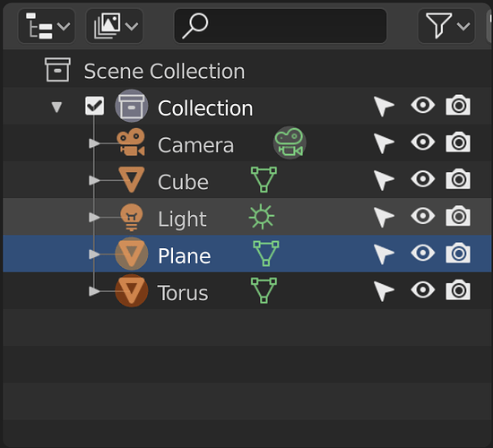
A lot of selection information is crammed into the outliner. It’s useful, but maybe could use some added clarity. In the screenshot below, in the viewport I have selected the torus and the plane.
There are so many selection-related indications going on it is very hard to tell (at a glance) which objects are going to be affected by viewport commands/actions. This is often how I personally use the outliner, as a visual guide to what’s selected in the viewport–it’s nice to see the object names!
For me the blue highlighting has much more visual weight than the circularly outlined icon indicators. I really have to look closely to figure out what is viewport selected, which makes it less useful to me.
Also the gray highlighting over the Light object, which I guess indicates whatever the cursor was last hovering over, adds to the visual complexity. I’m not sure why that needs to be persistent when the focus has left the outliner . . . I can believe there might be a reason, but it is confusing when it’s left in a state like the screenshot.
SOLUTION
I realize interface issues are tricky and a lot of thought is going into these matters. Here is my $.02:
- Functionally speaking, I suggest trying to increase the visual weight of the viewport selection status. I have two specific suggestions, but really anything that accomplishes the functional goal would be welcome.
- Unless there is a good reason to leave the “graying” persistent when the focus has left the outliner, I would suggest just removing that aspect of the indication when the focus leaves.
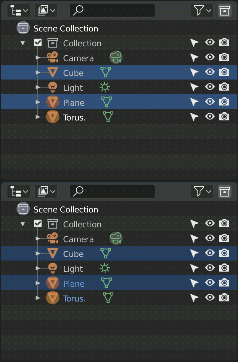
As to how specifically to change the visual weight: perhaps things would be clearer if, in addition to the circle highlighting, the viewport-selected item names appeared in another color, and then the ui dialed back on the blue-selection intensity a bit.
Since I am limited to one screenshot per post as a new user, I guess I am going to have to put the mockups I created in later posts.
Anyway . . . fantastic work on 2.8, hope this is of some assistance.


 It will slow down as we enter UI freeze so it will be time again to start piling up the things to fix for 2.81