Maybe I don’t understand your issue. 
In short the squiggle menu has text next to it including the shortcut.
And beside that there’s a manual:
https://docs.blender.org/manual/en/latest/animation/keyframes/introduction.html#handles-interpolation-mode-display
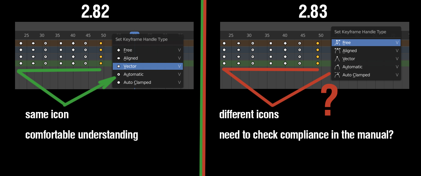
Squiggles?!? That is quite obviously a dancing man, someone enforcing social distance, then a mountain. Next is a diamond ring and then an illustration of scratching that diamond ring against glass to test if it is authentic. But not to worry as we will soon replace those squares & circles with pink hearts, yellow moons, orange stars, and green clovers. LOL
15 Likes
Most icons were clear to me. But I think diamond ring needs some update. 
I want to leave some feedback on the icons.
I really loved the design of snapping icons in 2.80.
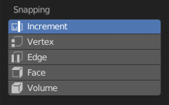
Starting 2.81 it’s inferior in readability in my mind.
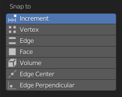
I understand the decision was made to go with new icon set but for me 2.80 were way better there.
At least implement side loading of users’s icons as in this proposal (D5655). It seem like it’s almost ready to go.
The icons are a great way to improve how much I enjoy working in Blender. The change of the icons’ desing in snapping menu makes me stumble now when I need to use it. Previous one was way better.
11 Likes
I think it is about readability of a scheme.
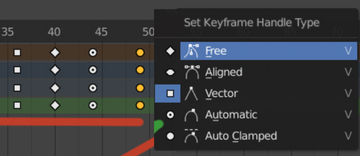
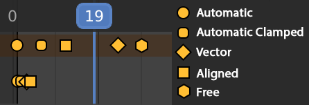
There is no description of an animation signs anywhere except manual, so it is easy to create a desired keyframe, because icon clearly show its action and behavior, but hard to read resulting keyframes set after that, because of no correlation in interface.
There is a need for signs decryption to read animation set.
7 Likes
Ideally this would include both icons - one to tell the user what the handle type does, and another to tell you which key icon it represents. It’s a little tricky to do this in the code, but it should be possible.
3 Likes
Is there a reason why only the Handle Type is displayed from the Dope Sheet? From the Timeline the keys are always represented as rhombus
Turning it around, it would make more sense for me to represent them like this
12 Likes
That mockup makes quite a lot of sense, tbh.
1 Like
Imho this is preferrable to the pictograms. Pictograms are nice for learning, but even then a beginner would quickly try out all possible handle types and figure out what they do, so I reckon it’s better to use the same icon all over.
Could we have some kind of crop icon for the toolbar?

Or:
![]()
This one doesn’t work for this purpose:
3 Likes
Where can I find the design specifications for UI icons?
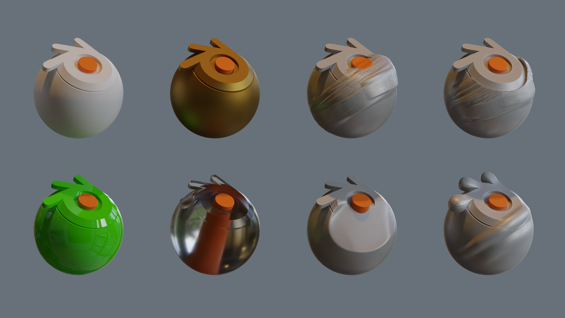
Going around the icons more, I have created an object that I think can work to show the properties of the materials and also of the sculpture brushes.
It has a couple of simple Mesh and Face Sets.
It has fine areas, interior objects, flat surfaces, ridges and corners.
I think it is still a simple way, and it also has a corporate image.
7 Likes
Love it! Can you share the blend??
1 Like
Open it with 2.9 to avoid losing the FaceSets.
Render models have Subdivision, and Multires sculpt models.
4 Likes
Thanks man! 
1 Like
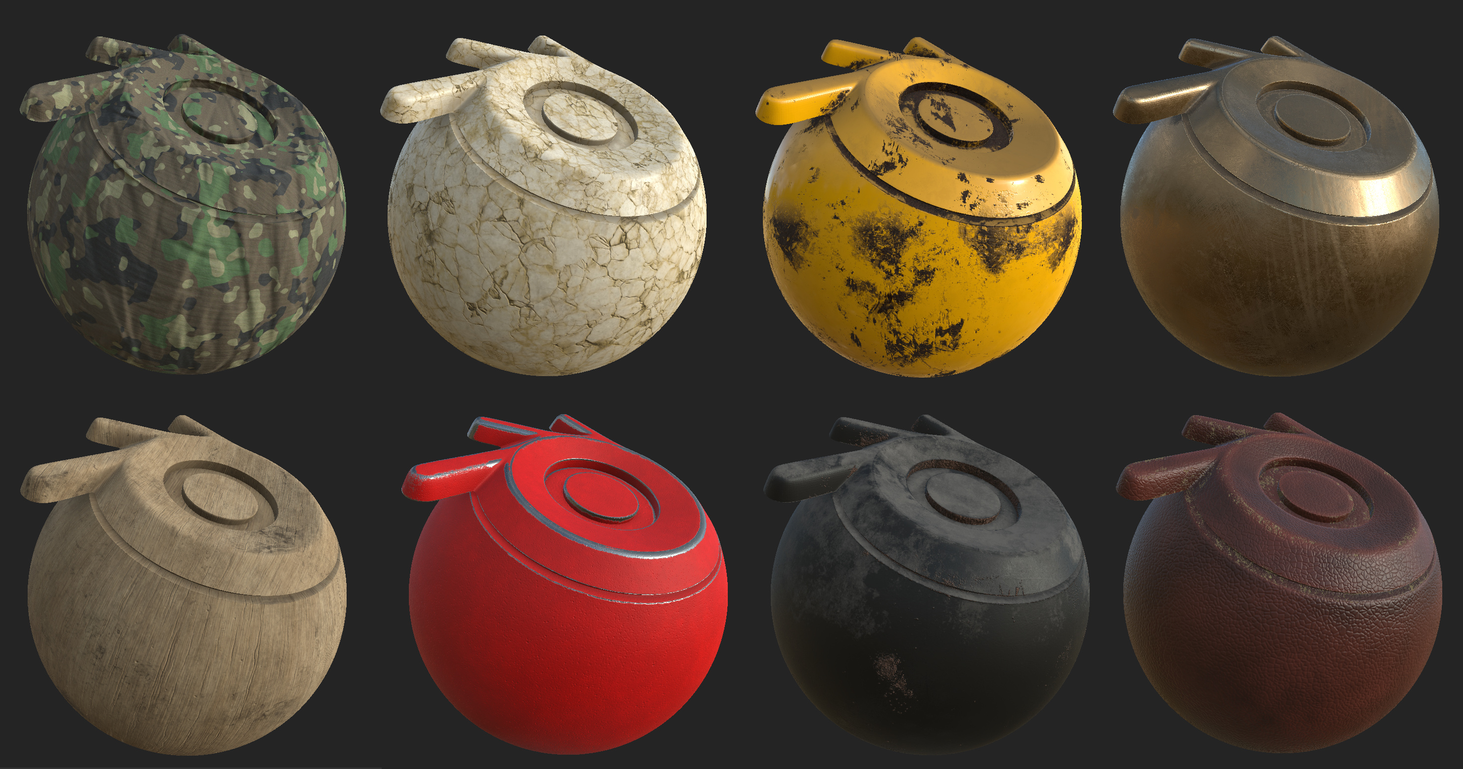
I have rounded the shapes a bit although the center is still completely flat.
I’ve also generated the coordinate map to apply texture.
These screenshots are from SP smart materials, and they have a little perspective.
The grill is to see how it would feel in an Asset Manager.
I have updated the file of the Drive, although I also keep the previous ball.
24 Likes
This looks tremendously better than the previous sample. I didn’t like the look of the previous one but I really like this one.
3 Likes