Present: Hans Goudey, Julian Eisel, Nathan Craddock, Pablo Vazquez
Organization
- Next week’s meeting will be later in the day to accomodate Australia and US time zones. This isn’t a permantent change, and can be considered flexible.
- The changed meeting time might also allow contributors to join.
- There was more discussion about better involving contributors in roadmap projects.
- Some further discussion and review for the “Blender Design Manifesto” Julian proposed. Can be sent to Ton for feedback soon.
2.92 Release
- Add-object tool
- Feedback is that the plane that appears below the mouse is distracting.
- Campbell already made it scale based on depth.
- Pablo will check if further tweaks are needed.
2.93 Release
- Asset Browser
- How should hierarchy be represented in the asset browser?
- The file system folder layout will probably have to be displayable. This has UI design implications (needs navigation buttons, path needs to be displayed, etc.).
- There may be needs for a hierarchical way to group assets, not tied to the file layout on disk, e.g. for pose libraries. Can be investigated further, but not prioritized.
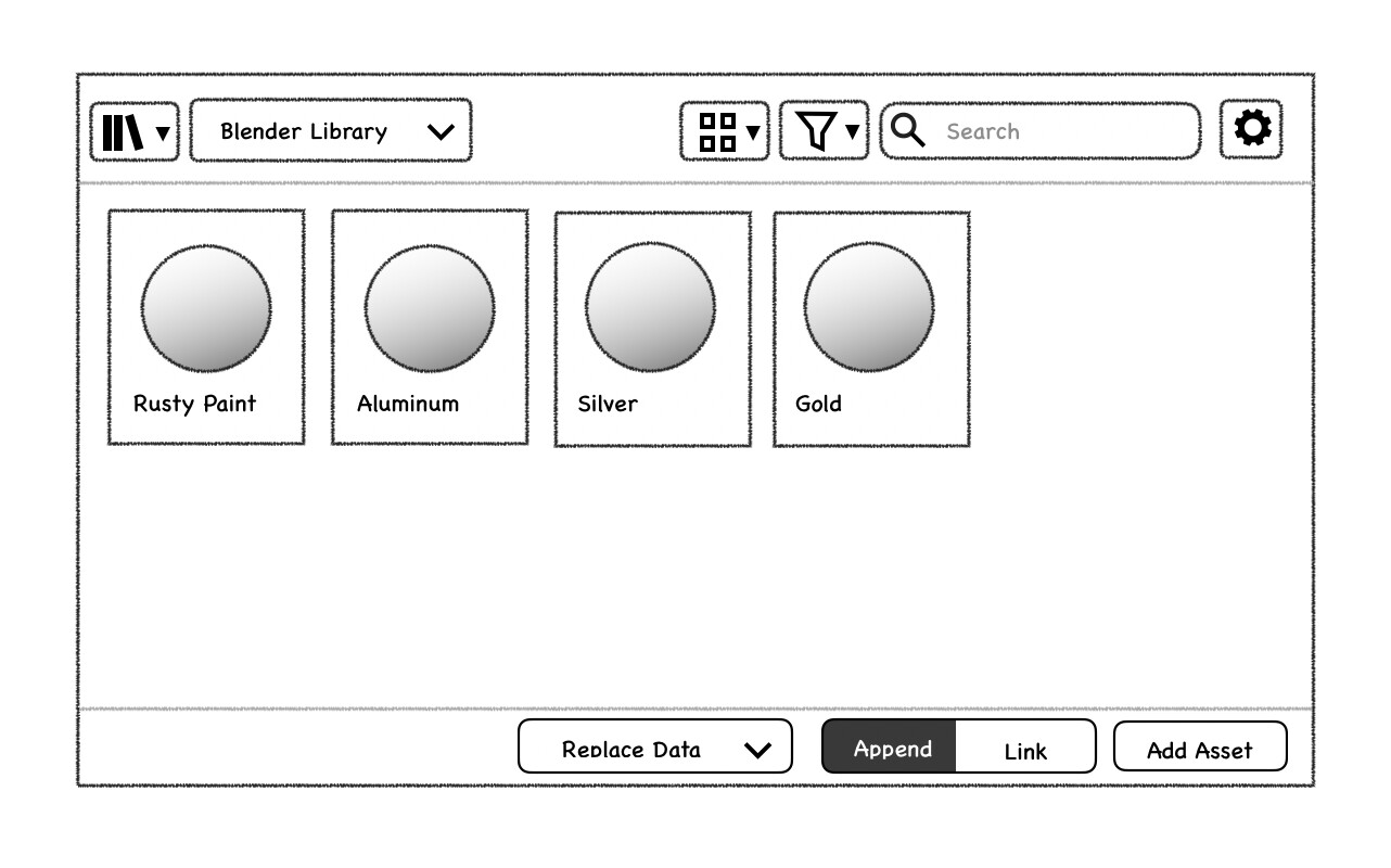
- Adjusting settings for drag and drop from the asset browser:
- There should (at some point) be a bar at the bottom with basic settings like Link vs Append, “Replace Data vs Add”, and maybe a couple others.
- Modifier keys could also change the action (e.g. link vs. append) while dragging, providing visual feedback like in the outliner.
- Asset Browser mockups already include this. They also include an “Add Asset” button which could be problematic: “Add Asset” would have to guess what to do with the asset, e.g. how to apply an image asset when there is a sequencer and a node editor open. When dragging in assets, the editors can decide much better what happens on drop.
- Less general settings should be placed in the “Adjust Last Operation” panel for tweaking after the drag and drop.
- How should hierarchy be represented in the asset browser?
General Design Review and Tasks
- Pose Libraries
- This project represents a clear use case for the asset browser and is being worked on now.
- Because of that it would make sense to treat it as a “squad” project and use it to finalize some of the basic design of the asset browser.
- The current design proposal by Sybren uses tags for hierarchical grouping/filtering, with a rather unusual UI. Something to look at.
- The settings for applying the pose can go in the bottom bar as discussed above.
- Node editor error messages
- The WIP changes have it just like the modifier error messages
- Changes agreed on in the meeting will move the icon to the header and display the message in a tooltip, which will allow space for longer messages and address problems with multi-line labels.
Next meeting: 2020-01-27, 9PM CET.