Loading Dialog

When you select File / Open to load a blend file, it can seem like the program has hung . Quite often the menu will remain open and onscreen the entire time, there is no “waiting” cursor, and no indication that anything is actually happening. You are just stuck staring at the old thing until the new thing arrives.

Idea number one. Any open menus are closed, a “waiting” cursor is shown, and a small dialog that contains the thumbnail and a bit of text.
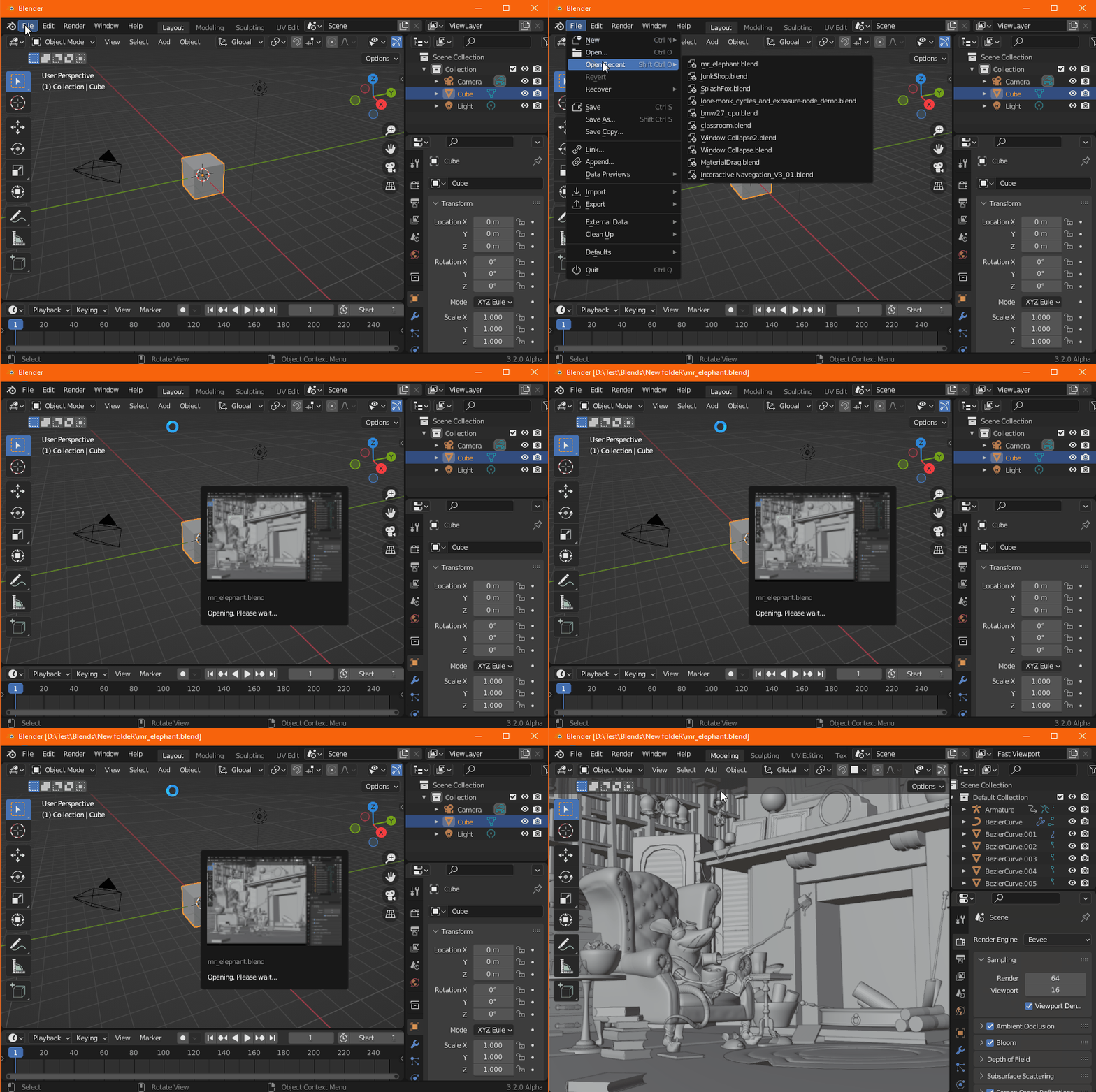
MrElephant2

Idea number two. As above except we show the thumbnail over the entire window, so basically showing an instant low-res preview that is then replaced with the final layout.

MrElephant

With either idea there could be lots of changes to the dialog itself, so if you imagine it bigger, smaller, change of text, whatever, then paste a mockup of how you’d like it to look.

With idea one we could also obscure the background by some means, so darkening perhaps, if you’d like that.

With idea two there is a complication in that you might have the preview type set to “Camera View” but then have a workspace window that is very tall or very wide. Do we then add black bars to the top and bottom or sides so that the thumbnail is not stretched too much?

Comments, ideas, complaints, mockups, cheer, jeers, and whinges all welcome. Something you can’t have though is a progress bar or any other animated widget because that can’t be done reliably and I’m far too lazy for that anyway.
32 Likes

This is just my person opinion, I prefer something like “Idea Number 1” (small loading dialog pop-up).

This is because the thumbnail included in the .blend file can be very different from what the UI will actually look like once the file has loaded, as such showing the thumbnail across the entire Blender window (Idea Number 2), then switching to the Blender UI once it’s loaded can be quite “jarring” if the thumbnail and final UI are significantly different.

Take for example a .blend saved on a computer with a dark theme and you opened it in Blender with a light theme. The change from dark theme thumbnail to light theme Blender after loading is quite “jarring” with “Idea Number 2”. With “Idea Number 1”, the preview is contained within a small window meaning any differences in the UI between the thumbnail and the final loaded result isn’t that “jarring”.

15 Likes

A thumbnail or preview is nice because it sometimes can help to identify if you are accidentally loading the wrong file.
However, it would be lot more useful in combination with a “cancle” button. Otherwise I either have to wait for 5 minutes until my large file has opened then load the correct one or I have to kill and restart Blender.

Another nice to have feature would be a loading bar indicating how much time remains. But only if it is a good loading bar and not one the rushes from 0% to 98% then loiters for 2 minutes before moving on to 100%. Good loading bars seem to be difficult. Bad loading bars are worse than no loading bars IMO.

6 Likes

I still don’t intuitively understand what thumbnail I’m gonna get (the whole UI or a “material preview” render?—I’m sure there’s a logic to it, I’m just too lazy to figure it out) so I have to agree with Alaska that Idea#2 would probably not work. Aesthetically too drastic and intrusive anyways imo, even if it would.

I like the Idea#1, especially the little preview. One little spar I have with the Blender UI from time to time is when I tell it to close the whole window or open a new file and nothing happens, which confuses me for a second or two. Then I realize there must be an “Are you sure?” prompt under the current floating Preferences window. That prompt doesn’t take priority over the always-on-top floating windows like Preferences or the Drivers Editor, and it immediately gets dismissed when you click anywhere outside itself. Not to mention Blender default theme is quite dark enough that it can be hard to notice even when there is no floating window. Could (should?) that be remedied along with this change? Could (should?) we also have a “this is the thumbnail it’s gonna have” preview when we save before closing, so it’s a more noticeable prompt (and we can cancel and change our viewport to get a better thumbnail if we care for such a thing)?

4 Likes

Yes, me too. Number one just makes more sense. I only cling to 2 because I find it and interesting and fun idea.

If that’s a problem with it set to “auto” then just set it to something else explicitly. Preferences / Save & Load / File Preview Type.

That’s completely unrelated to this topic.

2 Likes

Number 1, absolutely. Though I’d personally prefer a more rectangular look. Feels more fitting to standard monitor resolutions being widescreen nowadays.

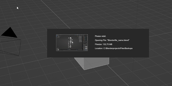
Bit of text could also include the filesize, Name and Location from where the user is opening the file (if the path isn’t too long). It can happen that the user … well … I occasionally do open stuff from where I don’t intend to (too many servers and folders) or klick the wrong thing in the list and wonder why it takes so long to load.

Number 2 is a pretty cool idea but it also feels kind of gamey. A thumbnail preview in the preview is absolutely enough.

8 Likes

I prefer option 1, the thumbnail would probably be very grainy on a high-dpi monitor.
Since a time estimation is not possible, you could perhaps show some scene statistics, such as vertex count, object numbers, etc. in the pop-up window. All the information that at least gives you a clue about how much data is loaded.

And maybe, if there are renders within the blend file, you could cycle those every 10s or so?

1 Like

Yeah, still a fan of #1 if anything has to be done here. We don’t have enough pixels in the thumbnail to scale to full-window size and then blur over top. It’s still pretty jarring when the real UI pops into place and wouldn’t work for the Camera view type very often I think.

For #1 you could perhaps darken, very slightly, the entire UI with maybe a full-window, semi-opaque, rect to focus more attention on the dialog in front and indicate you can’t interact with the main UI just yet. Or maybe not. Just don’t make the darken operation or whatever too jarring.

4 Likes

Any chance this “wait please” function is going to be exposed in Python? Would be really nice to have when making functions that take a while to finish, a user might be confused since to them it seems Blender just froze.

Edit: I also cast my vote for option 1

6 Likes

I like this ! good idea

2 Likes

I vote for ‘#1’ as well: it better conveys the message of “Blender is now switching to a new thing” (as per the tumbnail) than ‘#2’.

On darkening the screen, as @deadpin suggests: it might be a nice added touch, but not necessary for me: 1) Blender does not ‘darken’ on any other modal action (afaik) - the behavior would break consistency, 2) file loading is a specific / intentional user action, attention will already be on the loading action, also since you can’t do anything else anyway during loading.

1 Like

#1 sounds like the way to go.

1 Like

I would also like to tell that importing a model (collada, …) Can take a long time too.
Yesterday I imported a big collada model and it took more then a minute.
I thought Blender crashed but it was still busy.

A same dialog should be shown for importing models so the user knows Blender is busy.
(Of course no thumbnail here)

3 Likes

Great idea! I’ll take a look at doing that after (if) we get the regular file loading dialog in.

4 Likes

I like the idea of giving user more feedback when loading big files. I worked on a small prototype that I think helps with the idea. It’s mostly based on your idea @Harleya but I wanted to add some touches I thought it was missing.

4 Likes

Oh, I would love to do that! But I just haven’t found a way…

You shouldn’t take the following as the final word on any of this, but just my (limited) understanding of the situation today. You could prove me wrong tomorrow, and I’d be happy.

But our UI system is based on buttons and inputs and other things in blocks and regions which are inside areas, screens, and windows, etc. When we load a new file all those things are destroyed and then are built up again from the contents of the new file. In the middle of the process we just don’t have a working system to display pretty content.

You see this in current code when you select File / “Open Recent” and select a file that takes a while to load. You will see the menu remain open during much of the loading. The menu doesn’t actually remain “open”, it is just that the window is not painted again for a long time and you just keep seeing the last thing displayed.

My patch takes advantage of that by first redrawing the window, so the menu is drawn as closed, then the loading dialog is drawn just before the new file is loaded. But this dialog isn’t really “live”, it just continues to be visible while the new file loads just because it is the last thing drawn before the new content is drawn. It is basically frozen in time until the new file comes to life.

3 Likes

Yes, I think you’re right. I don’t have in-depth knowledge how UI re-draws and when but from what I’ve gathered over time following conversations and engaging in some I’d say your assumption is right. Which is sad since we can’t achieve certain desired interactivity with UI to improve user UX.

I’d love if these limitations could be removed. Still, I hope my prototype could give devs the idea what we’re missing with some interactions.