If you go into Preferences / Themes / Text Style you will see that for the three different interface items we have a choice of “Kerning Style”: “Unfitted” and “Fitted”, with the latter being default.
“Unfitted” is not a thing, there aren’t multiple kerning styles, it is typographically bad, and this is a bug and not a feature. It is born from a misunderstanding of the FreeType API. Explaining this is fairly straight-forward, but it might still be hard to remove if some users insist they prefer this option even if broken and incorrect. But supporting it makes our codebase more complex, harms performance, and might keep us from making some nice improvements.
Kerning is just the adjustment of the space between pairs of specific letters, for example to make “AV” closer together. It is done by the typeface designer and is done ONCE. They don’t do this multiple times in multiple “styles” of kerning.
FreeType, the library we use for font drawing, stores all of its values as integers (whole numbers) but as 64ths to allow for higher precision. When we ask for kerning values we also specify what kind of answer we want and that argument is called (unfortunately) “kerning_mode”. FT_KERNING_DEFAULT corresponds to our “Fitted” and returns the values scaled by font size and rounded so is a multiple of 64. FT_KERNING_UNFITTED is the value without rounding.
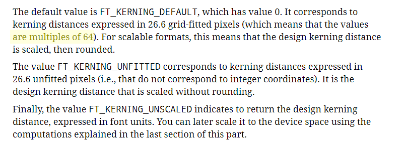
No matter which of these we ask for we immediately divide the value by 64 and assign it to an integer. The end result is that FT_KERNING_DEFAULT gives a rounded version of the ideal amount while FT_KERNING_UNFITTED gives us a truncated version of the ideal amount. So if the ideal kerning value is 1.7 then the former returns 2 while the latter returns 1.
Users can be forgiven for thinking that “Unfitted” is just tighter and “Fitted” is looser, but it really isn’t like that. Following shows changing between the two:
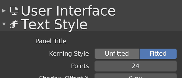
Note this changes nothing in “User Interface” at all and only the kerning around the “e” in “Text”. This is only ever a pixel change in some pairs regardless of the font size. It really is not a useful and proper setting.
Having to support this adds complication. Instead of caching a single kerning table we have to deal with a list of (two) tables. And we are constantly having to delete and recreate these tables with every size change which requires 16,129 function calls. So if we draw a panel title then a widget label we have to do this in between.
Ideally we would get rid of this idea that there are multiple kerning styles and simplify our code. And then we could choose to store the unscaled kerning values in 64ths (FT_KERNING_UNSCALED) just once and never change them during the life of the face - including through size changes - since we can easily scale the values ourselves. And then, once things are cleaned up, consider implementing FreeType’s own caching system instead of rolling our own.