Ah.
It didn’t occur to me that when testing a new feature for the shader layout, that I needed to not actually work in the shader layout.
Ah.
It didn’t occur to me that when testing a new feature for the shader layout, that I needed to not actually work in the shader layout.
Yeah,
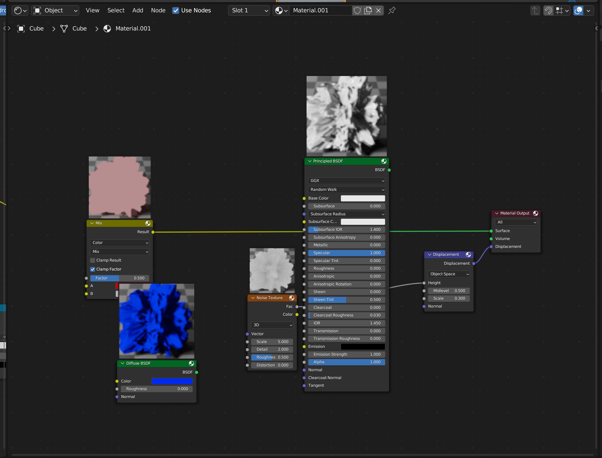
That is the point, the design is important and to stay consistent with the other node editors, and due to the different requests about this design change, I started by modifying a bit the existing preview area before contributing with additions.
Basic impressions:
My only issue is that the output dots are very small and missclicking one is far too easy so i end up dot hunting couple of times.
Those are my issues with blender in general
Other than that the preview size is good as windows previews are in the shape of the 16:9 screen. (i however use a ultra wide screen screen.
The preview actually takes the ratio of the render; set your output to 1080x1080, and it becomes square.
Of course, that’s just in the compositor… I believe the plan is for the shader editor would be a locked ratio?
As far as the output dots - they’re the same as every other node editor, i think? I just zoom in with the mouse wheel, when the dots get too small.
The size ratio for the compositor is great with its scalability, the shader window by logic should be locked to 1:1 ratio but i dont know what the verdict for that is atm.
From the software that i used with the nodes i can say that blender’s is the words in case with how the small the “selectable area” is, its rather small and i often fail to press the colour ramp dials but instead it grabs the whole node window for the 26th time due to the silly pixel perfection that blender wants you to have.
Software with nodes (at the top f my head):
Davinci no issue, S designer no issue, houdini no issue, Gaea also fine.
In my experience certain elements in blender are too small and they require pixel perfect precision which then makes me do hunting with the mouse which isn’t ideal.
Again : you can zoom in/out of the shader editor. I don’t know the default mouse/keymap behavior, but on my mouse it’s the wheel. You can make the nodes and connections as large as you want.
Zooming in and out and navigating a whole node tree just to connect or grab node’s isnt ideal and puts needless steps to trying to do work in a acceptable time and comfort.
Which is why i say that the dots are a bit too small. One day we might get scalable outputs/inputs in the settings menu that would help a lot.
In my experience.
The hitbox for the color ramp stops is actually not in line with the visual position of the stops, that’s a real problem, not just a precision/scaling issue.
That’s a good question, should the system allow for different aspect ratios? it could be nice to have that option, although on paper I mostly picture myself working with 1:1 previews.
Hitbox
That explains why i was losing my sanity ![]()
Ratio
By default aspect ratio on shaders wouldn’t have any actual impact/difference if you worked outside of the 1:1 aspect, as opposed to the compositor where its very relevant because of the output resolution/screen size variation that’s present.
Hey all,
I think the shader preview will take the 1:1 ratio, as it does in every software and because textures have always been square.
As for the other design issues about nodes, I cannot answer and it is a bit off-topic. I suggest you make a new thread for node design fixes and improvements to be made, and probably do a request on rcs. There are many things to consider, and it is difficult to have a fixed opinion about accessibility in UX. Sometimes that is too big, and sometimes too small, the middle is hard to determine and highly depend on users.
So, I ask you to talk about this very interesting question in another thread (why not mentioning UI developers for this ? I’m not going to think about the whole area design myself).
One thing all of here have forgot is… you can zoom in the shader editor in blender…
I just did a quick test and I’m liking it, great job ![]()
I know it is too early for this, but better having said it ![]() . Would be great if the preview toggle icon can change depending on if the preview is enable or not.
. Would be great if the preview toggle icon can change depending on if the preview is enable or not.
Could we add the build time of shader node like the GN node also?
We can know which node (group) cost the much time that needs we care of it.
All right. Some node (group) needs much time to render the shader preview picture too. We can close the big node preview if our PC start becomes slow.
Add a button to open/close all the node preview quickly by one hot-key!
Please stop sending design request of any node related design crossing your mind. The purpose is to discuss the Shader node previews, and not to redesign totally the node area. Some people are way more competent than us about those design questions, and this is not the topic for it.
As the preview is clearly visible, making the icon change appearance just seems like superfluous eye candy.
I’m aware of that, but in blender all the toggle icons have two states (on/off) so I’m looking for consistency ![]()
Icon states could be good for troubleshooting, if you’re clicking on it and preview isn’t showing up for some reason you can determine whether its because previews are glitching or button isn’t being pressed. In Compositor I’ve had that issue a lot when I would press icon and preview wasn’t loading (althou in old design node would become taller so that was indicator). It was mostly issue of not loading in time, but enabled button state could tell you to wait for it imo
Hey, lil update on this project, I now have a first prototype almost ready for triage.
I just have a few things to do before asking for early feedback :
It was just a quick hint to let you know I’m still on it ![]()
Are previews drawn in square textures or on a ball? Ability to choose will be amazing but if it has to be one surely squares.
And another feedback based on videos I saw: everything seems fine except how huge previews are on wider nodes like ColorRamp. It takes way too much space and is ugly bordering impractical. I think preview sizes should be fixed and not depend on node width. And maybe have a control over overall scale of previews in overlays.