GSoC 2023: Add a shader preview node - Feedback

Presentation

Hey guys, this year I’ll be a GSOC candidate and I have some ideas I want to share with you to have a clean proposal.
I’m actually at a school where I do a lot of maths and Computer Science.
I’ll be candidate for the 175h format which is the right one for me.

Edit May 9:

I’ve been accepted to GSOC 2023 so this thread will be used for user feedback.

The idea

So, I want to work on the pre-visualisation during shader editing.
What the user wants is to have a better knowledge of a specific node tree, and know what are the effects of some parts of the node tree. (useful for team work, large node tree, old blender files, …)

What comes in mind at first is having a small area of preview atop every node. But this first approach is very annoying, because of multiple constraints :

  • it is heavy on performances → recalculate tons of previews
  • some nodes not important visually (no effect on the shader) → no need to preview them
  • it is not very flexible → all have to be the same size, and so not precise

So, to face these issues, I think the user could choose himself where to put the different preview points (in the node tree).
Sooo, I propose a new node type : a “Preview” node :

  • the user can place them wherever he wants
  • the performances are influenced according to the number of Preview nodes
  • the preview nodes would be resizable so the user is not annoyed of too big/small previews

Constraints over this GSOC project

I want to share with you this idea, because I cannot apply for GSOC with a project that is not relevant or useless for the Blender community. I also need to make sure this project is not too long. I think I could do it in the time announced. At first, I’ll probably take some inspiration from the material preview (in the property area), and the other node designs.

With this in mind, I would like to have your thoughts about this proposal, before I complete the final submission.
Thank you for you consideration and the time you will take to answer me :smiley:.

Note : I’ll probably add some mockups(UI/UX descriptions) if no one rises against this idea.
16 Likes

How would this compare to this existing option:

What would you do to set your work apart from this work? One possibility would be previews that work in Eevee, as this add-on doesn’t work with Eevee.

What advantages does this approach have over having previews directly attached to nodes, as the add-on does? With the latter approach, previews don’t add space to a node graph- your approach would require a significantly larger canvas to encompass the same node graph because of the added nodes. It’s definitely possible that you could come up with ways to make this less of an issue, but it’s something to bear in mind at this ideation point.

Overall, I think this is a cool idea; however, I think you should do a bit more ideation and figure out what advantages this has over the current system, and how to make the needed extra space more manageable :slight_smile:

3 Likes

I mean, the idea is that it would be incorporated to blender and so more efficient and reliable. Moreover, some functionalities are not possible with this addon and might become possible with a true integration.
Instead of what is shown in by the addon, the idea here is to have different states of the node tree that would be displayed. The user can also specify different preview types (plane, cube, …).

What is really important for me to know at this point is whether it is interesting to have it integrated to blender natively. Having a commercial addon making it possible isn’t a block for this functionality I think.
Some peoples seemed to be very interested on Right Click Select, and some main devs are for this too.
The major point with this thread would be to understand what would be the optimal way of implementing a way of previewing the shader tree from the shader editor (currently, not with a new editor that could appear in 3years).

I made a little mockup to explain a bit what I had in mind (eventually add some checkboxes or a cleaner ui):
I made it big for me to explain better the idea, but it could easily be smaller.

11 Likes

The main point is perfs. And also visibility. I do not think the user is willing to know every aspect of every node. I might be wrong, but having a clear view at some specific point gives more focus over the tree than having views at every nodes.

3 Likes

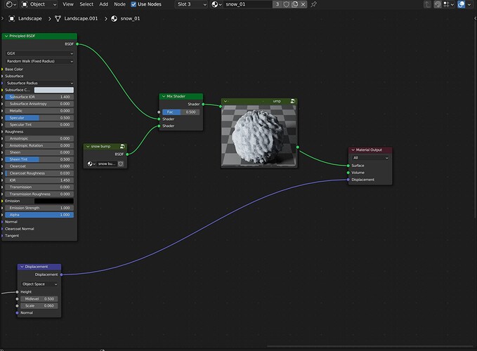
I don’t think this should be a separate preview node. Shader nodes in the past natively supported previews, and to me it seems logical to make it work the same. It’s useful to quicky enable the preview for a bunch of nodes to see how the values change from on node to the next.

Performance is a concern. In the old Blender Internal shading nodes there was a nice system where it would execute the shader nodes just once and write to an image buffer after every node. That was easy then because it would use the actual shader node data structures for execution, but Cycles and Eevee shader execution are quite far removed from that.

A optimization trick could be to automatically modify the shader node graph to write an AOV after every node that has a preview enabled, and then read back those. Unfortunately that would not work for nodes that output shader sockets (mainly BSDFs).

Even if it renders every preview individually and is slow with many node previews, I think it’s still worth having.

16 Likes

Alright,

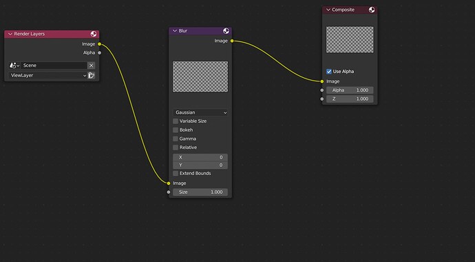
so the idea is to be similar to the previews of the compositor :


As you said : Under the hood, it should be possible but some optimisation is to be done in order to improve performances.

I’ll wait for others to share their opinion about that.
@brecht you said it could be difficult to fit it in the 175 h schedule. I think it is because of all these optimisations needed ?

2 Likes

I haven’t actually used the “node preview” addon but having a preview on every node looks quite distracting. I think it would make the most sense as a “viewer” node of sorts, kinda like the one from geometry nodes : you can have several at a time placed strategically to highlight specific, relevant points in a material graph. This strikes me as more of a documentation/cooperation feature. Supporting color and float inputs would be the most important aspect to me because there’s always the viewport to visualize bsdfs.

2 Likes

Having a preview on every node, I think, is better UX than searching for and connecting viewer nodes.
However, they have to be toggleable on all nodes. Like, with a small eye icon button on the header of every node.

6 Likes

Yes, as long as it can be activated on a per-node basis that sounds good

4 Likes

Speaking for myself, knowing the aspect/output appearance of each node is exactly what I would need.

Example: When I’m adding a noise node, it’s beneficial within the tree what the base values of the noise look like without regard to whatever UV coordinates are going to do with the shader once applied.

Ie, exactly the feature of the Node Preview addon posted by Joseph.

Having a “final shader composite preview” node at the end of the tree is of no value to me; I can see the result in the 3D viewport. (UVs are a factor here, yes - but again, the full composite is of less interest to me than the individual components, because it’s a the individual node that I need to see when I’m editing it)

2 Likes

Global settings to control when to update the previews will also help. Like ‘update every time’, ‘update only by explicit user command’ (Ctrl + R or some button to refresh for example).

1 Like

A problem of the node preview addon is that it isn’t macOS-compatible, so, just from that standpoint a native solution would be great.

As for an in-node viewer vs. a viewer node, the in-node version could be in a collapsed state by default, so, not taxing the system from the moment one opens the Shader Editor. Ideally, it ought to save its state in the .blend file so that one doesn’t have to re-expand them every time.

2 Likes

I just let you know that I applied for GSOC with this project, and I plan to make node previews as it was previously before Cycles.
See you later if I get accepted :slight_smile: :crossed_fingers:

13 Likes

Node Previews add-on has a functionality where you can disable it by default and only toggle it for certain nodes. For me, functionality can’t be any better than that. I can choose where I want and how many I want. As others told you before, original UX idea you proposed is flawed, but I agree that if there is a performance gain it is worth doing.

UI-wise Node Previews add-on is perfect for me, previews on top of nodes (opposed to inside the nodes, as it was before) is much better looking if you ask me. add-on also gives you ability to set preview sizes in the preferences.

Basically if I were you I would just copy that add-on, but make it in C++ and much faster. I don’t see any downside to add-on besides performance

3 Likes

I do think there is merit to a preview node, because you can preview your work exactly where you want it. Eventually, you can remove the excess nodes you no longer need to clean up the shader and save on performance. I mean, you might be able to activate a preview node by modifier + mouse click or hovering the mouse over a noodle and hitting a shortcut. That is as convenient as it gets.

Of course, a double click expansion of a shader node to show a preview. But, it’s much harder to backtrack where you have these and which ones you want to keep or want to remove. Although they can certainly be helpful for nodes with lots of inputs (like the principled BSDF), they change the actual node tree arrangement (you need to make space for the preview dropdown, whereas the preview nodes only affect the horizontal space of the tree, so you could in theory, expand the node tree to fit a preview node and shrink it back when you delete one.

You could preview your node exactly where you want it without the preview node. I don’t see why you wouldn’t?.. And there’s no need to clean up anything if there’s no such thing as a preview node. You just turn off the “Preview eye icon” on nodes that you don’t want to see a preview on…

Alternatively, the preview could just be in the N shelf, Node tab.
No need for any eye icons or anything like that… And no cleanup, as you would only see one at a time.

Yes, that is what I plan to do.

The original post I made was about an idea of mine, but it turned out that is was not relevant to the needs. As many mentioned here, the old system was nice, and I’ll mainly try to have it back on. Maybe considering to have a preview in the N shelf could be interesting, I’ll see later.

Edit:
I’ve been accepted to GSoC :partying_face:
I think students usually create dedicated threads for weekly reports and feedbacks. This thread will be used for feedback.

9 Likes

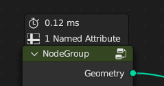
This will be very convenient to have! I’d be interested to see some work on a visual mockup before coding work starts though, so that can be agreed upon. On that topic, I’d like to see the previews use something like the node overlays concept. So rather than going inside the node, changing its size, they would look more like a temporary popover that can be toggled, sitting above the node, rendered on top of everything else. Geometry nodes does this already, though only with text right now:

image

That would help to separate the shader instructions (the stuff inside the node) from the previews and results conceptually, and would make it easier to arrange nodes, since they wouldn’t change size and overlap each other when toggling previews.

11 Likes

Well, it makes a lot of sens to use this kind of popover for nodes.
Like other people here said, the location of the preview is to be thought carefully, but in any way, changing the location is not that hard when the preview will be working. It is nevertheless not to be forgot, I’ll make a little mockup in the following days for users to think about this perspective.

Thank you for pointing out this option that is really interesting.

Compositing and texture nodes already show previews. I’m not opposed to changing the UI, but if we do it should be consistent across node systems I think.

For this GSoC project, I’d consider making changes to this UI a stretch goal, after all the other parts work.