GSoC 2023: Add a shader preview node - Feedback

But as others have stated putting the preview inside the nodes has its drawbacks as well. Expanding and collapsing the preview moves the inputs and outputs around which makes it cumbersome to manage the overall layout.

5 Likes

UV coordinates are in a ^2 (square) arrangement as in a square, textures are also in that said square, doing anything shader wise is within that said square, anything else than that would be inconsistency weather you or I like it or not, that is a technical thing.

But if you still think strongly that that is wrong then suggest for a global 1x1 lock/unlock

3 Likes

It seems that the aspect ratio and coordinate transformations are what gives rise to a special preview node…

While it is true from a technical standpoint that preview inside the node is technicly correct, with the best example shown here:
(for the purpose of explanation)

You also have to look at the least practical example for the inside window

(imagine if this node was twice as tall, like the unified shader node)

And here it just looks a bit odd, of course this could be personal preference and of course it might be easier to follow the spagetti flow of what image leads to what other image and of course this would be a “Industrial Standard” but,

my question is this, should the industry standard be followed blindly or can we improve upon it by doing it a bit differently ?

1 Like

This example are not correct and you can’t take it. the ratio of the preview isn’t square. and i have already said… in my past reply… is not an industry standard… resizing a node by conserving this proportion is fully integrable it’s called “Responsive” also integrated in the node is clearly better, simple and responsive too! See many shader in google… if somebody thinking is a good idea is already implemented but is not a good idea. Sorry…

And yes is needed to follow the industry standard for BASIC FEATURES LIKE THIS! Because is for performance and optimizing work…yes clearly! We need a clear interface. So that the whole node can retract… however the idea of leaving it on top can be a good idea if we only want the preview and not the content of the node

In any case, no matter how much you ask for this, you won’t get it, it’s not confrm with the blender pipeline… and that’s why for the design our dev must consult @brecht to be sure inform he is not free to do what he wants, this topic is a feedback … Not a request for addition or other! In our prototype it was decided that the knot would be like this… That’s it!

See again the implementation choosen …


And here : GSoC 2023: Shader editor node preview - Weekly Reports

Now if you have ideas put them here : https://rightclickselect.com/
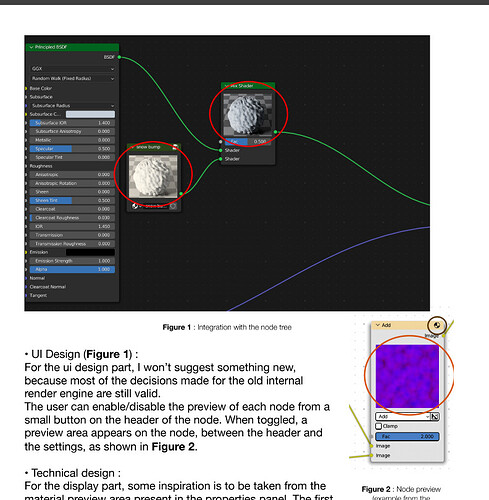
You have not given any single reason for why this is supposedly “not correct”. Perhaps you’d like to take part in the discussion ?

6 Likes

Because is not organized, simple and fluid. And the idea are not followed the original ideas, this proposal is out of context clearly.

You know it’s rather difficult to understand you sometimes with your text formatting,

Preview should be square at all the times as it would not make sense otherwise unless its a “final composition” node or something that would have a bit different use than math/shader nodes.

And when you say it’s clearly better with previews in the node, is it objectively better or subjectively ?

Because if the size of the node is barely anything bigger than a 1x1 square, sure the preview looks good and all but when you have it in a giant shader with lots of options and settings and then you have the preview window up there on the top of the node, is it still better ?

`

no matter how much you ask for this, you won’t get it

Also what’s up with this, this is a feedback thread where we have a discussion, which is what i’m trying to have.

5 Likes

if you are so attached to use this thing use the add-on… and not the new system, here is a new system for blender not a re-usable add-on :man_shrugging::man_shrugging:

now stop asked the same thing everytime you see in more dev news this summer for the preview…

Forgive my direct and straingforwarding approach, but in my opinion, all solutions in a thread I saw are ugly or cumbersome.

Why not use the Viewer node as we know it from Geometry nodes?

  1. users are used to it
  2. It’s in Geometry nodes, it’s in Compositor nodes, and it is logical to be in Shader nodes.
  3. The same hot-key as in Geometry nodes and Node wrangler: Ctrl-Shift-click
  4. same usual behaviour when clicking the eye icon

10 Likes

Because some users wants a single preview for each node, and some developers want to re-use the existing API afaik

3 Likes

viewer like that is a good and bad idea in the same time. Becaus eif you want preview systematicly you need add more and more and more nodes, and create more datablocks for there are created “Séparatly” isn’t optimal… But it’s good idea if he come for a “Big preview” instead the small preview inside the node :man_shrugging:.
The benefits for preview for “ALL NODES” is you can see quickly what’s the node do, without putting an extra nodes… More faster ! More optimal ! Simply !

Conclusion, is a good idea if is it an Extra nodes for see the texture more bigger.

1 Like

Because we want to be able to preview more than one node at a time. How is this so hard to understand for people? Viewer node should exist in Shader Editor but for exact same purpose that Node Wrangler does right now. I don’t think most of the commenters here realize what exactly node previews are.

  1. No we are not. I rarely use the compositor, as it does not have the tools I need. However, when i do use it, I find the whole viewer node background image thing to be kind of awkward to use.
  2. It works very differently in geometry nodes. It displays a checkpoint of geometry in the viewport. One at a time. The Compositor has previews on almost all nodes with a press of a “Shader icon”. (Wrong icon used, imo). But usually, the rendered image is not so tiny, so you want to see it in full size., therefore the viewer nodes exist. Still, it would be better if it wasn’t a viewer node for either geometry nodes or the compositor, but rather a button on all node headers.
  3. Eye icon is better than pressing a three-button hotkey.
2 Likes

Creating, moving and connecting a viewer node each time you need a preview is cumbersome to say the least. I also consider it to be a design flaw in geometry nodes for the same reasons. I mean it’s amazingly useful, but there are other, faster ways to get a preview.

6 Likes

On the other hand, having a preview over each node is a huge overcalculation. Personally, I’d rather have a preview on-demand over particular nodes.

4 Likes

From what I gathered, that’s the idea !

3 Likes

@Kdaf created pull that creates node previews on top of the nodes instead of inside them! I suspect that includes compositor ones too, since it’s a change not an addition. Good job I’m glad you’re taking community feedback!

1 Like

Let me explain a little fundamental problem here:
All internal/temporal graph data (all temporary data not passed to the output) must be removed.
My point is that if each node adds 10 shader code lines fo some result file, then storing the internal/temporal shader would be: 10+20+30+… for all nodes.
Rendering images would not create this progression. But there are still costs, as you can see.
Geometry nodes have this problem: For an spreadsheet, we want to switch between components and domains of geometry. But that would mean the nodes would have to be re-evaluated for new viewer context…
I’m not familiar with compositor or shader specifics. But that’s the reason why making it simple at first is the hardest thing to do. Explicitly changing the graph, marking a node for preview, or a separate node - those are the ways.