I’ve noticed one issue when adding multiple reviewers. The first seems to work fine, but it’s hard to get the second to do anything. When I manage to add another reviewer, it’s not clear what I did differently.
I’ve tried selecting the reviewer and refreshing the page, or selecting the reviewer and just waiting. Neither seem to work. Anyone else seeing this?
This bug is fixed now.
Thanks!
This is pretty nitpicky, but I thought I might bring it up in case the team is looking to improve stuff like this.
When looking through the pull requests, I find the branches take up a lot of visual weight, but they’re really not so important. I’d expect to see that information when looking at the PR, but in a list of all PRs it’s just noise.
I wonder if we’re able to tweak things enough to remove that, if others agree anyway.
Edit: Also, wanted to say that working with Gitea is very pleasant already. Well done to everyone on the transition 
I have a quick tip for users whom (like me) got used to having developer.blender.org bookmarked to quickly report bugs, as well as browse bugs reported by others or check on the bugs they’ve reported:
Replace your developer.blender.org bookmark with this link: https://projects.blender.org/issues
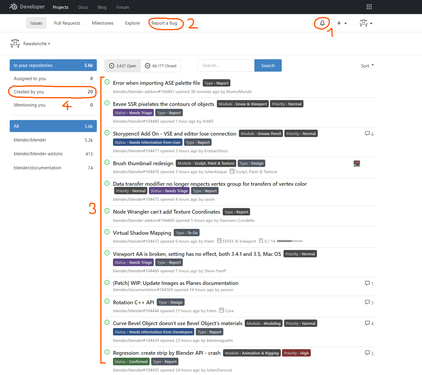
- You can check notifications about the updates on the issues you’ve reported just like you did with the phabricator.
- There’s a quick acces to Report a Bug button, just like in phabricator.
- You have a simple vertical list of the recently reported issues, just like with phabricator.
- You can view list of the issues you’ve reported, just like in phabricator.
Only thing I really miss was to be able to see recent commits and recent issues on the same screen. The commit feed on was nice as I was often discovered exciting new updates just at a glance while checking on bug reports.
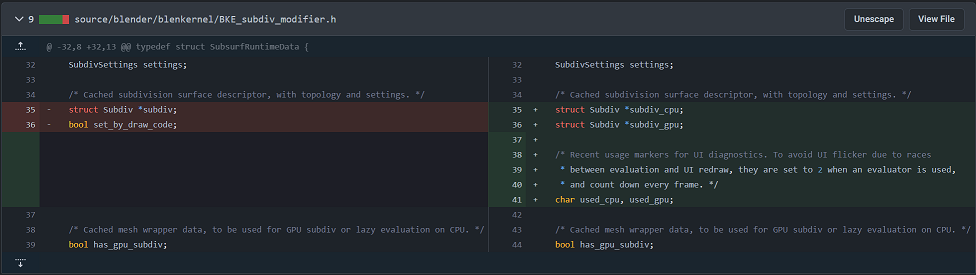
When you get to it, it seems like “git blame” support is broken on the site.
My local files have the correct blame data but that’s with a repo that was used before. I’m not sure what it would look like with a freshly cloned repo directly from gitea but I hope the disparity is limited to just the web.
Some examples:
https://projects.blender.org/blender/blender/blame/branch/main/tests/python/modules/render_report.py
https://projects.blender.org/blender/blender/blame/branch/main/source/blender/blenkernel/intern/image.cc
https://projects.blender.org/blender/blender/blame/branch/main/source/blender/windowmanager/intern/wm_files.cc
Must be a gitea visualization issue, I’ve logged it here:
Posting here my suggestions for changes in the dark color theme to make diffs more readable by toning down some backgrounds to be less distracting:
:root {
--color-box-body-highlight: hsla(204deg, 60%, 15%, .15);
--color-diff-inactive: hsl(229.4, 13.8%, 13%);
--color-diff-added-row-linesnum-bg: hsla(123, 36%, 40%, 0.2);
--color-diff-removed-row-linesnum-bg: hsl(0, 25%, 23%);
}
The idea is:
- The blue lines separating patch hunks should be way less prominent than file headers: visual priority should be red/green changes → file headers → everything else. In default phab color scheme they are very subtle, and I matched that.
- I think it is strange that in side by side view (e.g. this commit at random) ‘holes’ on the other side of additions/removals are brightly colored - I made them slightly darker than default background instead.
- Finally, in the same vein as the other changes, I made the color of the number column of red/green changes slightly closer to the non-number column.
Edit: it’s quite likely an actual designer could tune the colors even better - this is just a suggestion of the direction of change.
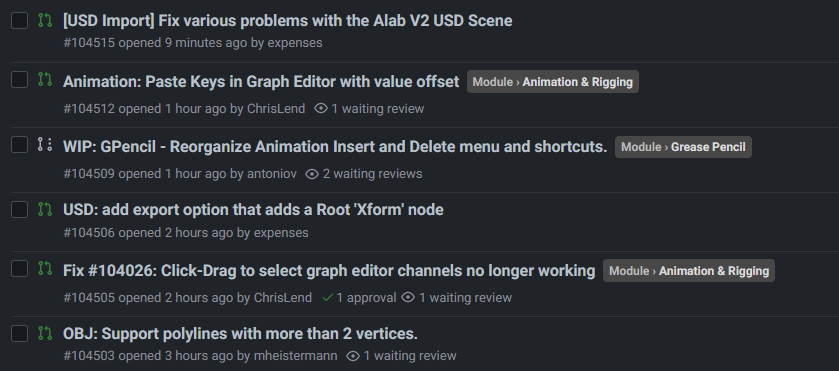
I find this helps remove clutter from the PR list. (don’t know if it affects something else though)
.issue.list .branches {
 display:none !important;
 padding:0 4px
}
Before:

After:
Yes, thanks. For some reason that whole ‘panel’ didn’t work for me, so I thought it was purely decorative element with some information slapped on it.
Good idea! I’ve applied the changes now in production.
A few recent changes:
- Convention is now to assign every non-WIP pull request to a project, so that it appears on project boards.
- Fixed blame views
- Fixed problem with pull request updates showing way too many commits
- Added compare button for force pushed commits
Does main page doesn’t exist anymore? Where you would see new topics and commits from all modules? Right now it seems I can only see them for separate modules
it is all here in the activity tab
I can’t see commits there. And this page is way too long to be of any help. Old main page was very helpful, right now it looks like its just gone and I can’t navigate this new website at all.
I also can’t find differentials page
This is the closest alternative for activity, however it is currently not paginated and there is too much activity for one page per day.
https://projects.blender.org/org/blender/dashboard
We are tracking improvements to this here: