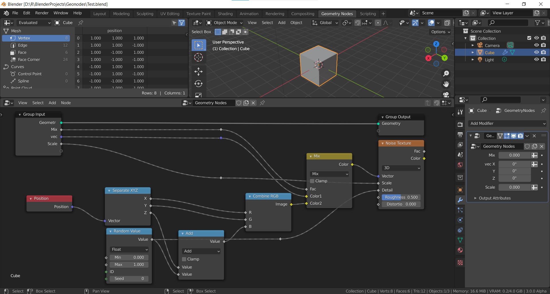
If i got it right then this task seems to be related. And unfortunately there may be no quick solution in sight.
Thank you, such attributes → data converter would probably do the trick, but I would still find it as a workaround to something which should be handled automatically in my opinion. From a user standpoint getting all the data lost during the Realize is definitely not an expected behavior.
I.e. it is difficult to understand why the node prevents materials, but not UVs.
In my (end user) view, this node does very similar thing to Particle Instance modifier, which also produces single mesh with all the instances merged, but in that case all the data are prevented - I would expect the same from Realize Instances.
1 Like
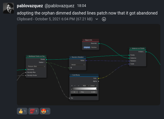
I was experimenting with this a bit and I think it looks better than the current dashed links
Original

11 Likes
Seems like the devs agree with you: ⚙ D12754 Geometry Nodes: Dimmed dashed lines
EDIT: Well… Not everybody 
7 Likes
…and a mere second after you posted the link Dalai added:
I will set this on the side for now (and the patch as abandoned).
EDIT: Pablo Vazquez to the rescue 
12 Likes
I am at loss of words.
I asked around the studio and there seem to be no one solution that fits it all. For the record:

* Simon and Pablo like the dimed dashed lines (though changing the data-flow line thickness to 1.0).
* Ton and Andy like the dashed lines (and Andy would love the dashes to be equidistant).

I will set this on the side for now (and the patch as abandoned). It takes some energy to get those big UI decisions onwards, and I would rather use that energy to other aspects of the usability at the moment. (that said, anyone from the UI team is welcome to pick this topic up).
This is getting to the clown world level of ridiculousness. A person in charge of Blender development coordination polls 4, yes… 4! people for feedback on this radical UI design change, and when these 4 votes end up in 2 vs 2 draw, the conclusion is “Welp, better abandon this direction then.”
I am starting to question if we’re not being made fun of…
4 Likes
Uff, thats ridiculous.
Everyone gets a shot at making UI decisions.
Blender always had a bad reputation for its UIX. Until the big re-design phase for 2.5 and 2.8 led by William Reynish. With it came a big gain in adoption of the 3D industry.
Now, without William, the UI decisions are made by the same people who were responsible for the pre 2.5 UI. Great job guys.
Hopefully the hire a real UI designer for Blender 4 once its apparent that it really needs fixing again.
11 Likes
Not Bad! I like the Geometry Data Flow being thicker!
But this is amazing (It would be even better if the Geometry were a bit thicker probably!):
2 Likes
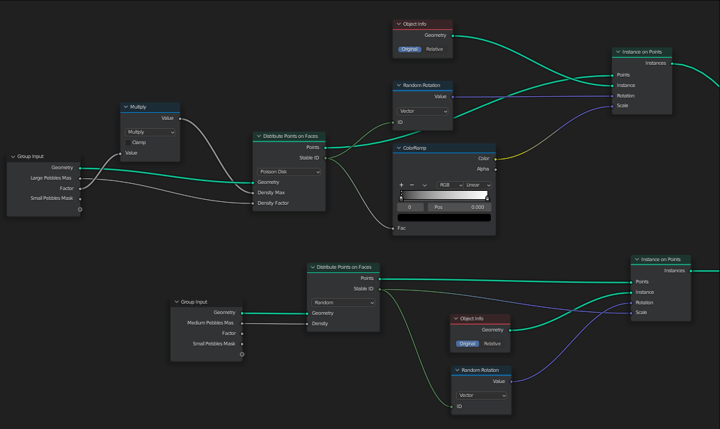
This is noodle porn to me
3 Likes
I might be one of the only ones who is a bit more tentative about this. It looks mostly good, but its genuinly pretty hard to tell until you get into a larger project with noodles here and there. I’m sold on the thicker green line, the dimmed dashed lines, eh, could be good. As for the extra colors I’m actually not sure at all, as in I can’t tell if it will be great or terrible noise (also let’s consider color blind people).
I am still of the opinion that these should be overlay options. I think a data flow section and a function flow section should exist in overlays, so you can mix and match. Want the dashed lines but no color? Do it. No dashed lines, but color yes? Do it. Data flow green line bumming you out? Remove it.
It’s not that everything in blender needs to be customizable, but for something that effects potentially all nodes in blender a little wiggle room is nice.
A bedtime story from another lands software had them changing the shape of certain nodes to denote changes between certain workflows. A lot of people liked it, a lot didn’t. So they just gave the option to toggle between the two types.
8 Likes
Does this menas that dashed lines are going to be left as they are now?
Yes, this is the by far best solution so far. Shows what an amazing taste for design Pablo has. The geometry data lines are thicker and colored the same as the geometry data sockets, and other connections are designated as fields simply by the combination of connections being thinner and sockets having different shape. That’s sufficient to let people know they are dealing with fields. No dashed lines needed.
I mean, user doesn’t have to be constantly forced to be aware which aspects of the node networks are fields, geometry data or constants. Such information is only relevant for learning and debugging purposes. Debugging metadata UI design should not be screaming directly into your face that it’s there even if you don’t need it.
On top of that, what’s on this screenshot just looks so modern and professional, while when I see the dashed lines, it’s immediate throwback to 90s.
7 Likes
I agree, it can be overlay or in my opinion, in preferences, I think there may be option for node socket connection lines like line thickness option and line type option and line color option for every single type of input/output for geomertry nodes (Geometry,Vector,Scale,Mix), so everyone can use however they like. No need to force people to use what is decided. Everyone can choose their own way. For example I prefer no color and no dashed line like old way and it never bother me. (I still use curved connection lines as well). But someone can prefer color difference or another someone can prefer line type.
6 Likes
This is the way! So close to perfect, and then just add a theme-able option to desaturate the colors on the noodles, and most people will be happy with it. A desaturate option would easily give the option to return to greyscale values (ala 2.93 design) or somewhere in between (which is what I would do). An option to desaturate to greyscale may also help color blind users, while still allowing them to see some subtle gradient change between data types.
The node header design is also dropdead sexy 
6 Likes
Decisions were just as ridiculous in the past or worse. Let’s remember that with everyone against it, the text was aligned to the right in properties editor
Yeah pablo did such a good work
i can’t wait until it hit main build, the colored attribute links is also an extremely useful addition
so it won’t hit 3.0 right? what’s the source of this info?
1 Like
Hey, i tried blender 3.0 build, and there is still no “get”/“input attribute” node.
Where are they?
Just to be clear, i don’t like/ do not understand at all why they moved the named attribute in the modifiers, i find this very unintuitive and it’s very hard to organize large nodes!
I’m coming from Houdini and if i can interact with attributes like i used to i must say i won’t use geometry node because it’s completely breaking my habits of working with attributes
7 Likes