I made a quick attempt ![]()
Oh  that is even more satisfying than I thought it would be ! Love the natural shape. I feel compelled to reverse-engineer it lol thanks for showing
Wow, beautiful results!
That’s very cool!
By the way, if you or anyone else are running into performance limitations when working on curves, please share files! Having some heavy files to profile when I get the chance to look into performance would be helpful.
I’m not a software developer, but I don’t need intimate knowledge of a node’s underlying code to make use of it in achieving a desirable result in the viewport.
As fascinating as it might be to see how data types like floats, integers, vectors, booleans, geometries, and fields all interact under the hood of each node, in practice I find it more of an unwelcome distraction.
If people like the idea of highlighting the difference between one data type over another, it might be best to give users that option in an overlays drop down or a right-click menu. I don’t think we can assume that everyone agrees that fields nodes should receive more superficial attention than any other node in the editor.
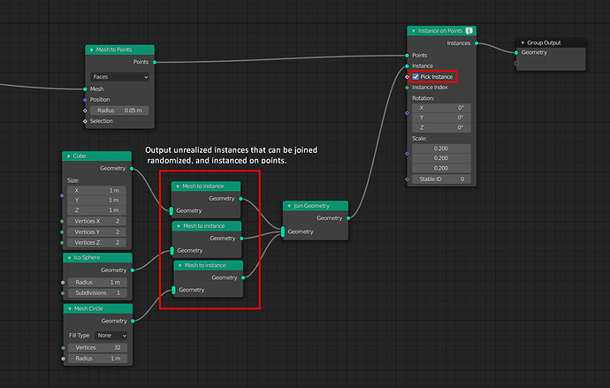
Since the instance on points node has this handy pick instance value, would it be possible to create an “instance group” in the future? This would be the equivalent of a collection, but within a nodetree.
EDIT:
It just came to mind that a “mesh to instance” node would make more sense. Object instances can already be joined with the join geometry node and randomized as usual.
I’d also like to see a standard selection input, so you could instance on specified points.
It’s not about knowing the underlying code, it’s more about understanding how your tool works.
As with most software, there are layers of usability. One could do some impressive thing in Geo Nodes simply by connecting and adjusting parameters, without necessarily understanding fully how it works.
But then there are layers of understanding the software deeper and using it more “correctly”. It’s a natural growth and good software design should encourage such growth to happen.
Imho the Fields concept as it’s being applied, is novel enough to mislead even the most experienced nodal wizards from software which shall not be named. Until they accept it as a workflow that is.
I don’t think it would be wise to erase such important indicators for mere aesthetics. Maybe it can be improved and iterated on, but after seeing how it works I think it does fit its purpose, and it should become apparent as more field workflows are added.
Quite frankly it seems to me looking for a way to distinguish fields is falling for aethestics. It does not add information since the diamond sockets already communicate the presence of a field. And whether or not it’s beneficial at all to show that a noodle carries a field versus a value has yet to be demonstrated. All I can see right now is dotted noise.
To me fields shoud be transparent to the user, just like Cycles variables such as normal or position are shown the same as regular vectors. The fact that fields are evaluated lazily should be no more than a technical detail.
Instead, showing data types more clearly with colored noodles and thickening the green geometry noodles add a lot to readability (from Pablo’s design).
I don’t think this kind of rhetoric is justified (and also not really in line with the Community’s Code of Conduct).
While I can understand your frustration with the current UI, I don’t think it’s fair to paint this as someone trying to push their vision against everybody else’s wishes.
When I approached Dalai with my proposal (the double lines) on blender.chat he was very open to consider it, but people at the studio preferred the dashes compared to my prototype. And while the feedback here is very one-sided I assume there is also a selection bias as people who are fine with the dashed lines are probably not going out of their way to find forums to talk about them.
This is clearly a polarizing issue and I think the discussion will be a lot more constructive if we keep it as objective as possible and give everybody the benefit of the doubt.
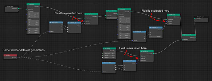
The diamond socket can have a field or a constant, it’s not obvious which one it is when a wire is connected.
The field is evaluated at the point where it stops being a field so it’s important to be able to track that.
While the intuitive sense from most node editors is that a value is being passed, here the same field can be connected to multiple nodes and produce completely different results. This is intuitive as well, just something that today’s users aren’t used to.
So I think it is important to show that something special is happening, and it’s also important to easily track down and debug the graph.
I don’t think that’s fair, because Dalai has more information than we do. It’s very likely that the users in the studio like the dashed lines because they were given a clearer understanding of how the fields are working, and that it is helpful to have clarity.
More communication would help to provide better feedback, but also development needs time and focus so there needs to be a balance between the two.
Seriously, that makes no sense… pleas let’s keep talking about blender design/development and don’t go personal. If I was a developer that’s the kind of statement that would make me give up listening to feedback.
Don’t get me wrong, I can understand the frustration and I may agree with some of your arguments… but if we keep talking like that, Don’t be surprised if devs stops spending time reading feedback or just close this thread because it goes off-topic.
I am glad to see that people from Blender Community itself spot and tackle unfair polemics.
It is tremendous that someone still has courage to take responsibility for decisions, or try something new, if any change could result in debates like that.
Ye, you guys are right. I was just too frustrated in the morning that everything that’s going so well for GN recently is hindered by this one UI decision, so I went a bit far. Removed my posts.
Yup if there’s a realize instance mesh, the opposite node should exist
Yeah absolutely,
It’s important to keep in mind, both from a user or a developer perspective that an idea != an individual.
And while the feedback here is very one-sided I assume there is also a selection bias as people who are fine with the dashed lines are probably not going out of their way to find forums to talk about them.
Note that it require way less self esteem to affirm your ideas online than IRL so this should not be a problem in an online forum imho
A lot of arguing and frustration could be avoided if big important changes were first presented to the community. People here have probably the best understanding of Geo Nodes outside of developers, so they could give valuable advice or create visual mock-ups for UI changes (as was demonstrated). If this thread was created to gather user feedback, then why not use it?
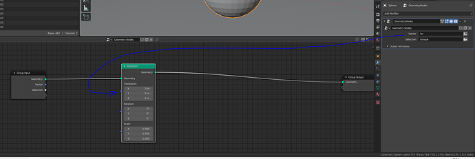
Not sure if I’m asking in the right place, but shouldn’t the Transform node have its inputs as Fields?
(or whatever is necessary so that I can plug an attribute created in another GN tree)
Hoping that this is as simple as changing a data type ![]()
Does MixRGB do any kind of color management? Is the math the same a real vector math (linear)?
No color management involved AFAIK.
I missed something?
Could you show me postings of concrete visual mock-ups or concrete examples relating to the current attribute assigning system?
— Edit —
If user control custom attributes from outside a GN node tree, this might work (like it or not) on the toplevel geometry of a node group.
For me, there is still an open question. What about geometries created from inside a node tree? How could it be be possible to assign custom attributes to this kind of ‘created on the fly’ geometry, which is not toplevel?
It would be interesting to know if there are plans for attributes of non-toplevel geometries.


