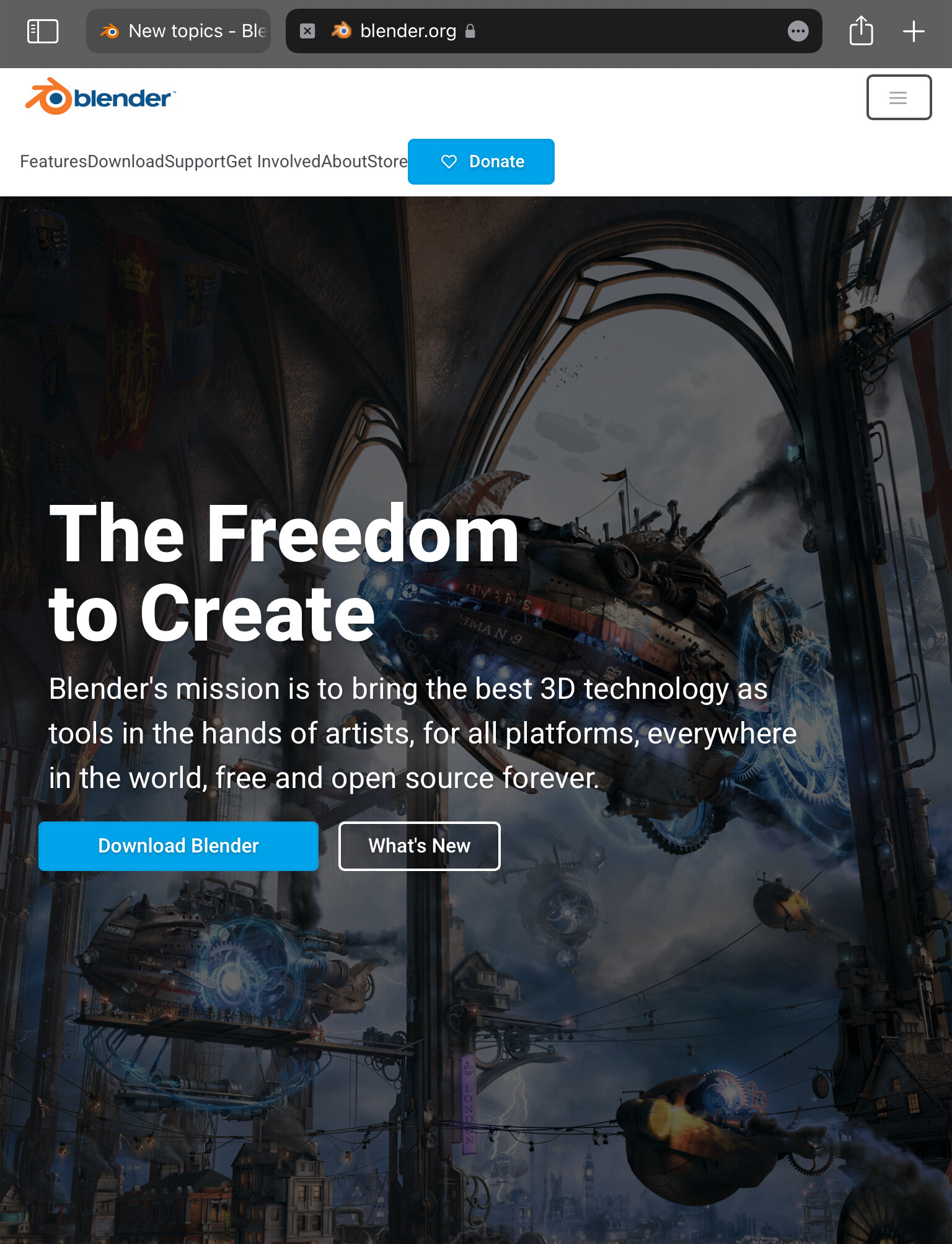
The top menu buttons in www.blender.org website do not look good when viewed from a tablet device like an iPad in portrait mode. Please fix these. Picture has been provided.
@pablovazquez
3 Likes
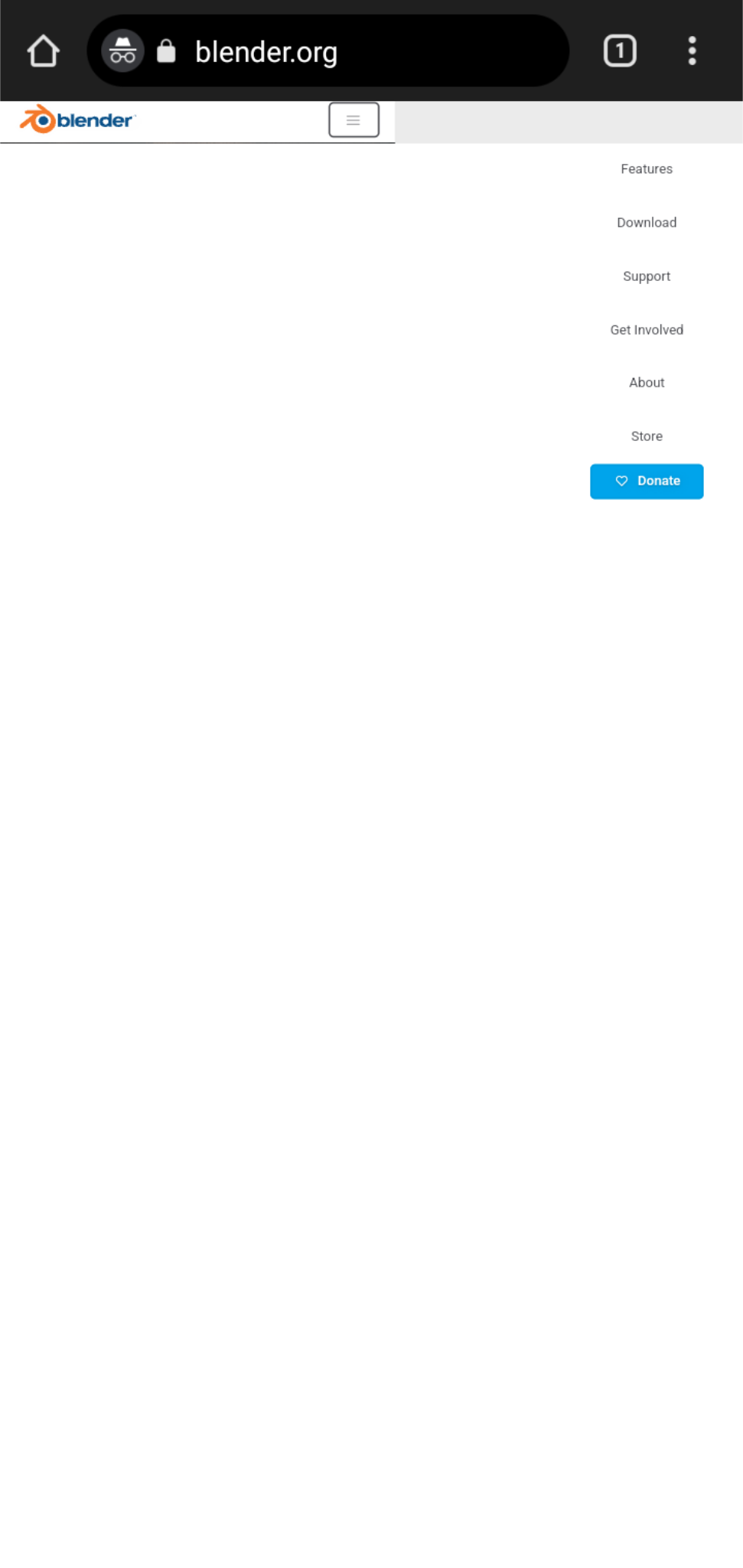
@pablovazquez Now the website’s menu looks so weird on mobile!! You need to zoom out to see it properly.
On iPad the website now opens in desktop mode by default, but there are still some resizing issues of the screenshots of Blender app (given down in the homepage) in both tablet and mobile.
Please look after this. I am not sure but this demo might help from w3schools: W3Schools Tryit Editor
This is on mobile:
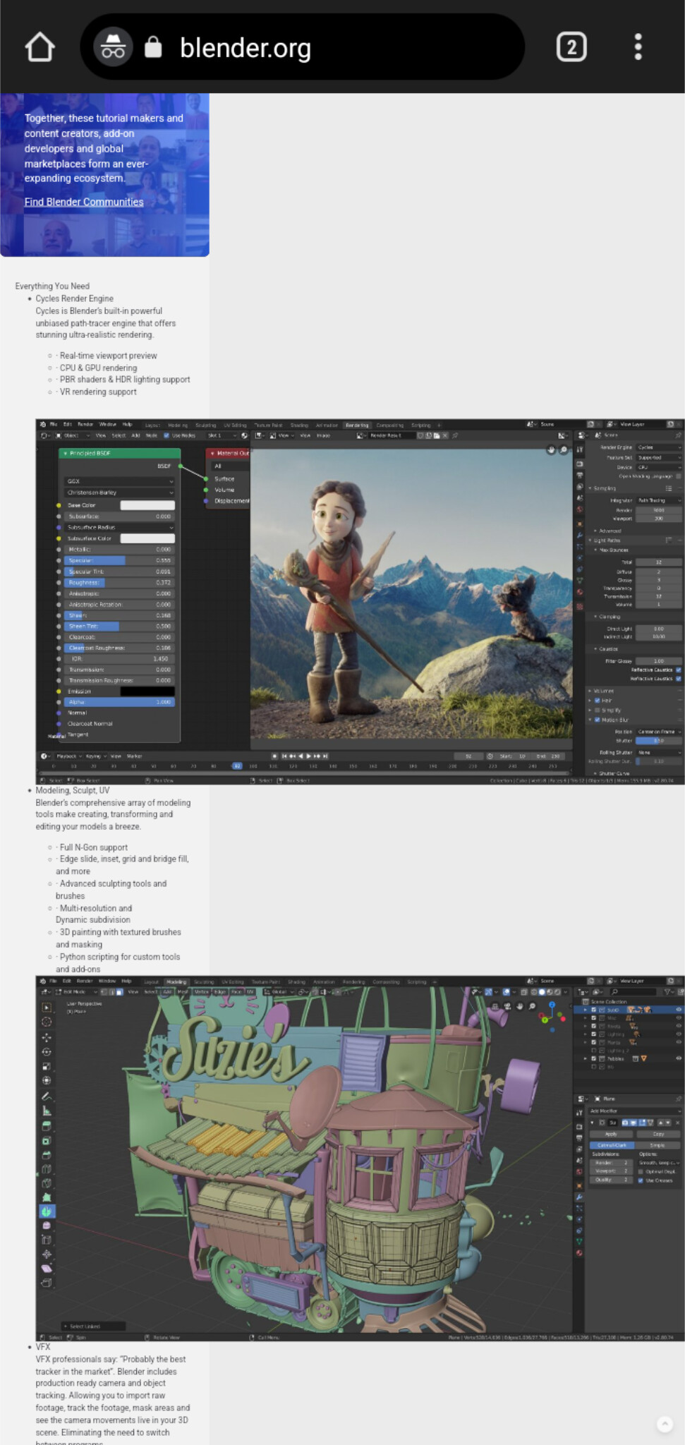
Such resizing issues are also on the pictures in the release notes of wiki.blender.org. Apart from these, all the other websites are perfect.
Hey hi, the website CSS code need adjustment for responsive design. Specifically media queries targeting tablet devices should be refined to check proper spacing and layout and resizing issues should be addressed through appropriate image optimization techniques and tools like https://jpegcompressor.com/.
Choice 1: Pay employee to fix this.
Choice 2: Pay employee to do something else that actually matters.
Choice 1: Pay employee to fix this.
Choice 2: Pay employee to do something else that actually matters.
Choice 3: Contribute. Every Blender website is open source just like Blender and contributions are welcome.
This thread is not only old (November 2021) but also offtopic, so I will close this. Bug reports should be reported as issues on projects.blender.org.
4 Likes