Right now the text is printed above the nodes but I would like suggestions for how it could be made prettier. As Jacques Lucke pointed out, we should take into account that there could be other stats that can be shown in the same place in the future.
Maybe an additional box under the nodes that can expand depending on the number of rows with information it contains?
Also feedback on how the numbers should be rounded/shown would be great!
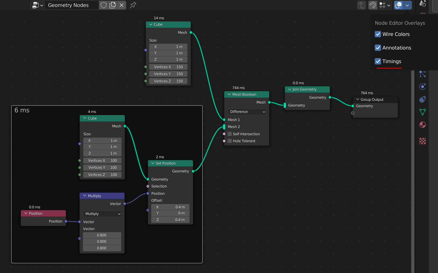
Currently it shows the number if the execution time is above 0, with 1 decimal up to 1ms, then 0 decimals.
That’ll be very useful for debugging. The task says that field nodes won’t have a time, however I see the position input node having one, even though it is zero. I like that frames display a sum of all contained nodes, great idea. Will group nodes also show a total eval time for their contents ?
What would be other statistics shown on the nodes ? whether or not the node is cached, I suppose ? the cache’s range in frames ? something like that ?
Some kind of backdrop would look more tidy for sure, the kind that appears on viewer nodes in AN.
I personally like having it on top though, because it’s closer to the node name and in terms of visual scanning it makes it easy to mentally link the two (“mesh boolean - 744ms, okay next…”). If it were placed below the node, the distance from the node name to the eval time would be arbitrary (depends on node height), and varying intervals are generally a bad thing in UX.
Right now it also doesn’t communicate what it does very well. I know it because I’m here, but it could be more educational : prefix them with “evaluation time” or a little chronometer icon. or maybe break down the overlay into each one component.
I forgot to add a Group node to the image, but they also show the total time of all nodes inside them, recursively.
I agree that it’s nice to have the time just above the node name. I guess the only options really are above or below, because if the extra info is put inside, the node dimensions will change and might cause problems in the layout.
I like the idea of having an icon instead of text. Maybe it could have a tooltip to further explain what it shows.
Another idea could be to just have something like a circular progress bar added to the top right corner like the warnings-icon. This could have a tooltip with the actual number. The challenge then is to decide what is fast, and what is slow.
I wouldn’t want to have to hover an icon to see the timings, I think it’s more straightforward to just show them right away when the overlay is on. (Or did you suggest this as a way to see them even when the timings overlay is off ?)
I like the idea of highlighting the slowest nodes… but maybe that could be made into a filtering option like the one in the spreadsheet ? rule-based, like “highlight nodes >100ms” instead of trying to come up with heuristic… that would vary too much from hardware to hardware
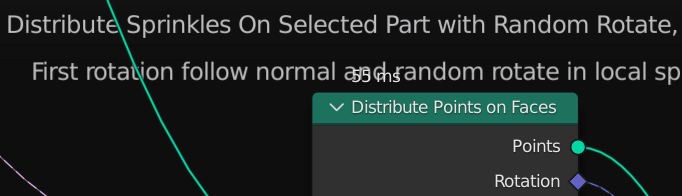
Seems like sometimes the name of the frame can overlap the time there, maybe the text needs to be moved to be part of the node or the frame should make space for it.
I think the idea is that since it’s an overlay, it shouldn’t change the shape/size of nodes at all. Generally I think that will scale better as we add more statistics like this that you wouldn’t always want to display.
Well something needs to change otherwise it will overlap (the frame traces the edge of the node so no matter how you move it vertically it will still overlap), in my case either the frame gets bigger when it’s toggled or the node.
Then maybe the frame needs to change to fit the text in its space.
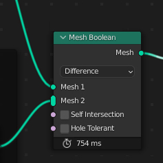
I made a backdrop for the overlays which I think made a bit less ugly when it overlaps in a frame. I guess it would be possible (but a bit complex) to resize frames, but as Hans said my idea was that this is an overlay that shouldn’t change the layout of other nodes.
I’m a fan of the general idea.
As for the UI, not a big fan of backdrop in the last mockup, second one was better IMHO.
I’d line up chronometer icon so it is centered with the arrow below.
I think this just reminds us that frames need some reworking… but that’s a separate issue… in any case I agree that an overlay should not have an effect on nodes/frames position.
I quite like this backdrop, I think it provides clarity without being too flashy. The width of it seems a little arbitrary, I suppose we might want it to align with the node below ? or at least keep the same margins left and right. Or maybe resize it according to contents ?
Really loving the work that’s being done here! I just wanted to suggest adding some sort of color coding, such that it is easier understand the performance individual nodes without reading the numbers. This might also be helpful when looking at a zoomed out node tree.
It could be aligned with the node I guess, but I thought it was too wide in general then. And if it’s resized according to contents it would flicker when you play the animation and the execution time varies. This is how I landed at this fixed width. Wide enough for 100’s of seconds but not too wide.
Not bad. The backdrop could be a little lighter IMHO, but no pressure.
The only thing that looks bad is icon placement - it should be aligned with the checkboxes.