Continuing the discussion from Blender UI paper cuts:
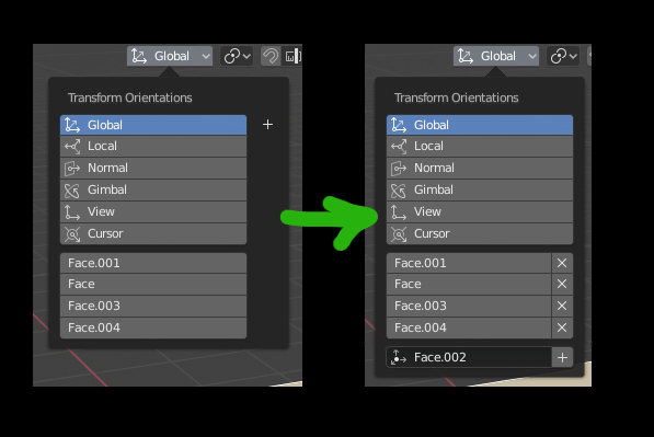
Building on the proposal from @So3Datel, I would like to see the transform menu look like this.
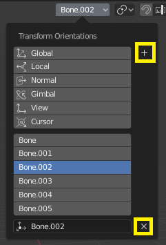
- The current selection is not visible until you already hit the plus sign. In my proposal, the current selection is always visible.
- The plus sign is too far from where the focus area of the custom orientations are, so I moved it to the bottom.
- The styling of the plus sign is not consistent with other Blender widgets, so I adapted it to conform better.
- Double click to rename and click to delete remains from the previous proposal.